Adding a Tabs Panel
Use Tabs when you want several blocks of related content in one place, with only one visible at a time. You end up with a row of tab labels; visitors click a label to see its content. The example builds an agency page with one tab per service. For questions and answers, a collapse panel usually reads better.
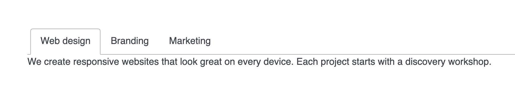
Add a tabs panel
- Hover the column and click + in its control bar, or the + in the middle of an empty column, to open the element picker.
- In the Layout tab, click Tabs. The element appears with one tab, labelled Title.
- Hover the tab's panel and open More > Settings. Type a name in Tab title and click Save.
- Click + inside the panel to add content, such as a Text element.
- To add a tab, hover the tab labels and click Add tab in the Tabs control bar. The new tab lands first, in front of the others. Name it and fill it the same way.
What you see
A row of tab labels sits above the content of the open tab. In Preview and on the published page, a click on a label shows that tab's content and hides the rest. Each tab holds its own elements, so one tab can carry text and another a set of cards. On screens narrower than 768 pixels the tabs turn into stacked headers that open like a collapse panel.
Set up your tabs
The Tabs element has three settings. Open them from More > Settings in the Tabs control bar, which shows when you hover the tab labels.
| Setting | What it does | Default |
|---|---|---|
| Tab direction | Where the labels sit: Default (above the content), Left or Right | Default |
| Style | The look of the labels: Default (a line under the labels), Modern (rounded cards) or Accordion (headers with separator lines) | Default |
| Mobile friendly | Shows the tabs as collapsible headers on screens narrower than 768 pixels | On |
Each tab has its own settings under More > Settings on its panel. Tab title is the label text. Tab description is an optional short line under the label of the open tab.
Manage tabs
- Reorder: drag a tab label to a new place among the labels. Its content moves with it.
- Rename: hover the tab's panel, open More > Settings, change Tab title and click Save.
- Remove: hover the tab's panel, open More and choose Delete. Everything inside the tab is removed with it.
Keep labels to one to three words and stay at about five tabs, so the labels fit on one line.
If you don't see it
- The new tab is first instead of last. Add tab always puts the new tab in front. Drag its label to the place you want.
- The settings show only Tab title and Tab description. You opened the settings of one tab. Hover the tab labels so the Tabs control bar shows, then open More > Settings there.
- Phones show stacked headers instead of tabs. Mobile friendly is on, which is the default. Switch it off in the Tabs settings to keep tabs on every screen width.
- Tabs is missing from the Layout tab of the picker. Your DXPR Builder user profile leaves it out. An administrator ticks Tabs under Elements in your profile at
/admin/dxpr_studio/dxpr_builder/profile.
What's next?
- Adding a Collapsible Panel: stack questions and answers that open one at a time.
- Adding a Carousel Layout: show the same kind of content one slide after another.
- Nesting: put rows and columns inside a tab for richer layouts.