Choose button styles that guide visitors
You decide how loud each button is. A solid button marks the one action you want most, and an outlined button next to it offers the alternative without competing. This page shows you how to style such a pair and which setting changes what. To add a button and set its link, see Adding a Button.
Style a main and a second button
Start with a button on the page, such as Apply now.
- Hover the button and open More > Settings.
- Set Type to Primary.
- Set Size to Large and click Save.
- Hover the button again and open More > Clone. The copy appears right below the original.
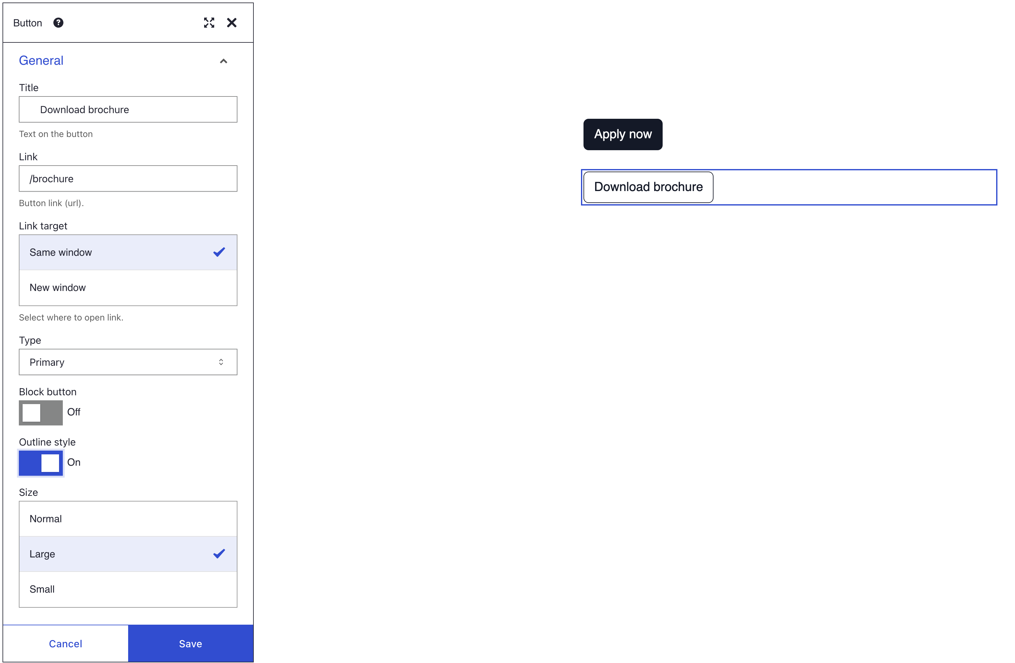
- Open More > Settings on the copy. Change its Title, for example to
Download brochure, and its Link. - Switch on Outline style and click Save.
- Click Save on the toolbar.
Pick a style for each action
| Action | Style | Example |
|---|---|---|
| The one action you want most | Solid Primary | Apply now |
| An alternative | Outline style in the same Type | Download brochure |
| A minor action | Link, which looks like a text link | Read the terms |
| A warning or a final step | Danger or Warning | Cancel my booking |
Use one solid button per section, so visitors see at once where to click. Write labels that say what happens: "Get started" rather than "Click here", "Send message" rather than "Submit".
What you see
Two large buttons stack in the column: a solid one with your theme's primary colour and an outlined one with a border and text in the same colour. The solid one draws the eye first. Links do not open while you edit. To test them, save the page, open the view menu (the eye icon) and choose Preview.
Settings
| Setting | What it does | Default |
|---|---|---|
| Type | The colour style: Primary, Secondary, Success, Info, Warning, Danger, Link, Light or Dark. The colours come from your theme. | Primary |
| Outline style | A coloured border and text with no fill | Off |
| Size | Normal, Large or Small | Normal |
| Block button | Stretches the button across the full width of its column | Off |
| Link target | Same window or New window. It shows once Link has a value. | Same window |
For themers: each Type adds the Bootstrap class btn-<type>, such as btn-primary. With Outline style on, it becomes btn-outline-<type>, except for Link, which always stays btn-link. Large adds btn-lg, Small adds btn-sm and Block button adds btn-block.
If you don't see the style
- The outlined button shows no border. Type is Link, which always looks like a text link, so Outline style has no effect. Choose another Type for an outlined button.
- The button almost disappears. Light is close to white, so it fades into a white section. Choose a darker Type, or give the section a background colour.
- The link opens in the same tab. Link target is Same window, and it only shows once Link has a value. Fill in Link first, then choose New window.
What's next?
- Adding a Button: every button setting, with a video.
- Hover effects: darken a button or add a shadow when the pointer reaches it.
- Colour and branding: keep button colours in line with your brand.