Plan column widths on the 12-column grid
Every row you add sits on the Bootstrap grid: twelve equal tracks that its columns share. A layout such as 1/3 + 2/3 gives one column four tracks and the other eight. Use this page to plan widths that add up, and to give a row a second layout for smaller screens. To add a row in the first place, see Adding a Row.
How fractions become tracks
| Fraction | Tracks | Typical use |
|---|---|---|
| 1/1 | 12 | One full-width column |
| 1/2 | 6 | Two equal columns |
| 1/3 | 4 | Three equal columns, or a sidebar next to 2/3 |
| 2/3 | 8 | Main content next to a 1/3 sidebar |
| 1/4 | 3 | Four equal columns, or a sidebar next to 3/4 |
| 3/4 | 9 | Main content next to a 1/4 sidebar |
| 1/6 | 2 | Six small columns, such as a row of logos |
| 5/12 and 7/12 | 5 and 7 | Two columns of almost equal width |
The tracks of a row add up to 12. When they add up to more, the extra columns wrap to a new line. Use fractions that come out as whole tracks: halves, thirds, quarters, sixths and twelfths. A fraction such as 1/5 has no matching Bootstrap class.
A row inside a column splits that column into its own twelve tracks. See Nesting.
Give a row another layout on tablets
The layout you pick for a new row applies from Medium devices (≥ 768px) up. Below that width, columns stack. These steps keep four columns on desktops and show two per line on tablets.
- Hover the row and click the grid icon in its control bar. The layout dialog opens on the Medium devices (≥ 768px) panel.
- Pick the tile with four equal columns.
- Click Add screen size. A second panel opens with a copy of the layout.
- In the new panel's screen size list, choose Small devices (≥ 576px).
- Click Custom Layout, type
1/2 + 1/2 + 1/2 + 1/2and click Save. - Click Save on the toolbar.
Four halves keep all four columns and put two on each line. A tile with two columns would instead reduce the row to two columns.
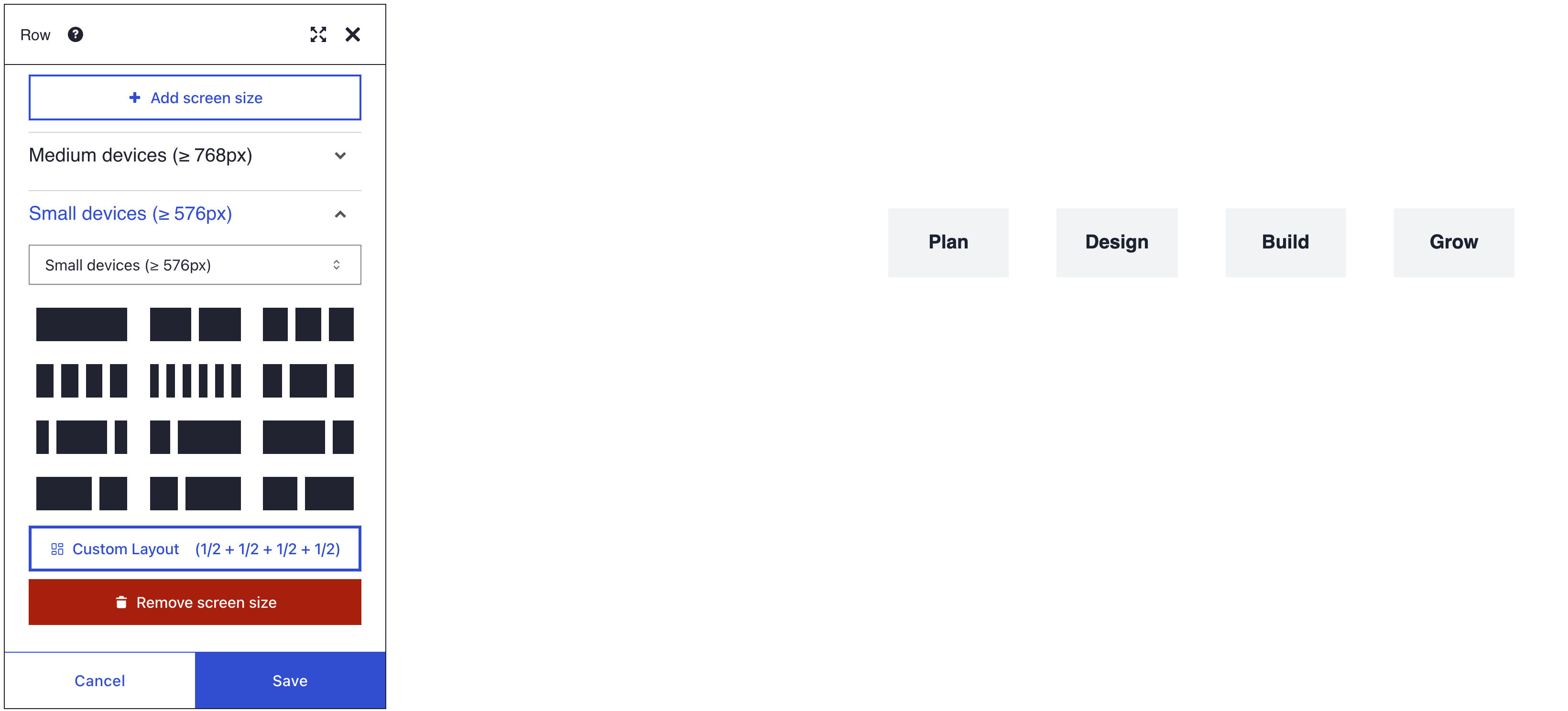
What you see
On a wide screen the row shows four columns side by side. Make the browser window narrower than 768 pixels and they wrap to two per line. Below 576 pixels, every column takes the full width.
Screen sizes
Each panel in the layout dialog sets the columns for one screen size. The layout also holds for larger screens, up to the next size with a panel of its own.
| Panel | Applies from |
|---|---|
| Extra small (< 576px) | The smallest phones up |
| Small devices (≥ 576px) | 576 pixels |
| Medium devices (≥ 768px) | 768 pixels; the first panel of a new row |
| Large devices (≥ 992px) | 992 pixels |
| Extra large (≥ 1200px) | 1200 pixels |
| Extra extra large (≥ 1400px) | 1400 pixels |
Remove screen size deletes a panel and its layout. Custom Layout takes any list of fractions, such as 1/4 + 1/2 + 1/4. When a panel's layout is not one of the tiles, the dialog marks Custom Layout and names the layout on it, such as Custom Layout (1/2 + 1/2 + 1/2 + 1/2). Click it to edit that layout in the custom layout box.
Bootstrap on your site
The grid needs Bootstrap 5 on the page. A site administrator chooses where it comes from in DXPR Studio > DXPR Builder > General Settings (/admin/dxpr_studio/dxpr_builder/settings), under Bootstrap. Sideload Bootstrap files offers Bootstrap 5, which the builder loads itself, or None (theme provides Bootstrap).
If you don't see the layout
- Columns stack on every screen size. No Bootstrap is loaded: the setting is None (theme provides Bootstrap) and the theme does not load it. Choose Bootstrap 5 under Sideload Bootstrap files at
/admin/dxpr_studio/dxpr_builder/settings. - The desktop layout lost columns. You picked a tile with fewer columns for another screen size, and the builder reduced the equal-width layouts to match. Undo the change, as Undo and redo shows, and use Custom Layout with one fraction per column.
- The last column drops to a new line. The fractions add up to more than one row of 12 tracks. Make them add up to 1, such as
1/4 + 3/4. - A custom column has no clear width. Its fraction, such as 1/5, has no Bootstrap class. Use halves, thirds, quarters, sixths or twelfths.
What's next?
- Adding a Row: add rows and pick a column preset.
- Responsive design: show or hide elements on phones, tablets or desktops.
- Nesting: place rows inside columns for finer layouts.