Lay out your page
Layout elements decide where your content sits: in bands down the page, in columns side by side, behind tabs, in panels that open on a click, on slides, or at exact spots. You find six of them on the Layout tab of the element picker. Look up what you want to do in the table, then follow the link.
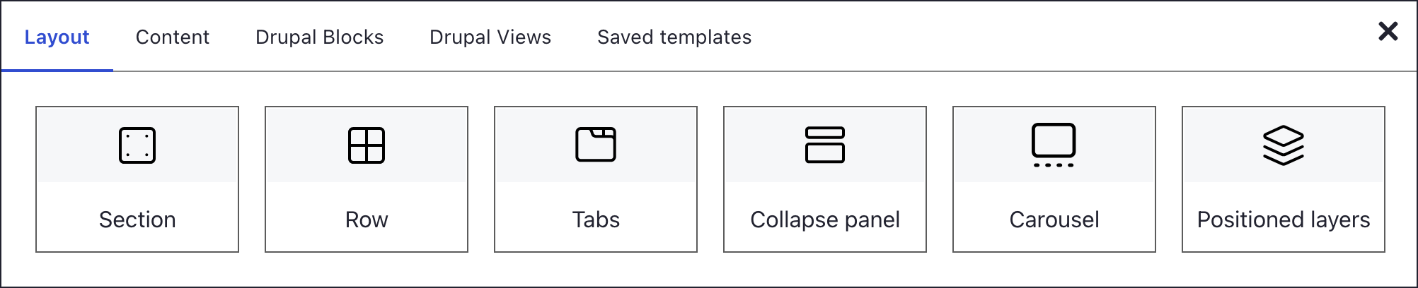
| I want to ... | Use | Needs |
|---|---|---|
| split the page into bands, each with its own background | Section | Nothing: every element sits in one |
| put content side by side in columns | Row | A section; the row brings two columns |
| split one column into a finer grid | Nested row | A row; three rows deep at most |
| let visitors switch between panels by clicking labels | Tabs | A Tab title for each panel |
| show answers only when a visitor clicks the question | Collapse panel | A Toggle title for each question |
| rotate slides that can hold any content | Carousel | Content for each slide |
| overlap elements at exact positions | Positioned layers | A fixed Height, 500 pixels by default |
Which should I use
Section or row. Sections stack down the page, and each one carries its own background, height and spacing. Rows split a section into columns, and every row sits in a section. When you pick a row or a content element on an empty page, DXPR Builder adds the section for you.
Row or nested row. A row sets columns across the whole section. Nest a row only when one column needs its own split, such as two icons above a heading. Two levels cover most pages.
Tabs or Collapse panel. Both hide content until a visitor clicks. Tabs show one panel at a time behind a line of labels; with Mobile friendly on, they turn into collapsibles on small screens. A Collapse panel lists every question at once, which suits FAQs and long pages read on phones.
Carousel or Image carousel. The Carousel on the Layout tab takes any elements on each slide, such as text, buttons and images. For a plain run of photos, the Image carousel content element is quicker to fill.
Grid or Positioned layers. The grid lets content flow and stack on phones. Positioned layers pin each element to a spot on a canvas of fixed height, for compositions where elements overlap. The canvas only scales with the screen when its Responsive setting is on.
On phones
Below 768 pixels, columns stack in their page order. To keep them side by side, give the row a phone layout with Add screen size. To hide an element on phones only, open its settings. Under HTML classes, pick Hidden on extra small devices, phones (<576px).
What's next?
- Sections: add your first band and set its background.
- Rows and columns: split it into columns.
- Full-width layouts: let rows run edge to edge.
In this section
- Sections: Divide a page into bands, each with its own background, spacing and height
- Rows and Columns: Split a section into columns, give phones their own column layout and line up column heights
- Tabs: Put related content side by side in tabs that visitors click to switch, such as one tab per service
- Collapsibles: Build FAQ questions and other content that visitors open and close one at a time, also known as an accordion
- Carousel layout: Show quotes, offers or announcements one slide at a time, with any elements on each slide
- Positioned Layers: Place text, images and buttons freely on a canvas and let them overlap, such as a headline over a photo
- Nesting: Put a row inside a column when one column needs a finer grid, up to three rows deep