Adding a Jumbotron
You get a large hero banner with a title, a lead sentence and a branded background, ready to hold a button. Use it to open a page, announce an event or lead visitors to one action.
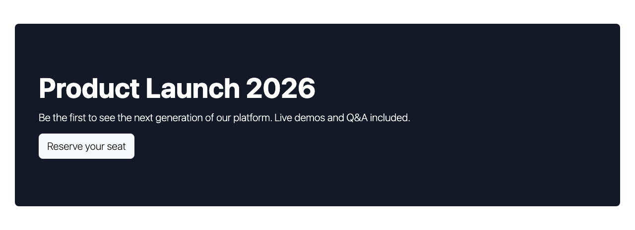
Add a jumbotron
- Hover the column and click + in its control bar, or click Add Elements on an empty page. Open the Content tab and click Jumbotron.
- Type the Title.
- Add a Lead sentence that sells the event.
- Choose a Type for the background; Primary with white text stands out.
- Click Save in the dialog.
- Click + inside the jumbotron and add a Button, because a jumbotron is a container.
Then click Save in the toolbar at the top of the content area to store the page.
What you see
Title, lead and button sit in one branded banner across the column. The button is a normal Button element inside the jumbotron, so you edit and style it on its own.
Set up your jumbotron
Open More > Settings on the element. Options:
- Title: the main heading displayed in the jumbotron.
- Lead: larger introductory text below the title.
- Type: background style: Light, Primary, Secondary, Success, Info, Warning, Danger, Dark, or Default.
- Padding: internal spacing around the content: Large, Medium, or Small.
The jumbotron is a container. Drag or add other elements inside it: buttons, images or more text.
If you don't see it
- Jumbotron is not in the Content tab. Your user profile hides it. Ask an administrator to enable it in User Profiles.
- It is gone after you reload. The page was not saved. Add it again and click Save in the toolbar at the top of the content area.
- The banner shows a "+" and nothing else. No element was added inside yet. Click the + in the jumbotron and pick a Button or Text.
- White text on a light background. Type is Light while the theme text is light. Pick Primary or Dark.
What's next?
Style tab to change spacing and background for your jumbotron.
In this section
- Button: Call-to-action button
- Link: Wrapper container with link
- Alert: Notification and info banners
- Card: Image, title, text card
- Panel: Bordered content panel
- Blockquote: Styled quotations
- Social Links: Social media icon links
Something wrong or missing on this page?
Report it
or edit the page.