Add space inside and around elements
Give text room inside a coloured box, or push a button away from the paragraph above it. Padding is the space inside an element's edge; margin is the space outside it. You set both in the box model at the top of the Style panel. Your theme and a new section already bring spacing of their own, and this page shows how your values fit with it.
Before you start
- Open the page in DXPR Builder; pointing at an element shows its control bar with More. New to the builder? See Your first page.
- Save in the dialog keeps a change in the editor. Save on the builder toolbar above your content stores the page and shows "Saved field".
- Use the box model to fix one gap on one page.
- Use your theme or a class for spacing that repeats, such as the gap between all sections.
- Keep to a scale. Pages look calm when every gap comes from a few sizes:
| Size | Use it for |
|---|---|
| 8 px | Small gaps inside a group, such as an icon and its label |
| 16 px | Between related items |
| 24 px | Between content blocks |
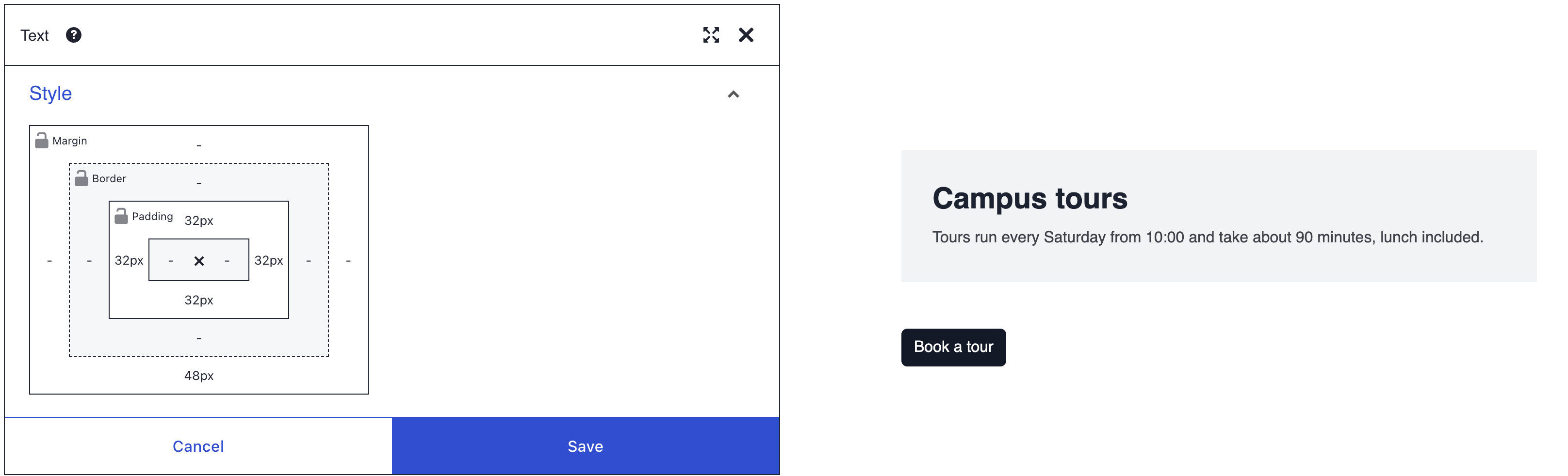
| 32 px | Inside a card or a highlighted box |
| 48 px | Between sections |
Recipe: room around a button
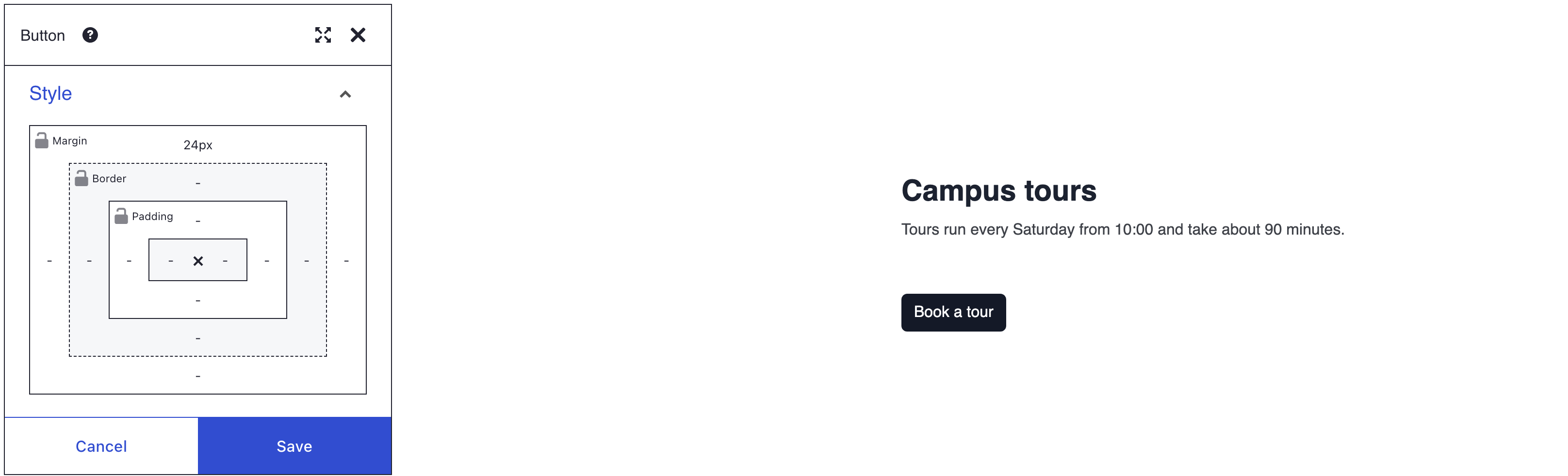
- Hover the Button, click More, then Settings.
- Open the Style panel and click the top side of Margin, the outer ring of the box model. The locks start open, so only this side changes.
- Check that the unit button shows PX. Type 24 in the value field and press Enter. The side now reads 24px and the button moves down.
- Click Save in the dialog, then Save on the toolbar.
On a Button the margin goes on the button itself, so the space starts right at its edge.
Recipe: a taller section
A new section gets top and bottom padding from the Vertical padding size 5 (py-5) class, which beats the box model. Remove that class first. Check that the dialog's title reads Section, not Row or Column.
- Hover the Section, click More, then Settings.
- In the General panel, find HTML classes and click the × on the Vertical padding size 5 (py-5) chip. The section loses some space at the top and bottom. If there is no such chip, skip this step.
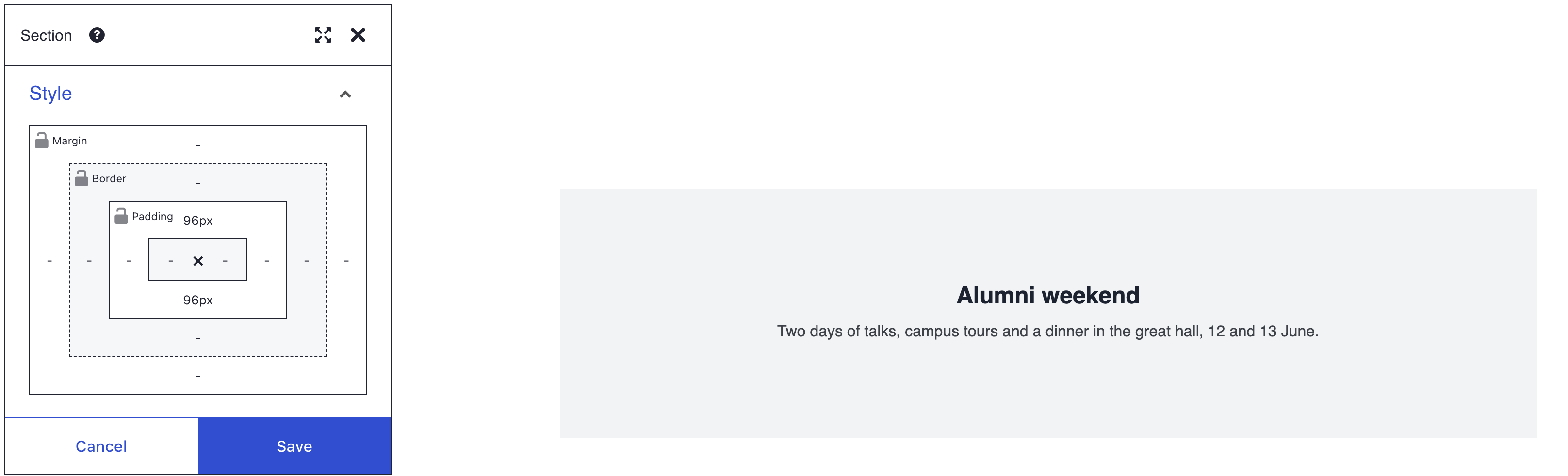
- Open the Style panel. Click the top side of Padding, type 96 and press Enter.
- Do the same for the bottom side of Padding. Both sides now read 96px and the section grows taller.
- Click Save in the dialog, then Save on the toolbar.
What you see
Each side you set shows its value in the box model, such as 24px. The button sits 24 px lower, and the section has 96 px of room above and below its content.
How the box model works
+----------------- Margin ------------------+
|  +-------------- Border ---------------+  |
|  |  +----------- Padding ------------+ |  |
|  |  |                                | |  |
|  |  |         width × height         | |  |
|  |  |                                | |  |
|  |  +--------------------------------+ |  |
|  +-------------------------------------+  |
+-------------------------------------------+
- Each ring has four sides. A side shows its value, such as 24px, or "-" when it is not set.
- Click a side to open a small picker with a slider, a value field and a unit button. The unit is PX or %; Border takes px only.
- Type a value and press Enter, or drag the slider. The up and down arrow keys change the value by 1. Escape closes the picker.
- To unset a side, empty the value field and press Enter. The side shows "-" and your theme decides again.
Margin runs from -200 to 200, padding from 0 to 200 and border from 0 to 50. Width and height run from 0 to 2000. A negative margin pulls the element towards its neighbour. A typed value outside the range is cut to the nearest limit.
The locks
Each ring has a lock beside its name: Margin, Border and Padding. When the lock is closed, a value you set on one side goes to all four. When it is open, each side keeps its own value. Closing the lock does not change the values you already have; only the next value you set is copied.
Percent, size and screen width
A percent value is a share of the width of the element's parent, for top and bottom too. So 10% top padding is taller in a wide column than in a narrow one.
The middle of the box model holds width × height. Elements that size themselves, such as Image and Map, ignore those two boxes.
The box model has no values per screen size. For more padding on large screens than on phones, use Bootstrap classes instead. For example, py-3 py-lg-5 gives 16 px on smaller screens and 48 px from 992 px wide. See HTML ID and classes for how to type them.
How your values meet the theme's spacing
- New sections bring padding. A section you add in the editor gets the class Vertical padding size 5 (py-5): 3rem, about 48 px, at the top and bottom. The class is marked
!important, so it beats your top and bottom Padding. Left and right padding still work. - Spacing classes win. Any Bootstrap spacing class under HTML classes, such as Top margin size 3 (mt-3), beats your value on the same side.
- Columns keep a gap. Bootstrap gives each column 12 px of padding on the left and right. Left or right Padding on a Column replaces it, so the content no longer lines up with the next column.
- Paragraphs keep their own spacing. Your theme puts space under each paragraph and heading. The box model does not change that space, because it works on the element as a whole.
- Margins of neighbours usually overlap. When one element sits above another, the bottom margin of the first and the top margin of the second share the gap. The larger one wins; they do not add up.
If you don't see it
- Top or bottom padding on a section does nothing. The Vertical padding size 5 (py-5) class wins. Remove its chip under HTML classes.
- A margin or padding value does nothing. A Bootstrap spacing class on the same side wins. Remove its chip, or use only the class.
- Padding does not show. The element has no background or border, so the space is invisible. Pick a Background colour while you adjust it.
- The value jumped to 200. Padding and margin stop at 200, border at 50. Use a smaller value, or a percent.
- The page is cramped on phones. The same pixel value applies on every screen. Use smaller values, a percent, or responsive classes.
- The two gaps did not add up. Stacked margins overlap and the larger one wins. Put the whole gap on one of the two elements.
- Columns no longer line up. Side Padding on a Column replaced the grid's gap. Empty those sides again.
What's next?
- Typography: size and colour the text inside your spaced-out box.