Style your elements
Every element on your page has a settings dialog. In it you change the element's look: colour, photo, border, spacing, text and hover effects. You see each change on the page as you make it. Use the table to find the page for what you want to do. The rest of this page explains the dialog and how to keep your changes.
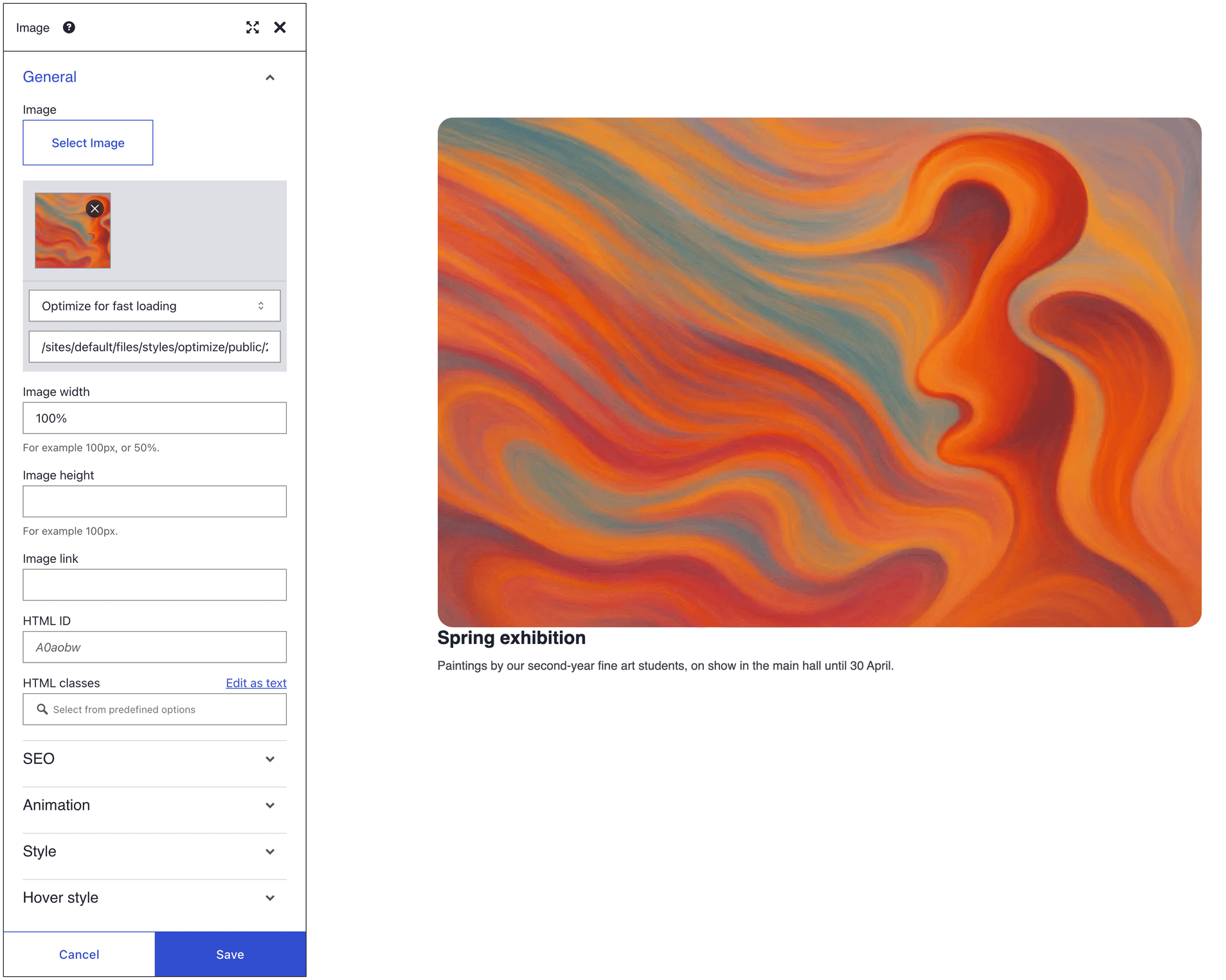
| I want to ... | Use | Needs |
|---|---|---|
| put a colour or photo behind a whole section or one box | Background | Background and Background image in the Style panel; a Section for Background effects |
| frame a card or lift it off the page | Borders and shadows | Border style, Border radius and Drop shadow in the Style panel |
| add room inside or around an element | Spacing | the box model's Margin and Padding in the Style panel |
| make text bigger or change its colour | Typography | Font size and Font color in the Style panel |
| fade an element, or learn when the theme wins | Style panel | the Style and Hover style panels |
| change the look when the pointer is over it | Hover effects | the Hover style panel |
| make a button jump to a section | HTML ID and classes | an HTML ID on the section, and # plus that ID in the button's Link |
| hide an element on phones, or reuse a look | HTML ID and classes | HTML classes in the General panel |
| animate an element as it scrolls into view | Animation | the Animation panel, which columns, single tabs, toggles and slides lack |
Which should I use
The Style panel changes one element on one page. That suits a hero section, a highlighted card or a gap that needs fixing. It is the fastest way to a result.
It is the wrong tool for a look that repeats. Every styled element keeps its own copy of the values. When your brand colour changes, you have to find and edit each one. For a look that repeats, choose one of these instead:
- Your theme sets colours, fonts and spacing for the whole site. One change there updates every page.
- A class under HTML classes applies one CSS rule to every element that has it. See HTML ID and classes.
- A user template stores a styled block that you insert again and again. See User templates.
Open the settings dialog
First open the page in DXPR Builder. New to the builder? See Your first page.
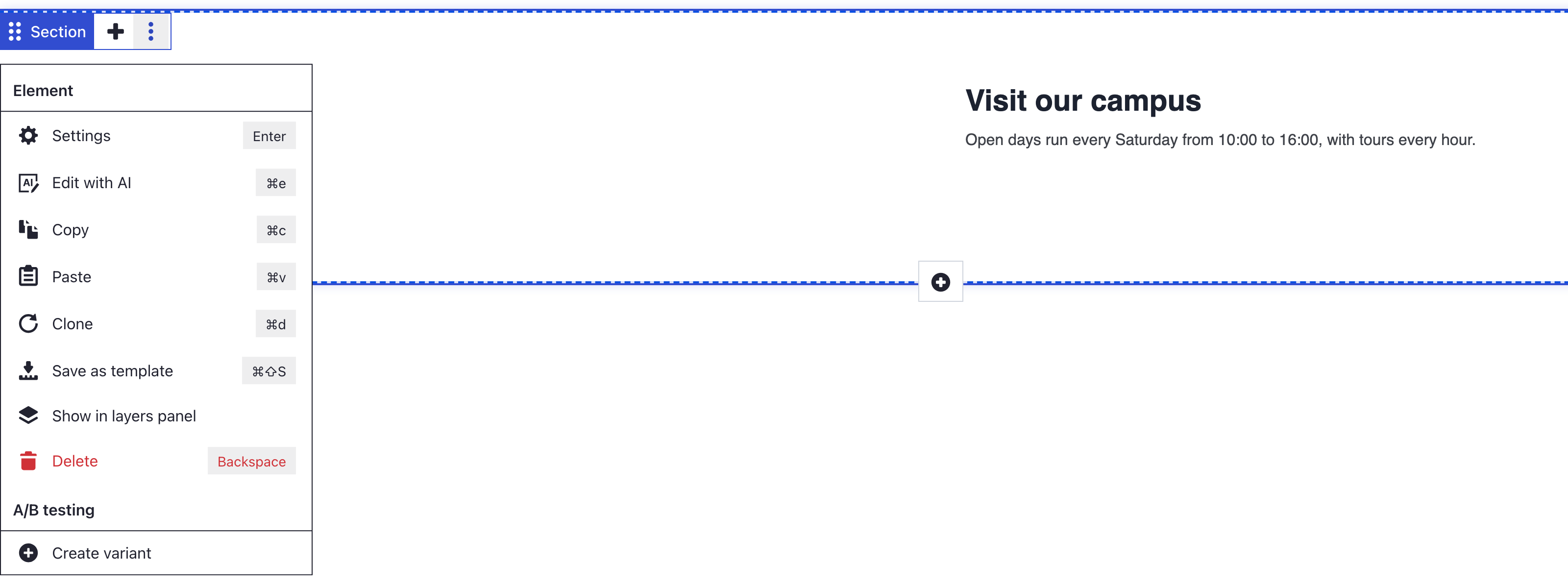
- Hover the element so its control bar appears.
- Click More, then Settings.
You can also select an element and press Enter. A section, a row and a column each have their own control bar. The dialog's title names the element, so check that you opened the right one.
The dialog shows a stack of panels; click a panel's name to open it. General comes first and is open. It holds the element's content, its HTML ID and its HTML classes.
Most elements end with Animation, Style and Hover style. Columns have no Animation panel, and neither do the single tabs, toggles and slides inside layout elements. Drupal blocks and views have none of the three. Style holds the background, border, spacing and font controls. Some elements add a panel in between:
| Panel | Element | What it holds |
|---|---|---|
| Background effects | Section | Fixed image, Parallax image, Gradient and YouTube video backgrounds |
| SEO | Image, Image carousel, Link, Marquee | Alt attribute and Title attribute; on Link, Title attribute and Tell search engines not to follow |
| Icon colors | Social links | Color and Background color of the icons |
| Icon utilities | Icon | Style, Icon orientation and Icon animation |
| Circle content | Circle counter | The text, info line and icon inside the circle |
| Dots | Carousel | Dots navigation, Dot color, Active dot color and the dot shape |
| Next/Previous | Carousel | The Next/Previous arrows, their Orientation and their colours |
The Animation panel makes an element move as it comes into view. You pick the effect in Animation in and its speed in Duration. See Animation for the other controls.
Keep or undo your changes
Each change shows on the page while you work, but it is only a preview.
- Save at the bottom of the dialog keeps your changes in the editor.
- Cancel, the close icon and the Escape key put back the settings the element had when you opened the dialog.
Save in the dialog does not save the page. Click Save on the builder toolbar above your content, or press Ctrl+S (Cmd+S on a Mac). Drupal's own admin toolbar has no such button. A "Saved field" message confirms the save.
The shortcut does not fire while the cursor is in a text field or in text you are editing, so click outside it first. If you try to leave with unsaved changes, your browser asks you to confirm.
Saving does not publish the page. A draft stays a draft until you publish it; see Save and publish your page.
What you see
The dialog's title names the element you opened. Each change shows on that element while the dialog is open. After Save on the toolbar, a "Saved field" message appears, and the change is still there when you reload the page.
If you don't see your change
- A change vanished when the dialog closed. You closed it with Cancel, the close icon or the Escape key. Make the change again and click Save.
- The page lost its changes after a reload. Save in the dialog keeps a change in the editor only. Click Save on the toolbar before you leave.
- Ctrl+S (Cmd+S on a Mac) did not save the page. The cursor was in a text field, so your browser got the shortcut instead. Click outside the field and press Ctrl+S again, or click Save on the toolbar.
- Save in the dialog does nothing. A field has an error, such as an HTML ID that starts with a number. Fix the field that shows the error. HTML ID sits in the General panel.
- The change is saved but the look stays the same. Your theme or a class may win, or you changed the section instead of the element inside it. See Style panel.
- Visitors still see the old version. The page is a draft or unpublished. Publish it as described in Save and publish your page.
What's next?
- Style panel: learn what each control accepts and when your theme wins.
In this section
- Style tab: What the Style and Hover style panels change, what Theme defaults means, how hover and opacity behave, and why the theme sometimes wins
- Background: Put a colour, photo, gradient or video behind content, keep a heading readable on a photo, and choose how the photo fills the space
- Borders and shadows: Frame a card, round corners and add depth: the three settings a border needs, what each Drop shadow level is, and how to make a circle
- Spacing: Add room inside and around an element with the box model: ranges, units and locks, and how your values meet the theme's spacing and a section's own padding
- Typography: Change text size and colour for one element, see why some headings and links keep the theme's style, and meet the WCAG contrast targets
- Custom CSS classes: Give an element an HTML ID for anchor links, and use HTML classes to hide it on phones, set spacing per screen size or reuse a look your theme defines
- Design guides: Colours, buttons, cards, backgrounds, animation, hover effects and layout widths: pick the design page for your goal
- Colour and branding: Apply your brand colours to sections, text and buttons with theme swatches and colour classes
- Button styles: Pick button types, outlines, sizes and widths so your main call to action stands out
- Card styles: Give cards a colour scheme, rounded corners, shadows and borders that match your brand
- Backgrounds: Fill a section with a colour, a photo, a gradient, a parallax image or a YouTube video
- Animation tab: Fade, slide or zoom elements in as visitors scroll, hover or click, with the Animation panel
- Bootstrap grid: How column fractions map to the 12-column grid, and how to give a row another layout on tablets or phones
- Full-width layouts: Let a section's content run edge to edge, or keep it boxed while the background fills the window
- Responsive design: Choose column layouts per screen size, mirror rows and hide elements on phones or desktops
- Hover effects: Make an element change when the visitor points at it with the Hover style panel