Add borders, rounded corners and shadows
Frame a card, round the corners of a photo or lift a box off the page with a shadow. You set all of this in the element's Style panel, and you can change it on hover in the Hover style panel. Use it to make one card stand out. For the same frame on a whole series of cards, a shared class keeps them alike.
Before you start
- Open the page in DXPR Builder; pointing at an element shows its control bar with More. New to the builder? See Your first page.
- Save in the dialog keeps a change in the editor. Save on the builder toolbar above your content stores the page and shows "Saved field".
- Highlight one thing. A border or a shadow draws the eye to a key date, an offer or a quote. Put it on everything and it stops working.
- Keep a series alike. For the same frame on many cards, save one card as a template or use a shared class. See HTML ID and classes.
- Let the theme tune shadows. The five Drop shadow levels are defined once for the whole site. Your theme can restyle a level, and every element that uses it follows.
Recipe: a highlighted card
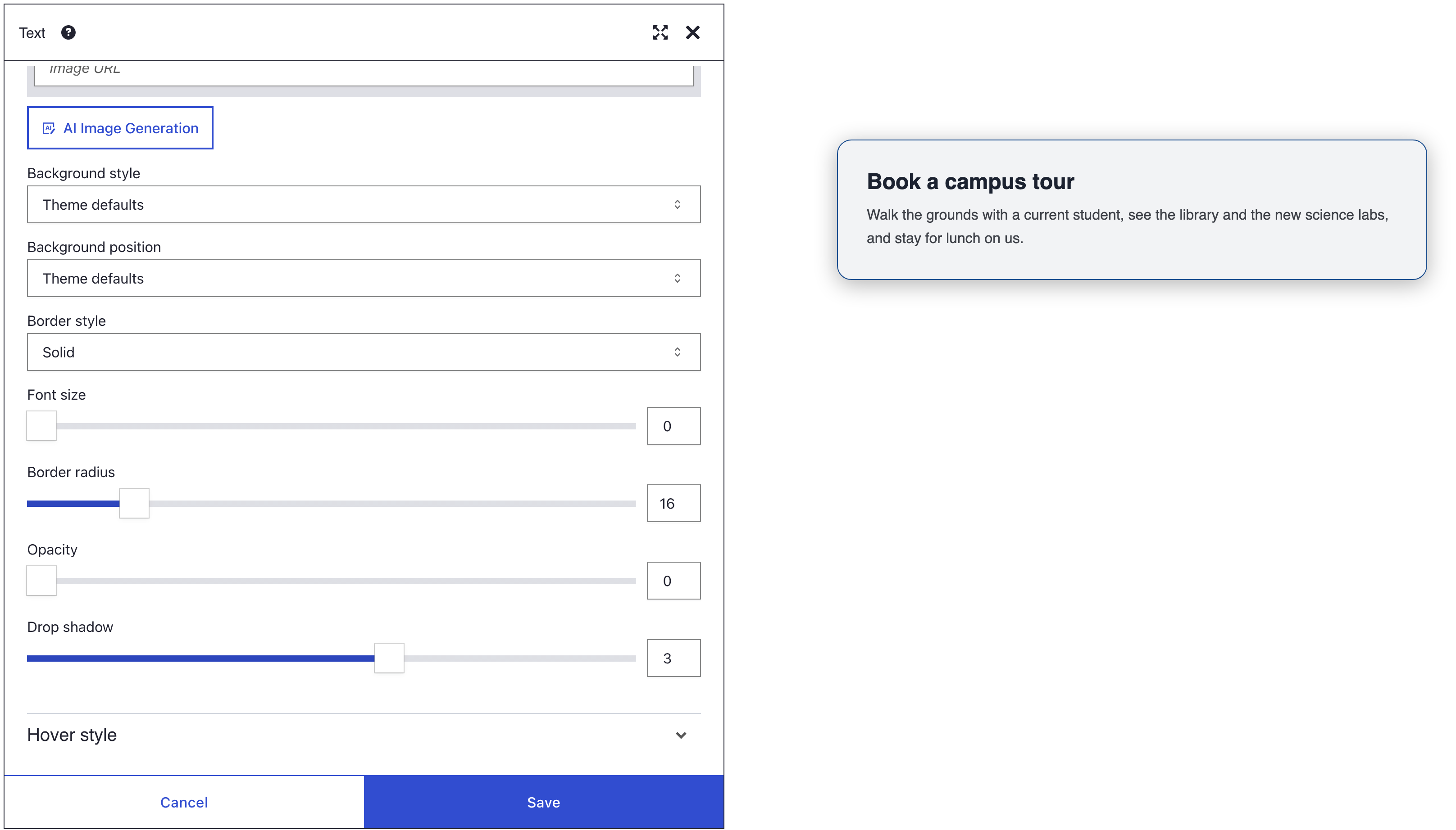
You get a soft box with a thin border in your brand colour. It has round corners and a shadow that grows on hover.
- Hover the Text element, click More, then Settings.
- Open the Style panel. The box model sits at the top. Its locks start open; click the lock beside Padding to close it, so its four sides move together.
- Click the top side of Padding, type 32 and press Enter. All four sides now read 32px.
- Pick a light Background colour, such as a pale grey.
- Set Border style to Solid.
- Close the lock beside Border, then click one of its sides, type 1 and press Enter.
- Pick a Border color, set Border radius to 16 and set Drop shadow to 3.
- Open the Hover style panel and set Drop shadow to 5.
- Click Save in the dialog, then Save on the toolbar.
- Choose Preview in the view menu (the eye icon) and point at the card. Its shadow deepens.
What you see
The card has a thin border in your colour, round corners and a soft shadow below it. In Preview, the shadow grows deeper while the pointer is over the card and settles back when it leaves.
How a border is built
A border needs three settings, and the panel spreads them out. Set all three:
- Border style picks the line: Solid, Dotted or Dashed. On Theme defaults, most elements have no border at all. None removes a border that your theme draws.
- The Border ring of the box model sets the width of each side, from 0 to 50 px. If you leave it empty, the browser uses its own width of about 3 px.
- Border color sets the colour. If you leave it empty, the border takes the colour of the text.
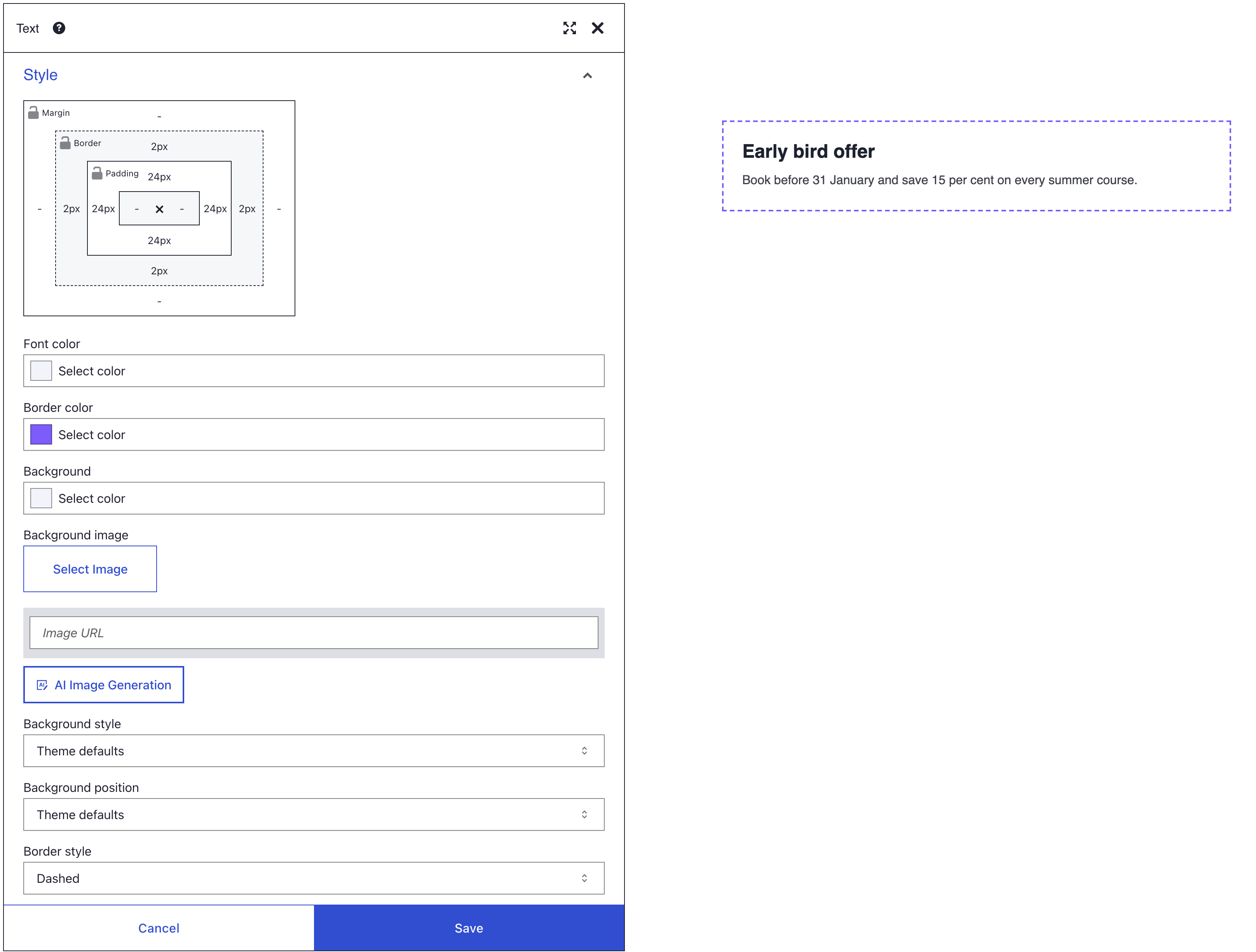
Border radius rounds all four corners, from 0 to 100 px. It rounds the background and the shadow too. On an Image it rounds the picture itself.
For a circle, make the element square. Then set Border radius to half its width in pixels: 100 for an element that is 200 px wide. For anything wider, add the Circular (50% radius) class under HTML classes. On an Image this class rounds the frame around the picture, not the picture, so use Border radius there.
Drop shadow levels
| Level | Shadow under the element |
|---|---|
| 0 | None from DXPR Builder; your theme decides |
| 1 | 2 px down, 7 px blur, 20% black |
| 2 | 4 px down, 12 px blur, 30% black |
| 3 | 5 px down, 25 px blur, 30% black |
| 4 | 8 px down, 38 px blur, 30% black |
| 5 | 12 px down, 57 px blur, 30% black |
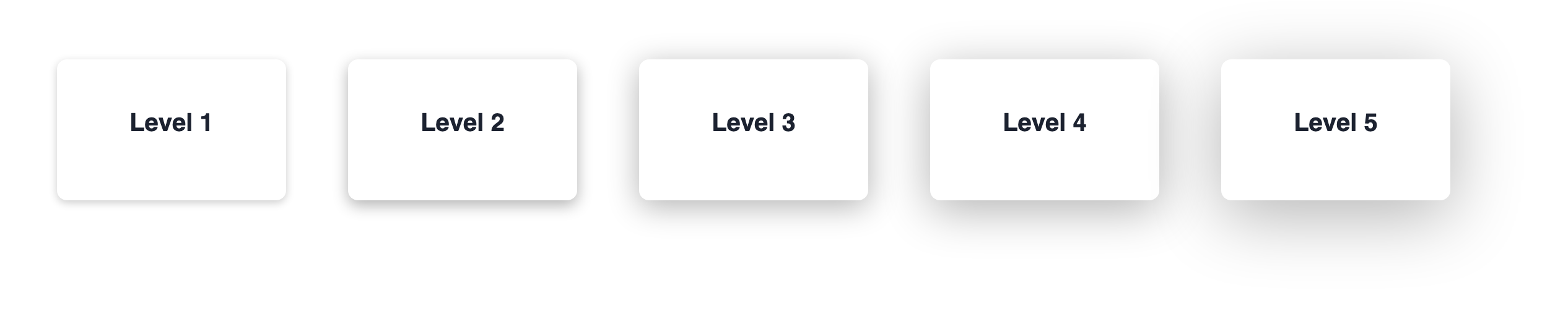
These are the default levels. Each level is a shared style, not a value stored in your page, so a theme can retune a level for the whole site. For your theme developer: the levels are the CSS variables --dxb-box-shadow-1 to --dxb-box-shadow-5.
In the Hover style panel, Drop shadow sets the level while the pointer is over the element. The new shadow fades in over 0.15 seconds. A higher level on hover makes a card look lifted.
HTML classes offers more shapes: Lifted drop shadow, Raised drop shadow, 3D shadow and Curved horizontal drop shadow. It also has Bootstrap's Small shadow, Default shadow and Large shadow. Use one shadow per element. Bootstrap's shadow classes beat the Drop shadow slider.
If you don't see the border, corners or shadow you set
- The border does not appear. Border style is on Theme defaults or None. Choose Solid, Dotted or Dashed.
- The border is thicker than you want. No width is set, so the browser uses about 3 px. Set the Border sides in the box model.
- The border has the wrong colour. An empty Border color takes the text colour. Pick a Border color.
- The corners stay square. A class such as No rounded corners (rounded-0) under HTML classes, or a theme rule with
!important, wins. Remove the chip, or ask your webmaster about the theme rule. - The corners round but no circle appears. The slider stops at 100 px. Use the Circular (50% radius) class.
- Drop shadow changes nothing. A Bootstrap shadow class such as Large shadow under HTML classes wins. Remove its chip. Level 1 is also faint, so try level 3 to test.
- The shadow does not grow on hover. Set Drop shadow in the Hover style panel, not in Style, and pick a higher level than the resting one.
- Only one side changed. The lock beside Padding or Border was open. Close it and enter the value again.
- The hover shadow never shows on a phone. Touch screens have no pointer, so a hover look shows only after a tap.
What's next?
- Spacing: give the content room inside the border.