Content elements
DXPR Builder includes 22 content elements and 6 layout elements for building pages. Each element serves a specific purpose, from simple text and images to interactive counters and carousels.
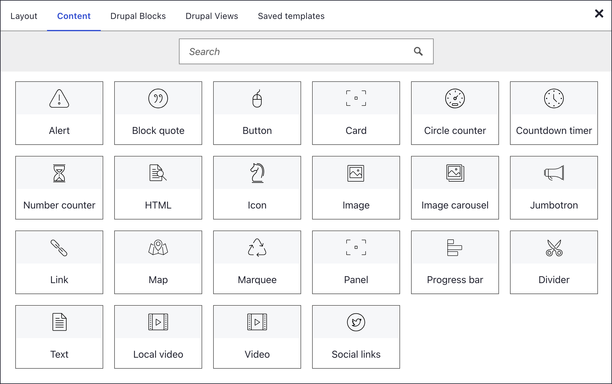
Adding an element
- Click + on any container
- The element picker opens
- Browse the Content tab or search
- Click an element to insert it
Element settings
Every content element has a settings dialog with the panels General, Animation, Style and Hover style. Some add a panel of their own, such as SEO on images. See element settings for details.
What's next?
Styling and layout options to continue exploring DXPR Builder.
In this section
- Text and media
- Text: Rich text content with inline editing
- Image: Single image
- Image Carousel: Image slider with navigation
- Video (embedded): YouTube or Vimeo embed
- Video (local): Self-hosted MP4 video
- HTML: Raw HTML/CSS/JS code
- Layout: Choose the layout element for the job: sections, rows and columns, nesting, tabs, collapsibles, carousel or positioned layers
- Sections: Divide a page into bands, each with its own background, spacing and height
- Rows and Columns: Split a section into columns, give phones their own column layout and line up column heights
- Tabs: Put related content side by side in tabs that visitors click to switch, such as one tab per service
- Collapsibles: Build FAQ questions and other content that visitors open and close one at a time, also known as an accordion
- Carousel layout: Show quotes, offers or announcements one slide at a time, with any elements on each slide
- Positioned Layers: Place text, images and buttons freely on a canvas and let them overlap, such as a headline over a photo
- Nesting: Put a row inside a column when one column needs a finer grid, up to three rows deep
- Marketing
- Jumbotron: Large hero banner
- Button: Call-to-action button
- Link: Wrapper container with link
- Alert: Notification and info banners
- Card: Image, title, text card
- Panel: Bordered content panel
- Blockquote: Styled quotations
- Social Links: Social media icon links
- Data and motion
- Number Counter: Animated number
- Circle Counter: Circular progress
- Progress Bar: Horizontal progress
- Countdown Timer: Date countdown
- Logo Marquee: Scrolling image banner
- Map: Google Maps embed
- Icon: Icon from configured icon sets
- Divider: Horizontal separator
Something wrong or missing on this page?
Report it
or edit the page.