Change an element's look in the Style panel
Use the Style panel when one element on one page needs its own look: a coloured card, a faded logo, a button in campaign colours. You see each change on the page as you make it. For a look that every page should share, such as the colour of all buttons, change your theme instead. One edit there updates the whole site.
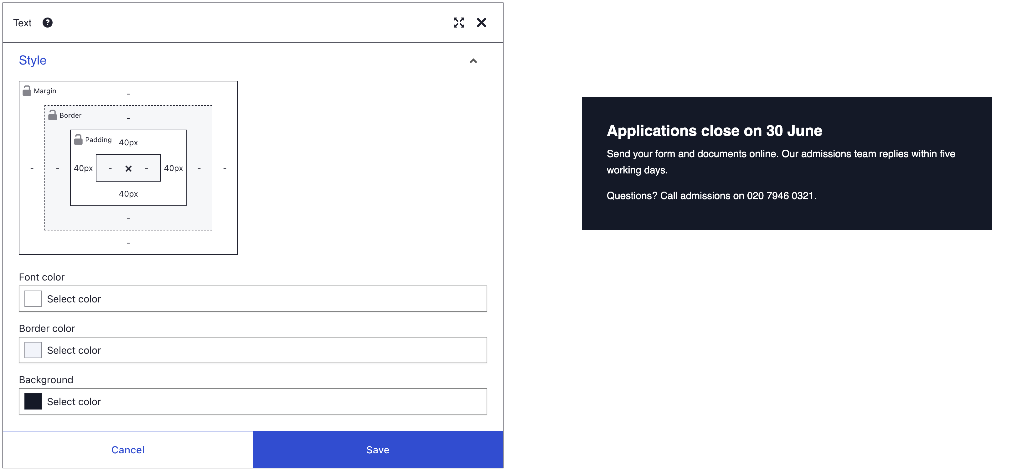
Before you start
- Open the page in DXPR Builder; pointing at an element shows its control bar with More. New to the builder? See Your first page.
- Save in the dialog keeps a change in the editor. Save on the builder toolbar above your content stores the page and shows "Saved field".
Settings in the Style panel belong to one element. They are saved in that page's content, not in your theme. If your brand colour changes next year, every element you coloured by hand keeps the old colour until you edit it.
- Reuse a look by saving a styled element with More > Save as template, or by giving elements a shared class under HTML classes. See user templates and HTML ID and classes.
- Pick colours from the swatches when your site shows them. They come from your theme's colour palette. A swatch copies the colour, so a later palette change does not update it.
Recipe: fade logos until the pointer reaches them
A row of partner logos looks calmer when the logos are muted. This recipe dims one logo and brings it back on hover.
- Hover an Image element that shows a logo, click More, then Settings.
- Open the Style panel and drag Opacity to 0.5. The logo fades as you drag.
- Open the Hover style panel below it and drag Opacity to 1.
- Click Save in the dialog, then Save on the toolbar.
- Open the view menu (the eye icon) on the builder toolbar, choose Preview and point at the logo. It switches to full strength and dims again when the pointer leaves.
Repeat the steps for each logo in the row.
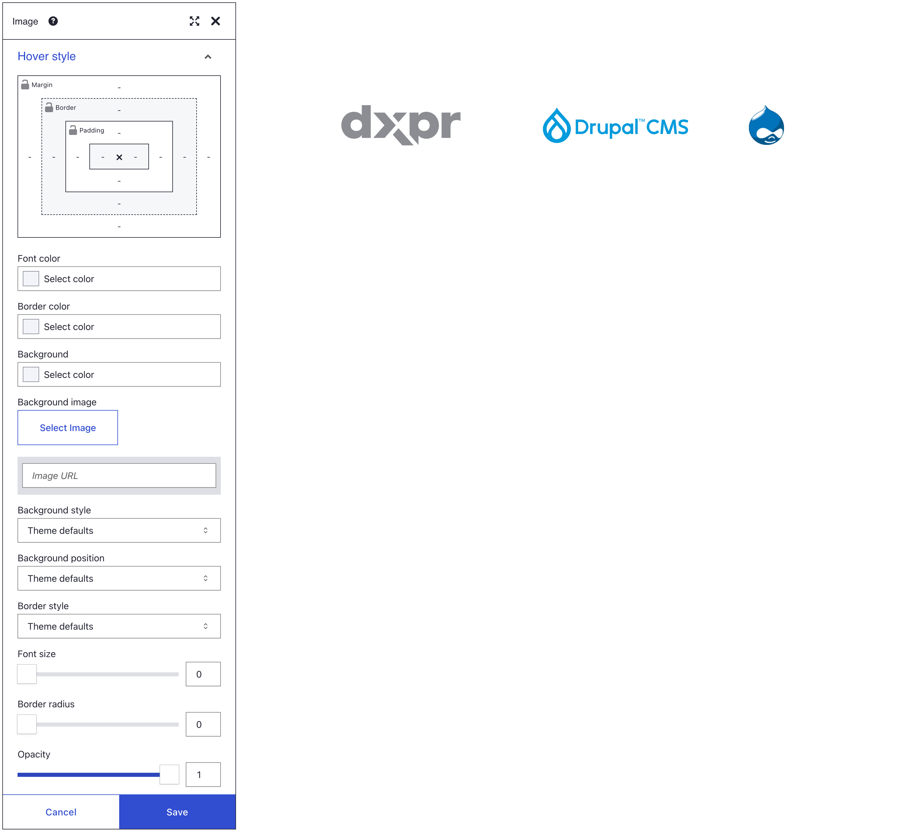
Recipe: a button in campaign colours
Your theme gives buttons a hover colour. A Background you set yourself also replaces that hover colour, so set both.
- Hover the Button element, click More, then Settings.
- In the Style panel, pick a Background and a Font color. Click a swatch, or type your colour code, such as #e4002b, in the colour field.
- In the Hover style panel, pick a darker Background.
- Click Save in the dialog, then Save on the toolbar.
- Choose Preview in the view menu and point at the button. It turns the darker colour.
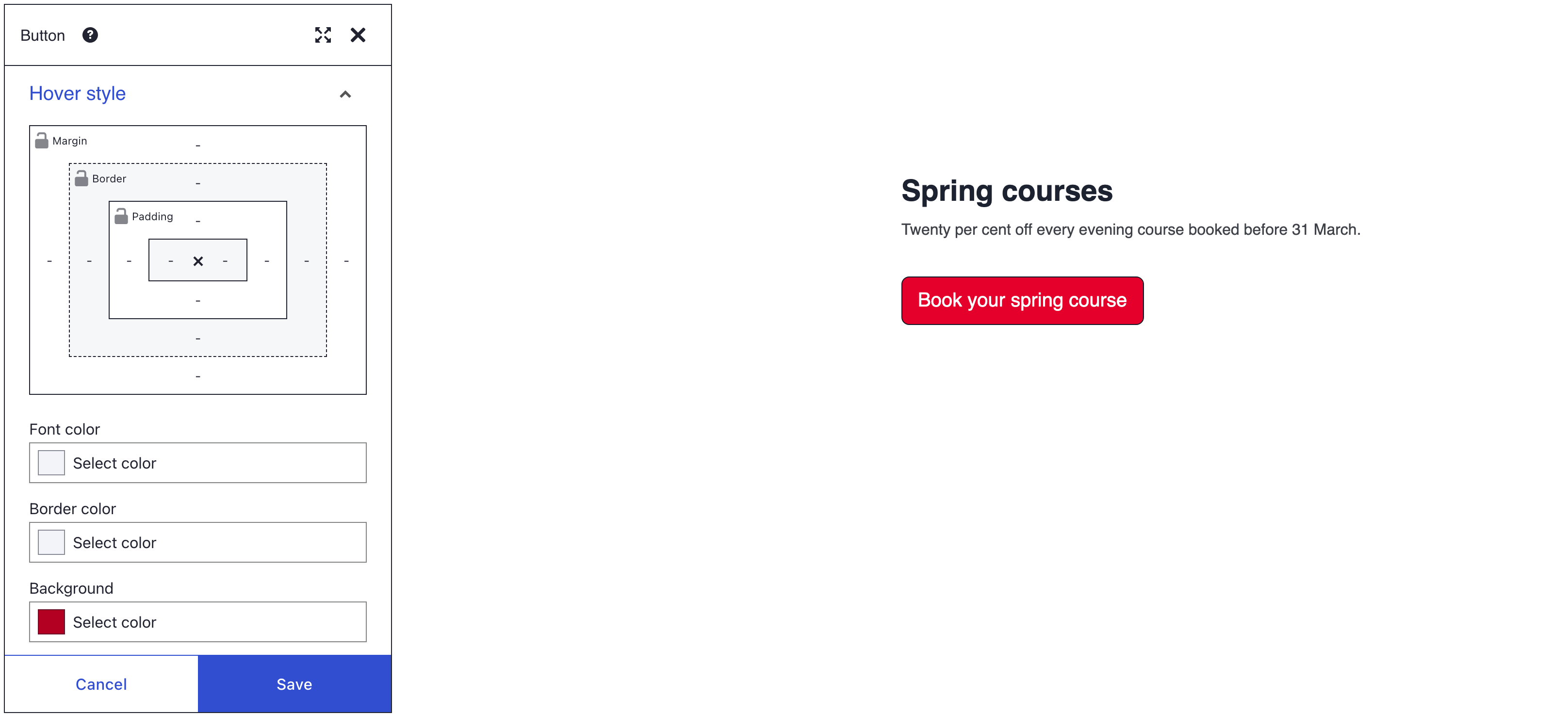
What you see
While the dialog is open, the element shows each change. In Preview, the dimmed logo turns to full strength under the pointer, and the campaign button turns its darker colour. Both looks remain after a page reload, because Save on the toolbar stored them.
What each control accepts
| Control | Range | Unit |
|---|---|---|
| Font color, Border color, Background | any colour, with transparency | colour |
| Background image | a picture from the media library, or a URL | |
| Background style, Background position, Border style | a list that starts with Theme defaults | |
| Font size | 0 to 100 | px |
| Border radius | 0 to 100 | px |
| Opacity | 0 to 1, in steps of 0.01 | |
| Drop shadow | levels 0 to 5 | |
| Box model Margin | -200 to 200 | PX or % |
| Box model Padding | 0 to 200 | PX or % |
| Box model Border | 0 to 50 | px |
| Box model width × height | 0 to 2000 | PX or % |
A typed value outside the range is cut to the nearest limit. The box model and its locks are explained on the spacing page.
How the settings behave
Theme defaults
An empty colour, a slider at 0, a list on Theme defaults and a box model side that shows "-" all mean the same thing. DXPR Builder writes nothing, and your theme decides. So Opacity 0 does not hide an element, and Font size 0 keeps the theme's size. To go back to the theme's look, click Clear in the colour picker, move the slider to 0 or choose Theme defaults again.
Where the settings land
Each Style setting except Drop shadow is saved as an inline style on the element. Inline styles beat ordinary theme CSS. Two things still win over them: theme rules marked !important, and Bootstrap utility classes under HTML classes, which carry !important too.
On some elements the settings go on an inner part. On a Button they style the button itself, on an Image the picture, on a Link the link and on a Map the map frame.
Every screen size
Style settings have no breakpoints. 64 px of padding is 64 px on a phone too. Percent values grow and shrink with the width of the page. For different values per screen size, use responsive classes, as shown on the HTML ID and classes page.
Opacity fades everything inside
Opacity works on the whole element. It fades the box, the border, the text and every element inside it. For a see-through box behind solid text, leave Opacity at 0. Pick a Background colour with some transparency instead: the colour picker has its own opacity slider for that.

Hover style
Hover style is a separate panel below Style. It has the same controls, its own box model included. Its values apply while the pointer is over the element. Unlike Style values, they are marked !important themselves, so they beat your Style values, the utility classes under HTML classes and most theme rules.
Only Drop shadow fades in, over 0.15 seconds. Other hover changes switch at once, unless your theme animates them. Bootstrap buttons fade colours over 0.15 seconds.
Phones and tablets have no pointer. Visitors there see a hover look only after a tap, so never put information in it that they need.
Elements with their own settings
Some elements have their own setting for the same job. Their own setting wins, and the Style control does nothing.
| Element | Ignores in Style | Use instead |
|---|---|---|
| Circle counter | Background, Font size, width × height | Background color and Dimension in General, Font size in Circle content |
| Progress bar | Background, width × height | Back color, Front color and Bar height in General |
| Divider | Background, width | Color and Length in General |
| Number counter | Font size | Font size in General |
| Image | width × height | Image width and Image height in General |
| Map | width × height | Map width and Map height in General |
| Marquee | width × height | Image width and Height in General |
| Video, Local video | width | Video width in General |
| Positioned layers | width × height | Width and Height in General |
If you don't see your change
- The change vanished when the dialog closed. You closed it with Cancel, the close icon or the Escape key, which put back the old settings. Make the change again and click Save in the dialog.
- The change is gone after a page reload. Save in the dialog keeps a change in the editor only. Click Save on the toolbar before you leave the page.
- The theme's look stays. A Bootstrap utility class under HTML classes or a theme rule with
!importantwins. Open the General panel and remove the class chip, for example Primary background, or ask your webmaster about the theme rule. - A control does nothing at all. Some elements have their own setting for the same job. See Elements with their own settings.
- The button no longer changes colour on hover. Your Background replaces the theme's hover colour. Set a Background in the Hover style panel too.
- The text turned faint along with the box. Opacity fades the whole element. Set it back to 0 and use a Background colour with transparency.
- Opacity 0 does not hide the element. 0 means Theme defaults. Add the Hide element (d-none) class under HTML classes instead.
What's next?
- Backgrounds: put a photo behind a heading and keep the heading readable.