Change text size and colour
Make a lead sentence larger, set a quote in your brand colour, or turn a heading white on a dark photo. With Font size and Font color in the Style panel, you change all the text in one element. For part of a text, use the text editor's toolbar instead. For sizes and colours that every page shares, use your theme.
Before you start
- Open the page in DXPR Builder; pointing at an element shows its control bar with More. New to the builder? See Your first page.
- Save in the dialog keeps a change in the editor. Save on the builder toolbar above your content stores the page and shows "Saved field".
- Use the Style panel for one element: a lead paragraph, a quote, a heading on a photo.
- Use the text editor for part of a text and for structure. Make a heading a real heading with Heading 2 or Heading 3, not a bigger Normal line. Screen readers and search engines read the level, not the size.
- Use the editor's Styles list for brand text styles. Your webmaster sets them under General Settings > Text Editor > Custom styles (
/admin/dxpr_studio/dxpr_builder/settings). - Use your theme for the body font, heading sizes and link colours.
Recipe: a lead sentence in your brand colour
- Add a Text element and type one or two sentences as Normal text.
- Hover it, click More, then Settings.
- Open the Style panel and drag Font size to 20. The text grows as you drag.
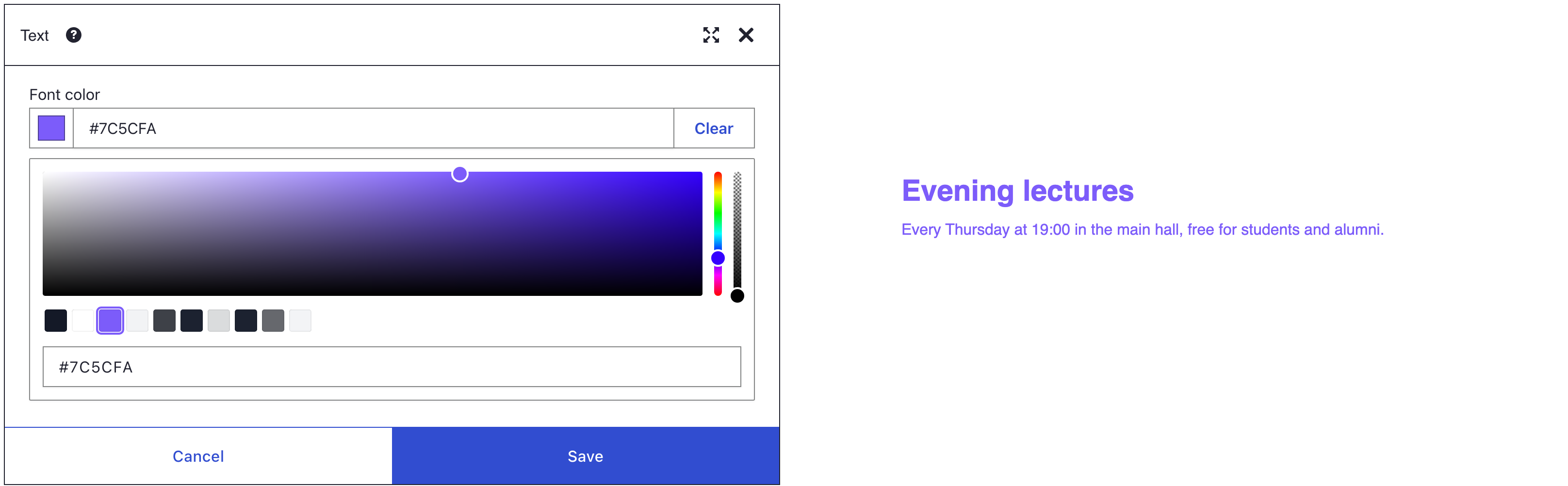
- Open Font color and pick your brand colour from the swatches, or type its code, such as #1a4d8f, in the colour field.
- Click Save in the dialog. At 20 px the sentence counts as normal text, so it needs a contrast of 4.5 to 1. Enter your colour code and the background colour in a contrast checker; a white page is #ffffff.
- Click Save on the toolbar.
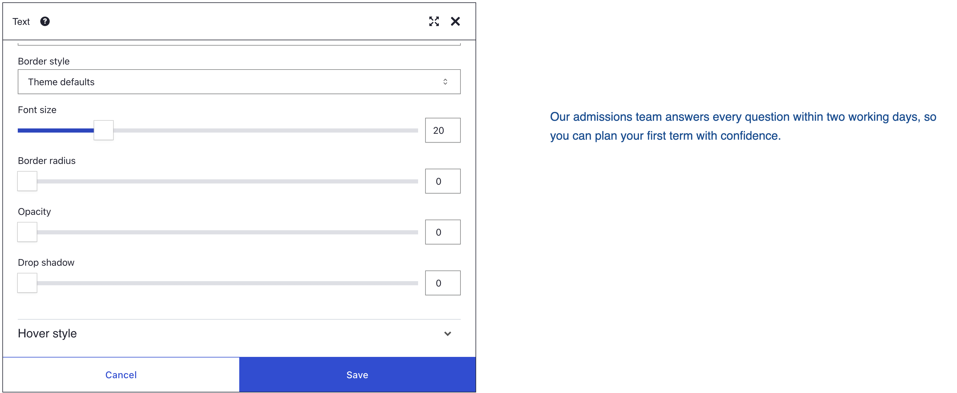
What you see
The sentence grows to 20 px and turns your brand colour. Headings and links inside the same Text element take that colour too, but headings keep their own size.
How the settings work
Font size
Font size runs from 0 to 100 px, and 0 keeps your theme's size. The value is the same on every screen size: a 48 px line on a desktop is 48 px on a phone too.
The size goes on the element, and text that has its own size keeps it. Headings usually do, because Bootstrap sizes them from the page's base size. Text you sized with the editor's font size tool keeps its size too.
Font color
The picker shows your theme's palette as swatches, when your site has one. It also has an opacity slider and a field where you type a colour code, such as #1a4d8f. Clear in the picker returns the text to the theme colour.
On a content element such as Text, Card or Alert, the colour reaches everything inside, headings and links included. On a Section it only reaches text without a colour of its own. Headings and links that your theme colours keep their colour there.
Bootstrap colour classes are marked !important, so they beat Font color. One example is the Primary text color chip under HTML classes. Another is an editor style such as Primary Brand Text on part of the text.
On a Button, the colour goes on the button itself and replaces the theme's hover colour. Set Font color in Hover style as well.
Hover
The Hover style panel has its own Font color and Font size. A larger size on hover pushes the content around it, so a colour change is usually the calmer choice.
Contrast
For text that most people can read, the WCAG 2 rules at level AA ask for this much contrast:
| Text | Contrast with its background |
|---|---|
| Normal text | at least 4.5 to 1 |
| Large text: 24 px (18 pt) or more, or 19 px (14 pt) or more in bold | at least 3 to 1 |
On a photo, measure against the lightest part behind the text. Test your colour pair with a contrast checker, such as the WebAIM contrast checker.
If you don't see it
- The heading inside the text did not grow. The heading has its own size from your theme. Pick another heading level in the text editor, or use its font size tool.
- Links and headings keep their colour. On a Section, text with its own theme colour keeps it. Set Font color on the Text element instead.
- Font color does nothing at all. A colour class such as Primary text color or White text under HTML classes wins. Remove its chip.
- Part of the text keeps another colour. An editor style on that part, such as Primary Brand Text, wins. Remove the style in the text editor.
- Font size does nothing on a counter. Circle counter and Number counter have their own Font size. Use that one.
- A swatch colour no longer matches the brand. A swatch copies the colour when you pick it. After a palette change, pick the swatch again.
- The brand colour fails the contrast check. Pick a darker shade of it. Or make the text at least 24 px, so the 3 to 1 target applies.
- The text is hard to read on a photo. The contrast is too low. Darken the photo with a gradient, as shown on the Backgrounds page.
- The button lost its hover text colour. Your Font color replaces the theme's hover colour. Set Font color in Hover style too.
What's next?
- HTML ID and classes: reuse a text style through a class instead of setting it on every element.