Edit a page on your phone or tablet
You can fix a typo or change a button from your phone or tablet: the builder runs in mobile browsers and adapts its dialogs to touch screens. This page shows a quick edit and what looks different. For new layouts and templates, a desktop screen is easier.
Before you start
- You are logged in with the Edit with DXPR Builder permission.
- The page shows the DXPR toolbar. If its eye icon is crossed out in red, the page is in Preview: tap the icon and choose Edit.
Fix a text
- Open the page on your phone or tablet.
- Tap the text you want to change.
- Type your correction.
- Tap Save on the DXPR toolbar.
Change an element's settings
- Tap the element to show its control bar.
- Tap More, the three dots on the control bar.
- Choose Settings.
- Change the setting, then tap Save at the bottom of the dialog.
- Tap Save on the DXPR toolbar.
What you see
Phones, tablets and touch screens up to 1024 pixels wide get the builder's touch layout.
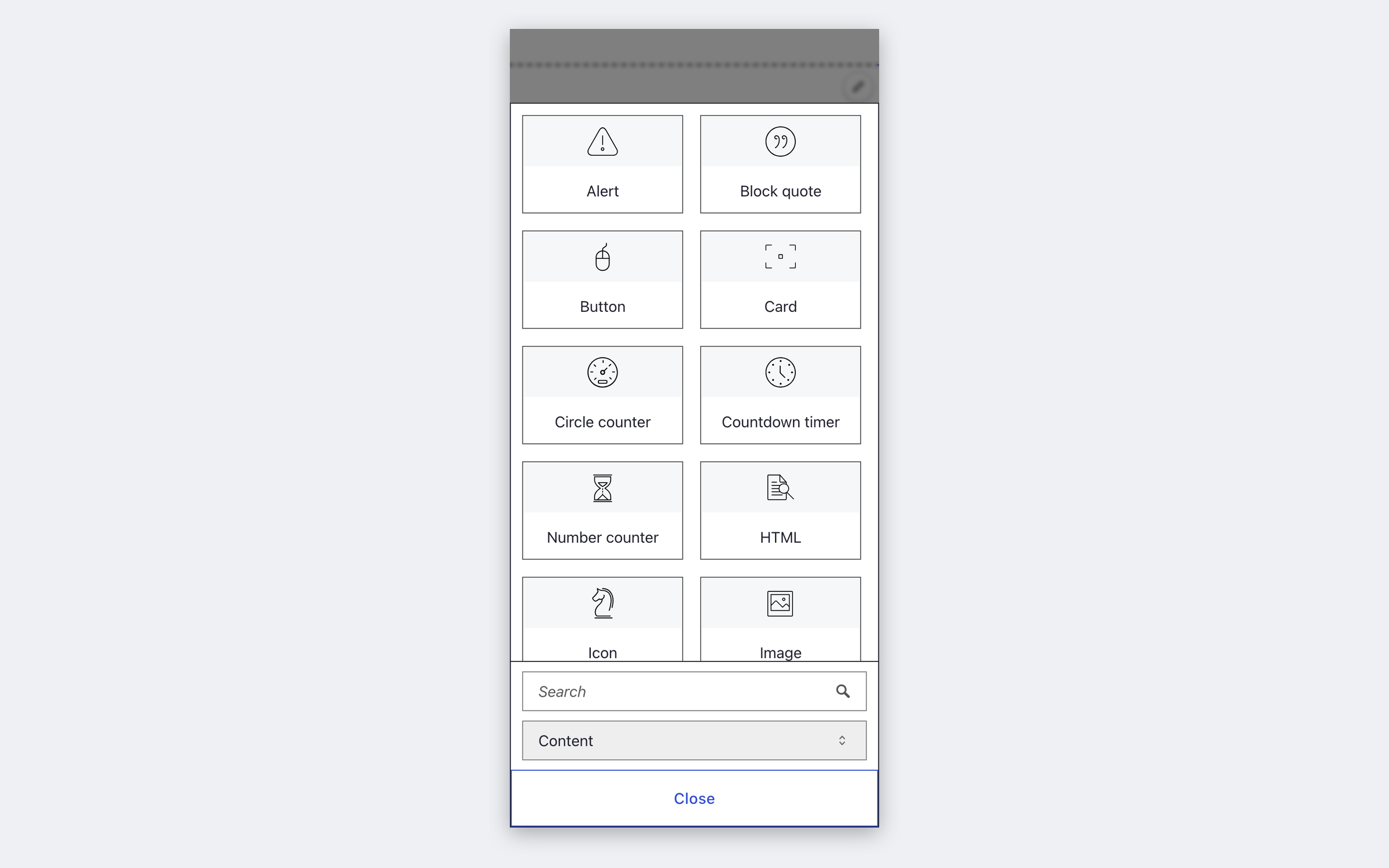
- Element picker. It fills the width of the screen. Its tabs become a list at the bottom, next to a search box and a Close button.
- Settings dialogs. They open over a dimmed page and stay in place. There is no close icon and no full-screen button: use Cancel or Save at the bottom.
- Text toolbar. Tools that do not fit sit behind its Show more items button.
- Menus. The keyboard shortcut hints are hidden.
Which device for which task
| Task | Device |
|---|---|
| Fix a text or swap an image | Phone or tablet |
| Change element settings | Tablet or desktop |
| Build or rearrange a layout | Desktop |
| Create templates | Desktop |
If you don't see the editor controls
- Nothing happens when you tap. The page is in Preview. Tap the eye icon on the DXPR toolbar and choose Edit.
- A settings dialog has no close button. On touch screens it closes with the buttons at its bottom. Scroll down in the dialog and tap Cancel or Save.
- The layout looks different from your desktop. Columns stack on narrow screens, just as they do for visitors on phones. Check the side-by-side layout on a wider screen, and see Responsive design.
What's next?
- See your page as visitors do: check the page before you save.
- Responsive design: control how your layout adapts to each screen size.
- Save and publish your page: store your changes and make them visible.
Something wrong or missing on this page?
Report it
or edit the page.