Adding a Row
A row splits a section into columns, so you can put content side by side: three services, a photo next to its text, a sidebar beside an article. You pick the split from twelve presets and can give phones a layout of their own. Read this page to add a row; for a row inside a column, see Nesting.

Add a row
The example adds a row of three columns to a section, one for each service a team offers.
- Click + on a section to open the element picker.
- Pick Row from the Layout tab. It arrives with two equal columns.
- Click the grid icon (Column layout) on the row's control bar, pick a column preset such as three equal columns, and click Save.
- Click + in a column to add content to it.
- Click Save on the toolbar to store the page.
The grid icon sits right after the row's drag handle. A preset changes the columns as soon as you click it; Cancel puts the old layout back.
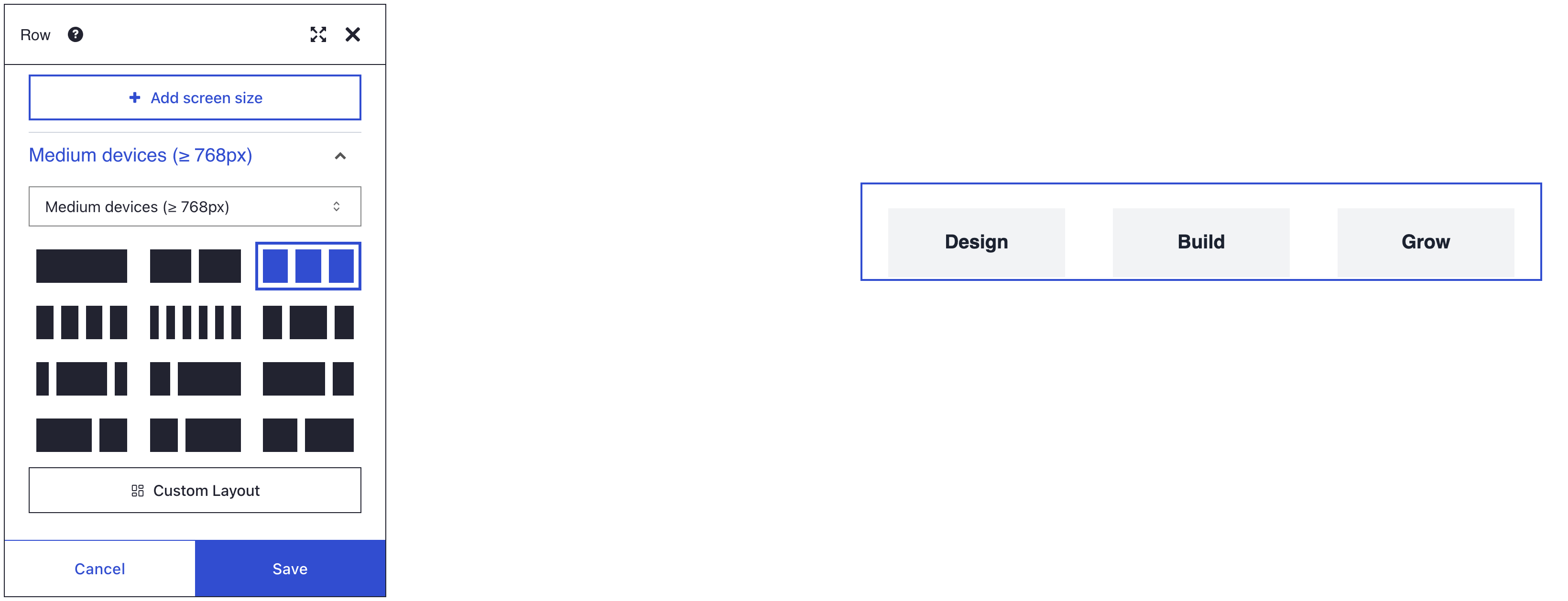
What you see
The three services sit side by side, each column a third of the section's width. On screens narrower than 768 pixels, the columns stack: each one takes the full width, in the order they have on the page.
Columns are only as tall as their content, so a short column ends before its neighbours do. You notice it once columns get a background colour; Equal-height columns evens them out.
Set up your row
Column layouts
The grid icon opens a panel for each screen size that has its own layout. Every panel shows these twelve presets as tiles:
| Preset | Layout |
|---|---|
| 1/1 | One full-width column |
| 1/2 + 1/2 | Two equal columns |
| 1/3 + 1/3 + 1/3 | Three equal columns |
| 1/4 + 1/4 + 1/4 + 1/4 | Four equal columns |
| 1/6 + 1/6 + 1/6 + 1/6 + 1/6 + 1/6 | Six equal columns |
| 1/4 + 1/2 + 1/4 | Narrow, wide, narrow |
| 1/6 + 4/6 + 1/6 | Narrow, very wide, narrow |
| 1/4 + 3/4 | Quarter left, three quarters right |
| 3/4 + 1/4 | Three quarters left, quarter right |
| 2/3 + 1/3 | Wide left, narrow right |
| 1/3 + 2/3 | Narrow left, wide right |
| 5/12 + 7/12 | Slightly narrow left, slightly wide right |
For any other split, click Custom Layout and type the widths as
fractions, such as 1/6 + 5/6. Widths that add up to more than 1 wrap onto
a new line. When you open the dialog again, Custom Layout is marked and
shows the layout, such as Custom Layout (1/6 + 5/6).
A layout per screen size
The first panel, Medium devices (≥ 768px), sets the layout from tablets up. To change phones too, click Add screen size at the top of the dialog. A panel for Extra small (< 576px) opens; pick another size from its list if you need one, then a preset. Remove screen size deletes a panel again.
Row and column settings
Open More > Settings on the row's control bar, or on the column's bar for the column setting.
| Setting | Element | What it does | Default |
|---|---|---|---|
| Equal-height columns | Row | Stretches every column to the height of the tallest one | Off |
| Mirror row | Row | Shows the columns in reverse order from 768 pixels up; stacked columns keep their page order | Off |
| Vertical centering | Column | Centres the content in a column that is taller than it | Off |
Mirror row suits a page of alternating rows: photo left, then photo right, while phones always show the photo first.
Move and remove columns
Drag a column by its handle, or use More > Move Left or Move Right on its bar. Columns have no Delete: pick a preset with fewer columns instead. Content is never lost that way; it moves into the last column that remains.
If you don't see it
- Vertical centering on a column changes nothing. The column is only as tall as its content, so there is no space to centre in. Switch on Equal-height columns in the row's settings.
- The columns stack on a phone. Below 768 pixels that is the default. Click the grid icon, then Add screen size, and pick a preset for Extra small (< 576px).
- Text jumped into another column. You picked a preset with fewer columns, and the content of the removed columns moved into the last one. Press Ctrl+Z (Cmd+Z on a Mac) to undo the change.
- A column has no Delete in its More menu. Columns are removed through the layout. Click the row's grid icon and pick a preset with fewer columns.
What's next?
- Nesting: put a row inside a column for a finer grid.
- Sections: give the band around your columns its own background.
- Responsive design: how your layout adapts to each screen size.