
Icons
Icon props of components pick from two kinds of icons: the glyphs of an icon font the theme loads, and the icons of icon packs of Drupal's Icon API. A prop says which with its schema.
Icon packs
Core's Icon API (Drupal 11.1 and later) lets a theme or module declare packs of icons in <extension>.icons.yml. Frame lists them in the icon picker, stores the choice, and renders it with core's own icon render element, so an icon looks the same in the editor, on the page and in Twig ({{ icon('my_theme', 'arrow') }}).
# my_theme.icons.yml
my_theme_icons:
  label: 'Interface icons'
  extractor: svg
  config:
    sources:
      - icons/{icon_id}.svg        # icons/arrow.svg is "my_theme_icons:arrow"
  template: >-
    <svg class="icon" xmlns="http://www.w3.org/2000/svg" viewBox="0 0 24 24" width="{{ size|default(24) }}"
    height="{{ size|default(24) }}" aria-hidden="true">{{ content }}</svg>
  settings:
    size: { title: Size, type: integer, default: 24 }
The extractors are core's: svg (the file's content is the variable content), svg_sprite (symbols of a sprite file), path (the file itself, source), and those of contributed modules. template is the Twig that draws one icon. See the Icon API for every key (description, license, library, preview, settings).
A prop picks from the packs when it has the widget icon and no enum:
# a component of the theme
props:
  type: object
  properties:
    icon:
      type: string
      title: Icon
      x-builder-widget: icon
      # Optional: the pack ids to pick from. Without it: the packs of the active theme and of its base themes.
      # '*' offers the packs of the whole site.
      x-builder-icon-packs: [my_theme_icons]
      # Optional: settings of the pack for this prop (the defaults of its blocks).
x-builder-icon-settings: { color: red }| Part | Is |
|---|---|
| the editor | an icon picker: small tiles of the icons, drawn as the site draws them, with a search that filters as you type, a pack filter (when the prop offers more than one pack) and a More button (also loaded at the end of the scroll) for large packs; the arrow keys, Home and End move between tiles |
| the stored value | the string pack_id:icon_id or an object, see the two forms |
| the component | gets the markup of the icon (the output of #type => 'icon') in the prop: print it with {{ icon }}, it is not escaped again. A value of an icon that no longer exists (a pack was removed) gives no value |
x-builder-icon-packs | a list of pack ids, or ['*'] for all packs |
x-builder-icon-settings | settings of the pack for this prop, for example { color: red }: the variables of the pack's template. Only the settings the pack declares are used, and they are checked against their declared type |
The library of the pack (library: in its definition) is attached with the icon. Nothing is stored beyond the id and the block's own choices, so a change to a pack's template or files shows in every page that uses it.
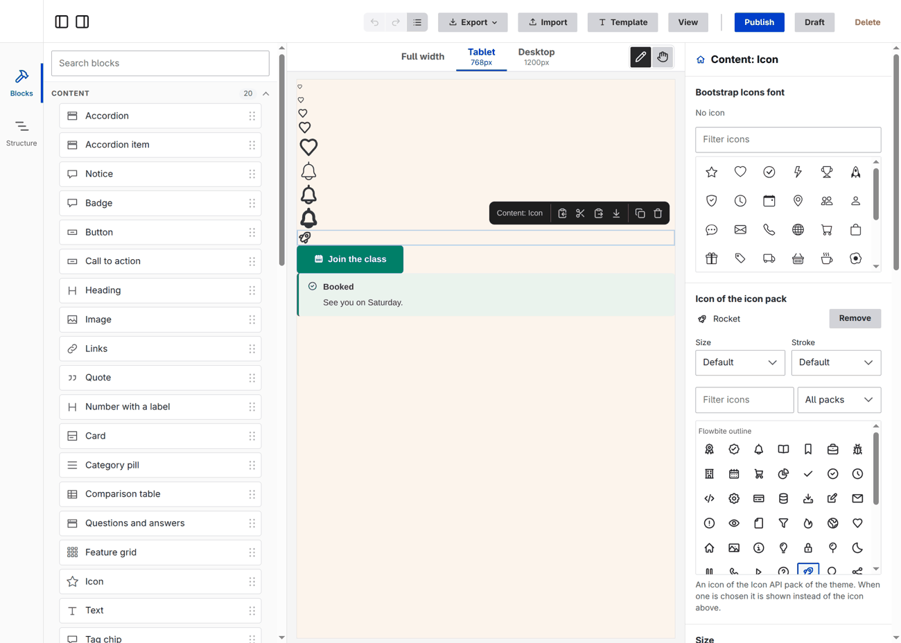
The two forms of the value
| Form | Example | Use it when |
|---|---|---|
| a string | my_theme_icons:arrow | the icon has no choices of its own. This is what the editor writes, and what older layouts and the examples of components have |
| an object | { pack: my_theme_icons, icon: arrow, settings: { color: red }, size: l, stroke: bold } | the block has a size, a stroke width or a setting of the pack. Prefer it when any is needed |
Both are valid everywhere: the editor, the layout files, import, the validator, the renderer and the assistant. They are read in one place (IconPacks::parse()), so there is no third reading. The editor writes the string when nothing differs from the defaults and the object otherwise. The component prop stays type: string: it gets the markup either way.
The keys of the object:
| Key | Is |
|---|---|
pack, icon | the pack id and the icon id. Required |
settings | the settings the pack declares (in settings: of its definition), by name. Those the pack does not declare, and those of another type, are dropped. The settings of the block replace those of x-builder-icon-settings |
size | Frame's own: a step of the theme's icon_sizes (xs, s, m, l, xl). The editor writes steps only; a length such as 40px from an older layout still renders and the picker shows it as Custom |
stroke | Frame's own: a step of the theme's stroke_widths (thin, regular, bold). An older number from 0.5 to 4 still renders and shows as Custom |
Size and stroke width
Every icon of a pack can have a size and, when it is drawn with strokes, a stroke width. Both are Frame's own choices, the same for every pack and every kit: they are not settings of a pack. Like the other scales they belong to the theme, under frame_editor.uikit of its .info.yml, and the editor offers only the steps:
frame_editor:
  uikit:
    icon_sizes: { xs: 0.75rem, s: 1rem, m: 1.5rem, l: 2rem, xl: 3rem }   # these are the defaults
    stroke_widths: { thin: 1, regular: 2, bold: 3 }                       # numbers, as the stroke-width of the SVG
A scale is replaced as a whole by the theme that declares it. A value can be a custom property, var(--icon-m, 1.5rem), as in the other scales. The same scales are in the SCSS module (frame/tokens): the maps $icon-sizes and $stroke-widths, the functions frame.icon-size(m) and frame.stroke-width(bold), the custom properties --frame-icon-size-m and --frame-stroke-bold, and, with @include frame.rules, the utility classes .frame-icon-size-m and .frame-icon-stroke-bold (also .frame-icon-size-m\@tablet with $responsive: true). A reader of core's design tokens (*.tokens.yml) should map the groups iconSize and strokeWidth onto icon_sizes and stroke_widths; ThemeKit and tokens.js have a comment where.
Where to set them:
| Where | Is | Per breakpoint |
|---|---|---|
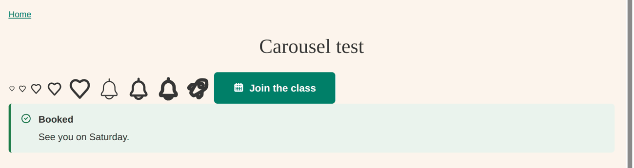
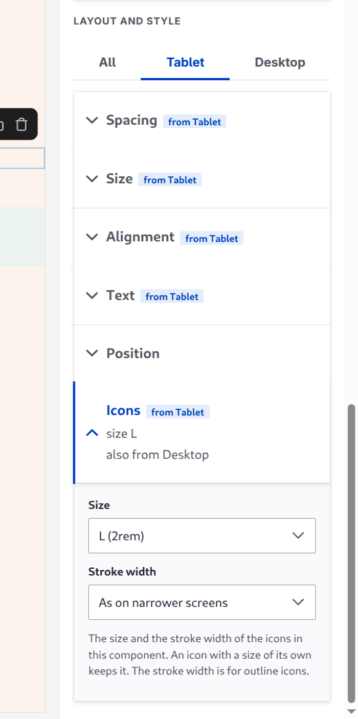
| the Icons section of Layout and style | every icon of the block. It writes --frame-icon-size and --frame-icon-stroke on the block, and marks it with frame-has-icon-size and frame-has-icon-stroke | yes: a value per breakpoint of the theme, like Spacing, Text and the others (the tabs above the sections) |
| the icon's own settings under the picker | this icon only, in the value (size, stroke) | no |
Icons is a feature like the others, off by default: a component turns it on with features: { icon: true } in its .component.yml (the Button, the Notice, Links and the demo Icon do), or a theme for all with frame_editor: features: { icon: true }.
Per breakpoint exists only for the features of the Style tab: the value of a component prop is one value, and has no at (the responsive mechanism is a property of the features, stored under _spacing, _text... with an at per breakpoint). That is why the per-breakpoint size is the Icons section of the Style tab and not a prop; the icon's own choice stays the single value that wins over it.
The icon markup is always in <span class="frame-icon"> (with frame-icon--size and frame-icon--stroke and the custom properties when the icon has choices of its own), and the CSS of the base theme does the rest:
.frame-icon--size > svg, .frame-has-icon-size .frame-icon > svg { width: var(--frame-icon-size); height: var(--frame-icon-size); }
.frame-icon--stroke svg *, .frame-has-icon-stroke .frame-icon svg * { stroke-width: var(--frame-icon-stroke); }
CSS wins over the width, height and stroke-width attributes of the SVG, so it works with files that have them fixed (Flowbite's outline icons do). A pack's own size setting stays a separate choice, shown as a pack setting.
- The picker shows Stroke when the icon's markup has
stroke, or uses a sprite (<use>), which cannot be seen from outside. A fill-only icon has no Stroke control, and ignores the property if one is stored. - A sprite (
<use href="sprite.svg#id">) takes the property from the host: the custom property is inherited into the symbol, which works when the symbol does not set its ownstroke-width. - A block with a size only from a breakpoint on has 1em icons below it (and stroke 2).
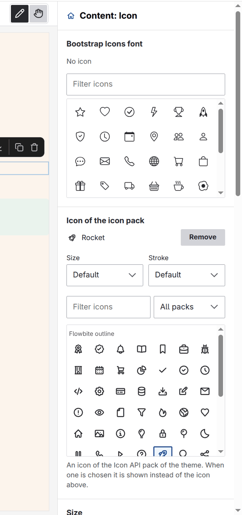
When the pack declares settings, the picker shows a small form for them under the icon, one control per setting by its declared type (a checkbox, a choice list for an enum, a number, a colour for format: color, a text). A pack without settings shows none.
Components that use it
The base Button has an icon prop (before the label), the Notice has one (before the text) and each item of Links has one (instead of the marker). The Icon component of the Frame Demo theme has one beside its icon font choice. A site without an icon pack sees "No icon packs." in the picker. The demo theme declares two packs of about 50 Flowbite Icons (MIT), outline and solid, in frame_demo_umami.icons.yml.
In Twig you can also call core's function yourself, for icons that are not a prop: {{ icon('my_theme_icons', 'arrow', { size: 32 }) }}.
Icon fonts (CSS classes)
A prop with an enum keeps the picker of glyphs. Draw them with x-builder-icon-class, where {name} is the value, and name the library that has the font with x-builder-icon-library:
glyph:
  type: string
  x-builder-widget: icon
  enum: [star, heart]
  x-builder-icon-class: 'bi bi-{name}'
  x-builder-icon-library: my_theme/icons   # the CSS of the icon font, for the picker
The picker lives in the editor page, which does not have the styles of the theme, so without x-builder-icon-library the tiles are empty (the font is not loaded there). The library's stylesheets are added to the editor page when the picker is shown; the canvas and the page have the theme's styles as before.
The component receives the name (star) and writes the classes itself. The icon of the block in the editor's list is another thing: see the icon of a component.
Telling the editor about an icon font
The editor's own page (the Blocks panel, Structure, the lists and the pickers) has not the styles of the theme: the theme's CSS is only in the frame of the canvas, as on the page. So a font does not draw there unless the theme says which library has it. Declare it once, in the .info.yml of the theme:
frame_editor:
  icon_libraries: [my_theme/icons]
A library of the list is attached to the editor's page, so the glyphs of the blocks (icon: 'bi bi-star' in a .component.yml) and of the pickers are drawn. Every theme of the chain adds its own libraries, base themes first. Put only the CSS of the font in such a library (it is loaded in the editor's page, which no other style of the theme is): the font files are found relative to the CSS, as on the page. A name that is not a library, or of an extension that is not installed, is left out. x-builder-icon-library on a prop does the same for one picker; with icon_libraries it is not needed.
Icons of an icon pack are inline SVG and need none of this.