
Fields with many values
What it does
A Field block of a field with many values (tags, a gallery of media, links, a list of words) shows the list of the formatter. List mode shows every value as a component instead: tags as badges or buttons, media as images in a flex gallery, links as buttons.
Select the Field block and set Show as in the right column:
- Default list is the field as its formatter makes it. Nothing else changes.
- Components shows every value as a component, with these settings:
- Item component: the components that fit the field (see below).
- Item options: the fields of the item component that the items do not fill, and for images the Image style (see Image styles, responsive images and Fit and Item options below).
- Wrapper: Flex (in a row that wraps), Stack (one under the other) or None (side by side).
- Link items: every item goes to what it is, where that has a page (a term, a node), or to its link.
- Limit: how many to show. Empty shows all.
The canvas of the editor shows the real values of the page, or of the latest content on a display. In a template or a saved block it shows sample items (three, or the number set in Sample items on the canvas).
In the editor
Select the Field block. The right column has the settings of the list, under Show as:
- A line says what the block is: "Tags: list of Badge". Structure says it on the row of the block too.
- Item component opens a list right under the button, in the column (it is not a dialog, and it does not trap the focus). Every offered component is a row: its icon, its name and a small preview of a sample item, drawn by the theme and scaled down. The list scrolls inside; the chosen component is marked. Open it with the button or Arrow down; move with the Arrow keys (Home and End jump); Enter picks; Escape closes the list and gives the focus back to the button. From nine components on there is a search field.
- Not offered for this field (at the end of the list) shows the components that were left out, each with the reason: "Takes links, this field has images." A component fits when it takes one of the interfaces every value of the field has (see below).
- Date format is there when the items are dates. It is a select of the date formats of the site (Configuration, Regional settings, Date and time formats), each with the date of now as an example. The first option is the default: the Medium format for a date with a time, the HTML date format for a date without one. It is stored as
format, the machine name of the date format (short,medium,long,html_dateor one the site adds), never a PHP format string. A name that is not a date format is refused when the layout is saved. - Sample items on the canvas (1 to 12, three at first) is there in the editor of a template, a saved block or a display, where there is no page content to take the items from. It is only for editing: it is kept in the editor for the session and is not saved in the layout.
- Under Wrapper are its most used options: direction, alignment, gap and wrap for Flex and Stack. They are stored as
wrapperPropsof the list, only when you change them; the wrapper starts with its own values. Another wrapper starts clean. For all other props, select the wrapper in the layout file (list.wrapperProps). - When no component fits the field, the setting says why and only the default list can be chosen.
- When a saved list names a component that is not offered any more, the settings show a warning, and the canvas and the page show the default list until you pick another component. See When a component is gone.
- When a saved list names a component that is not offered any more, the settings show a warning and Choose a component (nothing is selected), and the canvas and the page show the default list until you pick another one.
The canvas shows the real values of the page. Where there is no page (a template, a saved block) it shows three sample items; Sample items on the canvas changes their number.
What an item is
Every value of a field has a chain of views, from the outside in. Each view has an interface name:
| Field | Chain of one value |
|---|---|
| Reference to a term or a node | entity_label |
| Reference to image media | entity_label, media, image |
| Reference to other media (a document) | entity_label, media |
| Link | link |
| Text | text |
| Formatted text | rich_text |
| Image | image |
| File | file |
| Reference to media with a file source | entity_label, media, file |
| Reference to video media | entity_label, media, video |
| Date, date range, timestamp, created, changed | date, text |
| Integer, decimal, float | number, text |
| Boolean | boolean, text |
| List (options) | option, text |
link, text |
entity_label is the name of the entity and, when it has a page, its address. media is the media item. image is the image of a media item with an image source, or of an image field.
A component is offered for a field when one of the interfaces it takes is in the chain of every value the field can have. A reference that may point to several bundles has the interfaces they share: a media field of images and documents offers the components that take media or entity_label, not those that take image. A field of image media only offers image to the components that take it.
The deepest interface of the chain that the component takes is the one it gets. The Image component gets the image, not the media item; the Badge gets the name.
Components of Frame that take an item
| Component | Takes | Gets |
|---|---|---|
| Badge | text, file, entity_label | the text; the address when the items are linked |
| Button | link, file, video, entity_label | the text and the address (a button needs one, so it always has it) |
| Heading | text, entity_label | the text |
| Number with a label (Stat) | text | the text, as the number |
| Text | rich_text, text | the formatted text, or the text |
| Image | image | the image, in the image style; a link when the items are linked |
The text of an item is shown as it is: tokens and markup in a name are not replaced.
For theme authors
A component says what it takes in its component.yml, under thirdPartySettings.frame_editor:
thirdPartySettings:
  frame_editor:
    item: [link, entity_label]
    # Only when the names of your props are not the usual ones:
itemProps: { text: caption, url: href }itemis an interface or a list of them. A component without it is not offered for lists.itemPropsmaps what an item has to the props of the component. The keys aretext,url,html(formatted text),image,altandmedia. Without it the first prop that exists is used:text,labelortitlefor the text;url,hreforlinkfor the address;imagefor the image;alt; and forhtmla prop withcontentMediaType: text/html.- A prop the component requires and the item cannot fill is left empty.
- The interfaces and their values are in Item interfaces. A component that takes
videohas to say where the address and the provider go:itemProps: { url: src, provider: kind }. Only the keys with a usual name (datefor a propdate) are mapped withoutitemProps.
A component can be the wrapper of a list when it has a slot and says so:
thirdPartySettings:
  frame_editor:
    listWrapper: { slot: content, props: { direction: row, wrap: true } }
slot is where the items go (default content), props are the values the wrapper starts with. Flex and Stack of Frame have it.
For module authors
The steps from a value to its views are item unwrapper plugins: a class in src/Plugin/FrameItemUnwrapper of any module or theme, with the attribute Drupal\frame_editor\Attribute\ItemUnwrapper, that implements Drupal\frame_editor\Item\ItemUnwrapperInterface (extend ItemUnwrapperBase). Frame has these: field_value (text, link), field_image, field_file, field_date, field_number (numbers and booleans), field_option, field_contact (email), entity_reference (label and address of the entity), media, media_image, media_file, media_video and value_text (the text of a date, a number, an option or an email address). It is a plugin type and not a tagged service, so a site can change the list with hook_frame_item_unwrapper_info_alter().
#[ItemUnwrapper(id: 'my_embed', label: new TranslatableMarkup('The video of an embed'), weight: 30)]
class MyEmbed extends ItemUnwrapperBase {

  public function applies(ItemView $view): bool {
    return $view->interface === 'media' && $view->bundleId() === 'video';
  }

  public function unwrap(ItemView $view, CacheableMetadata $metadata): ?ItemView {
    return $view->next('video', $view->isStatic() ? [] : ['url' => '...']);
  }

}
The chain is made by asking the unwrappers in order of weight about the last view, until none applies (at most eight steps; an entity that is met twice ends the chain). unwrap() must work on a static view too (isStatic(): a kind of item, with an entity type and a bundle, and no values), which is how the editor knows what every value of a field will be. Return NULL to drop the item. Add the cache data of what you read to $metadata. The access to a referenced entity is checked by entity_reference: an entity the user may not view is not shown.
When a component is gone
A saved list can name a component that is not there any more: a theme was changed, a component was left out of the offer (frame_editor.components), or the field changed so that the component does not fit. The visitor does not see a broken page: the field is shown as its formatter makes it (the default list). The editor does not let it stay unnoticed.
What you see. When the editor opens a page, a display, a template or a saved block with such a list:
- the block has a red outline and a Fix label on the canvas, and a red mark on its row in Structure, whose parent rows are opened;
- in the right column the Item component is marked as wrong, with the sentence "The component Chip is no longer available. Choose another." under it;
- a list of problems at the bottom lists each block with its sentence and a Go to block button, which selects the block and shows it in all three places;
- Save, Publish and Draft are disabled with the title "Fix 1 problem first".
Choose another component, or Default list, and the marks, the list and the block on the buttons go at once. Nothing needs a reload.
What the server does. A save of a page, a display, a template or a saved block refuses a list that names a component that does not exist, one that cannot show the values of a list, and one that is not offered for the field. The answer is 422 with the sentences in errors and, next to them, problems: one entry for each block.
{
  "errors": ["Tags: the component \"frame:chip\" of the list does not exist."],
  "problems": [{ "id": "tags", "type": "drupal_field:field_tags", "field": "list.component", "message": "Tags: the component \"frame:chip\" of the list does not exist." }]
}
id is the id of the item in the layout, type its component, field the setting that is wrong (list.component, list.wrapper, list.byType, list.fallback, slots.<slot>), message the sentence. The editor marks the block of each problem and waits until the block is changed. A refusal the editor could not have seen (a component for a kind of item in list.byType) is marked the same way.
Which fields are known depends on where the layout is saved. A page knows its fields. A display knows the fields of its entity type and bundle. A template knows the content types it is for: a field is taken from the first that has it. A saved block belongs to no content type: only the names are checked (a component that does not exist, a wrapper that cannot be one), not whether a component fits the field.
The editor does not offer what cannot be saved: the choices of the picker are the components the field offers, there is no free text, and a stored value that is not offered is not shown as chosen.
For other checks. A check of the server that knows its block returns the same entry: LayoutValidator::refusals() gives id, type, field and message. The editor does the rest for any problem with an id: the marks, the list and the blocked buttons (Problems.jsx, problems.js).
The content report keeps listing lists whose component is gone.
Paragraphs and lists of mixed items
A field of Paragraphs has a List mode too. Its values are paragraphs of several types, so the settings have a table Component by item type. Under the heading it says: "Items of this field can be of different types. Choose the component that shows each type." There is one row per paragraph type (and per bundle, for a reference to entities of several bundles), each with the components that fit that type. A type with no choice gets the Item component.
A row named Parent > Child is an item of the type Child inside an item of the type Parent. For a field that allows From library paragraphs, a type the field does not allow itself but a library item can hold has such a row, for example From library > Quote. A type the field allows has its own row, and its entry also catches it when it comes from the library. The table has a line that says this when there are such rows.
Other items says what happens to an item whose type has no component in the table and that the item component does not take: Leave out (the default: it is not shown) or Show as the field does (as the field itself shows it, in its view mode).
In a layout file:
list:
  mode: components
  wrapper: frame:stack
  byType:
    paragraph:text_block: frame:text
    paragraph:quote: frame:heading
  fallback: field
The keys of byType are the bundle of a referenced entity (image, tags), paragraph:<bundle> for a paragraph, or an interface name. The deepest view of the chain that has an entry wins. The ids must be components offered for that type.
The chain of a paragraph
| Item | Chain of one value |
|---|---|
| A paragraph | paragraph, paragraph:<bundle>, and text or rich_text |
| A paragraph from the library | paragraph, paragraph:from_library, then the chain of the paragraph it holds |
paragraphis the paragraph; itsparagraphvalue names it as a layout does (id,vid,uuid). A component that takes it maps that value withitemProps: { paragraph: <prop> }.paragraph:<bundle>is the more specific name of the paragraph type, for exampleparagraph:text_block. A component can take it initem.textorrich_textis the first text field of the paragraph type (a plain text, or a formatted one), in the order of its fields. A paragraph type without one has no such view.- A From library paragraph (Paragraphs Library) is shown as the paragraph its library item holds, so a table entry for
paragraph:quotealso catches a quote that comes from the library. A wrapper that holds a wrapper is followed, as far as a chain goes (eight views), and a wrapper that leads back to itself ends the chain. An entry forparagraph:from_librarycatches the wrappers of items it cannot open. - A paragraph or a library item that the user may not view, and a library item that is not published, give nothing: the item is not shown, and not given to the fallback either. Their cache tags stay, so the page changes when the item is published.
- Which type a library item holds is not known before the page is shown, so the table lists the types a library item can hold as
From library > <type>and the entry of such a row is the key of the type (paragraph:quote).
A component is offered for a type when one of the interfaces it takes is in the chain of that type. A field of paragraphs of different types has no interface in common but paragraph, so the Item component is empty for it and the table is how the list is made.
Item interfaces
These are the interfaces of the views of an item, and the values each one has. A component gets the values of its view and of the views before it, the inner ones winning.
| Interface | Values | From |
|---|---|---|
entity_label | text (the label), url (when the entity has a page) | a reference to any entity; a user is its display name and /user/ID |
media | media (the id) | a reference to media |
image | image (the media item, or the file of an image field), alt, width and height (of an image field, when known) | an image field; media with an image source |
file | text (the description, else the file name; for media its name), url, size (bytes), mime | a file field; media with a file or audio file source |
video | text (the name of the media item), url, provider (file, or the host of a remote video) | media with a remote video or video file source |
date | date (ISO 8601; only the day for a date without a time), timestamp, end (of a range), text | datetime, date range, timestamp, created, changed |
number | number (int or float), text (with the prefix and suffix of the field) | integer, decimal, float |
boolean | boolean, text (the On or Off label of the field) | boolean |
option | key, text (the label) | list (text, integer, float) |
link | text, url | a link field; an email address (mailto:) |
text | text | a text field; and the second view of a date, number, boolean, option or email |
rich_text | html (the value and the format) | formatted text |
Notes:
- A date is formatted by Drupal with the date format that the list names (
list.formatin the layout file, the machine name of a date format; never a PHP format string), else the Medium format; a date without a time has the HTML date format (2026-03-04). A date with a time follows the time zone of the user. A date range with an end showsstart - endas its text. - Components that take
text(Badge, Heading, Text, Number with a label) show dates, numbers, booleans, options and email addresses as text. A component that takesdate,number,booleanoroptiongets that view, not the text. - The image style of a list applies to the images of image fields and of media alike; see Image fields and responsive images.
- The telephone field is not in Drupal core any more. Its type
telephonehas the same view as email (tel:). - A video component takes
item: videoand maps the values it needs withitemProps(url,provider,mime). No request is made to the video provider.
Caching, access and translation
- Loading. The values of a field are loaded together: the referenced entities with one load, and the files of media items with one more. A list of 20 tags or 20 images does not make 20 queries. Limit is applied before anything is loaded: only the values that are shown are loaded (a value that is left out, for example one the user may not view, does not count).
- Cache. The block depends on every entity it shows (tags
taxonomy_term:1,media:5) and on the file of an image (file:9), so a change to any of them clears the page. It varies with the permissions of the user and with the language of the content. A link to an item adds the cache data of the link. - Access. An item that the user may not view is left out: the referenced entity, and the file of an image. The access results are part of the cache data.
- Translation. An item shows the translation of the referenced entity in the language of the page (the name of a term, the alternative text of a media item that is translated). Without a translation the original shows.
- Lists in lists. The values of a field are never rendered as pages, so lists cannot go round. A list inside a list stops three levels deep, with a warning in the log.
Other features
- Export and import carry the
listprop as it is. An image picked inlist.propsis named by UUID in the file and found again on import, as every picked image. An import that names a component that this site does not have, or one that does not fit the field, is refused with a sentence ("Tags: Image is not offered for the values of this field."). - Saving gives the same sentences for a page, a display, a template and a saved block.
- Presets keep
listwith the other options of a Field block (how the values look, not content), and can lock it. - Content report. A list whose component is gone is shown as a problem of the Field block. The page shows the field as its formatter does until the list is fixed.
- AI assistant. The assistant may give a Field block of a field with many values a list, with the components and wrappers the field offers,
linkandlimit. The props of the components are not its to set. A list of an item the page has is kept.
Try it
The example subtheme frame_demo_umami has components made for lists (see Example components):
- Tag chip and Category pill take
entity_label,linkortext: tags and categories as rounded chips or as small labels with a dot. - Gallery item takes
imageormedia: a picture with a caption, cropped to a shape. - Gallery grid is a wrapper: it has a slot for the items and puts them in columns that follow the width of the place it is in.
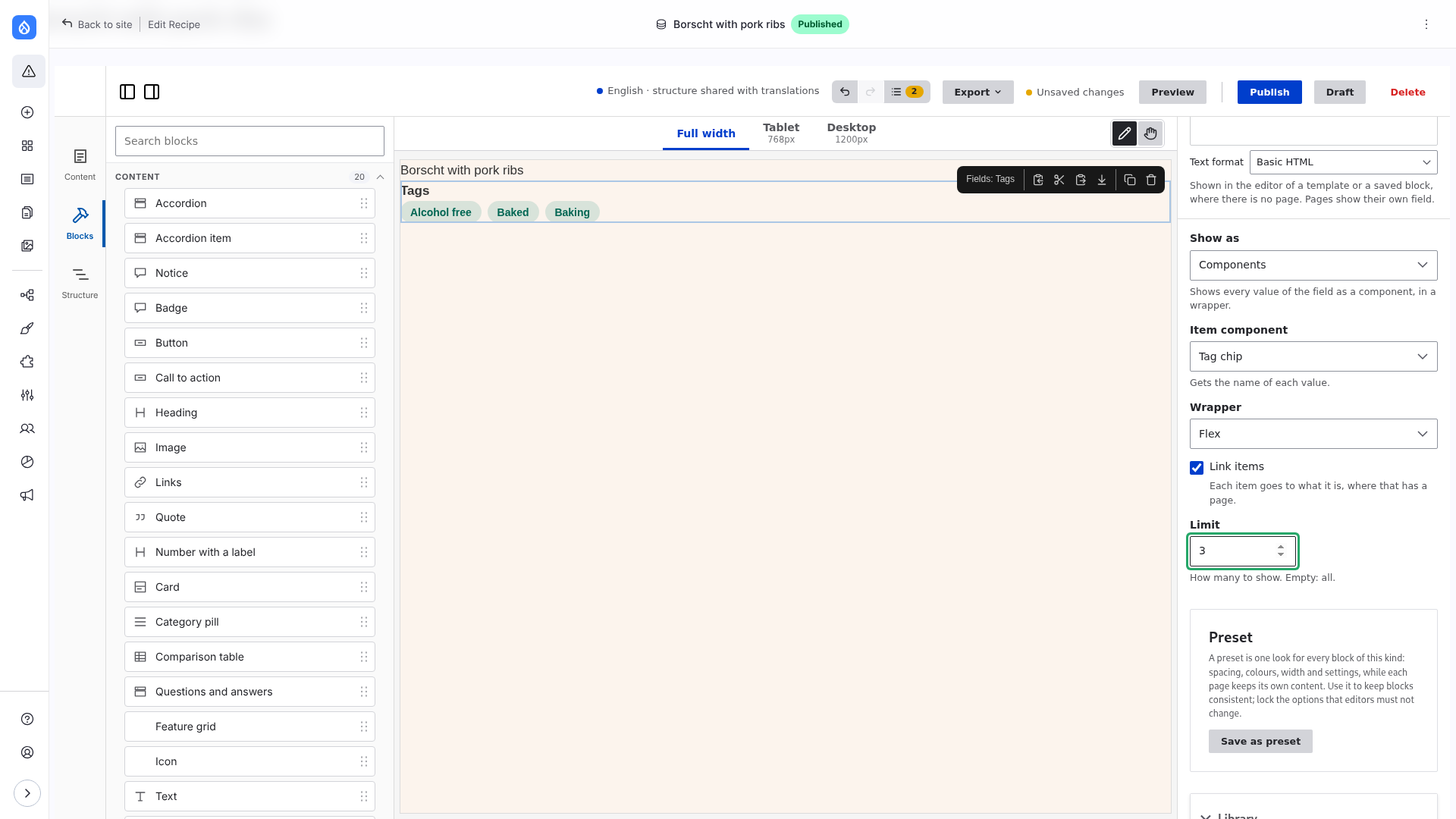
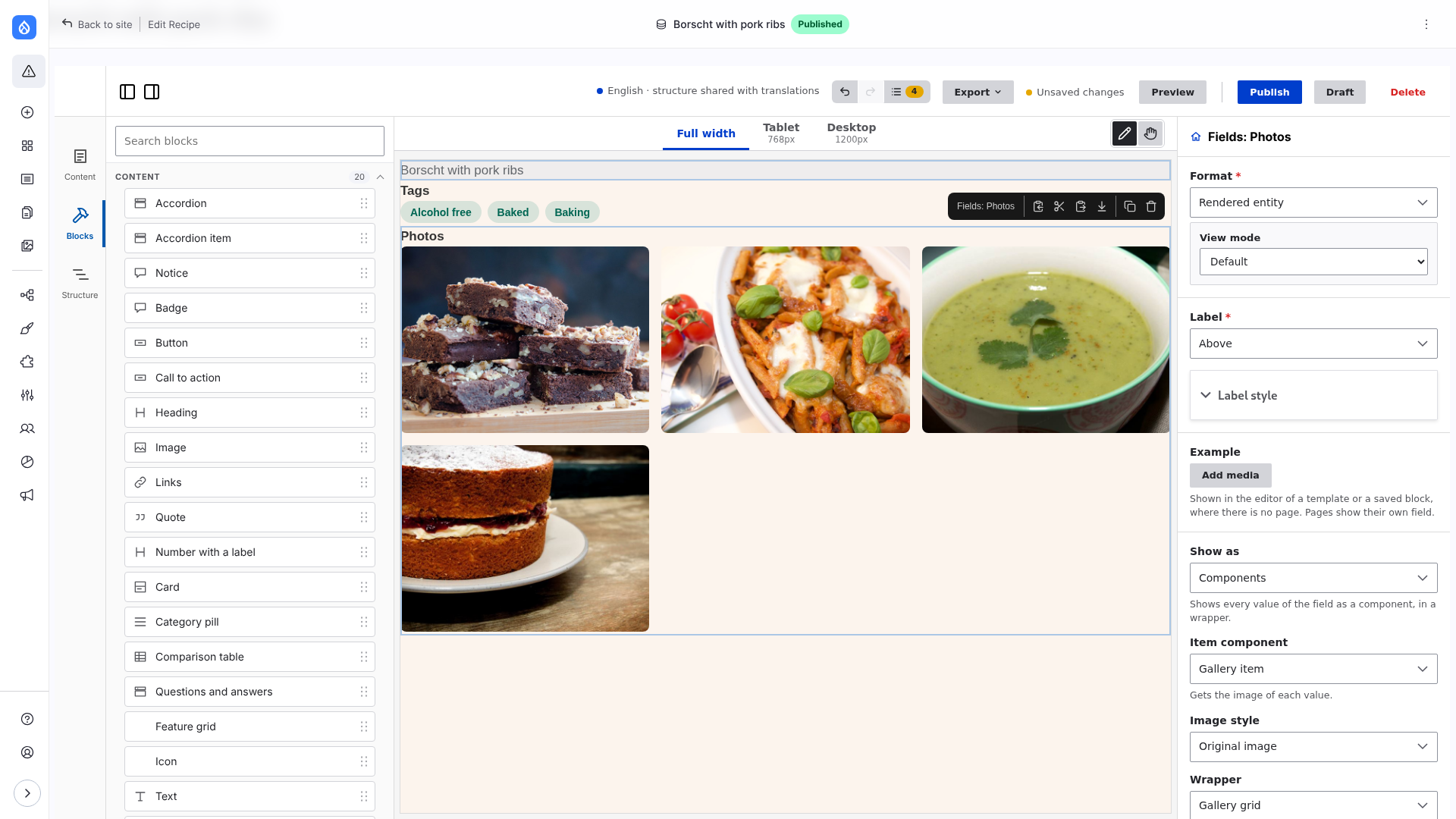
On a content type with a field of tags: add a Field block of the field, choose Show as → Components, Item component → Tag chip, and switch on Link items. For a media field of images choose Gallery item and the wrapper Gallery grid.
Copy a folder of examples/frame_demo_umami/components to your theme to start your own item component.
Image fields and responsive images
An image field (core image) with many values is a list of images, a gallery, as a field of image media is: choose Show as: Components, the Image or Gallery item component, and a wrapper such as Gallery grid or Flex. Each item takes its alternative text and size from the field.
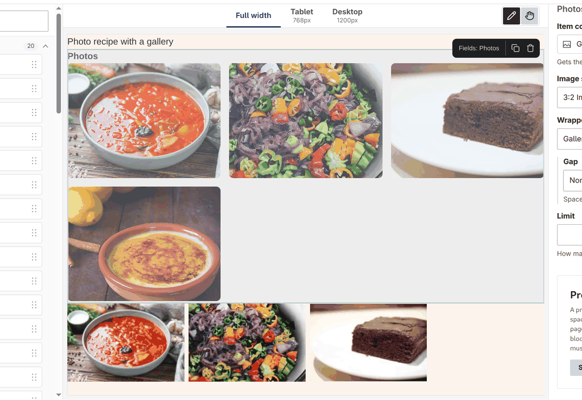
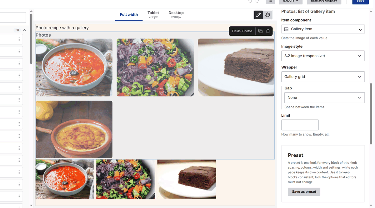
The Image style of the list applies to every image, of an image field and of media the same. Its choices are the image styles and the responsive image styles of the theme.
- An image style gives the address,
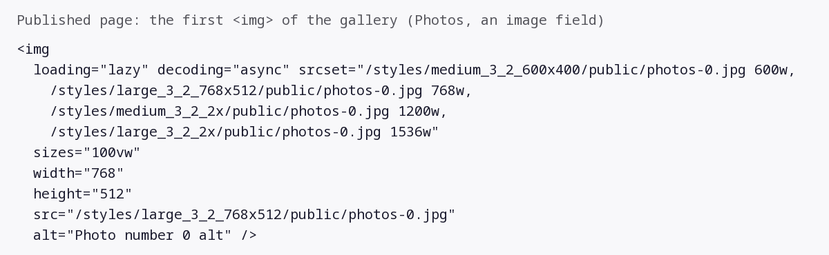
widthandheightof the image the style makes. - A responsive image style gives the address of its fallback image style, and a
srcsetwith one candidate per image style it uses (by its width,600w) and thesizesof the style (100vwwhen it has none).
What a component needs to show them:
Image and Gallery item show the image as Drupal renders it (
image_picture): an<img>withsrcset,sizes,width,height,loading="lazy"anddecoding="async", or a<picture>for a style that maps breakpoints. Nothing more is needed.A component that writes its own
<img>names the props that get the parts of the image on its image prop:yamlimage: type: string contentMediaType: 'image/*' x-builder-srcset: srcset x-builder-sizes: sizes x-builder-width: width x-builder-height: height x-builder-alt: altand prints them (
srcset,sizes,width,height,alt) in the template; seeimage.twig. A prop that is left out gets nothing.A component that does not name them gets the address of the image style (for a responsive image style, of its fallback): an image that is shown, without a
srcset.
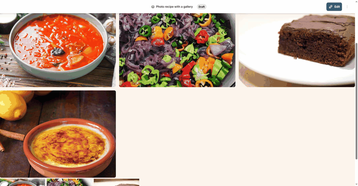
An item whose file is deleted, or that the user may not view, is left out without a notice, so a list of three can be a list of two or of one. The block depends on the files and on the image styles it uses.
The other Format choices of an image field (Image, Responsive image) work as in Drupal, and the Field block lists them with their settings. For a srcset without making a responsive image style, choose Responsive: automatic (below).
Image styles, responsive images and Fit
An image can be chosen in one Image style select, in the Image component, in the media pickers and in the settings of a list. It has two groups, and the entry Original image for the file as it is:
- Image styles: core image styles. One file at one size (
Large (480×480)). - Responsive image styles: core responsive image styles. Several files for different screens, and the browser picks the best one (
srcset,sizesor a<picture>). Responsive: automatic is the first of this group.
A short hint under the select says the same. The labels are the real labels of the styles of the site; the theme limits them with uikit.image_styles (see UI kit settings).
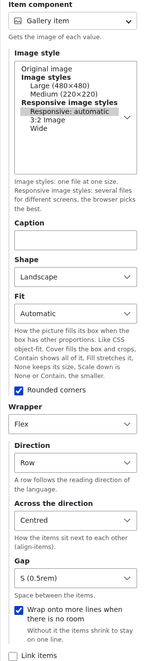
Responsive: automatic
It makes a srcset with width descriptors from the image styles of the site, without a responsive image style:
- the image styles with an
image_scale,image_scale_and_croporimage_resizeeffect with a width are used; styles without a width are ignored; they are sorted by width, and styles of the same width count once; - styles that would be wider than the file (and may not enlarge it) are left out; the file itself is the largest candidate, when its width is known;
- at most 6 candidates, spread over the widths, with the smallest and the largest kept;
- the smallest is the
src, for a browser that has nosrcset; - the candidates must have the proportions of the file: styles that crop are used only when no style keeps the proportions, then only those of the most common proportions, and the file is left out;
sizesis100vw. In a grid or a row with columns the images are narrower than the window: make a responsive image style with thesizesyou need (for example(min-width: 60rem) 33vw, 100vw) and choose it.
The value is style: auto (list.props.image.style for a list). With no usable image style the image is the plain file. The widths are cached with the cache tags of the image styles. A theme can turn it off with uikit.image_auto: false.
Fit and Position
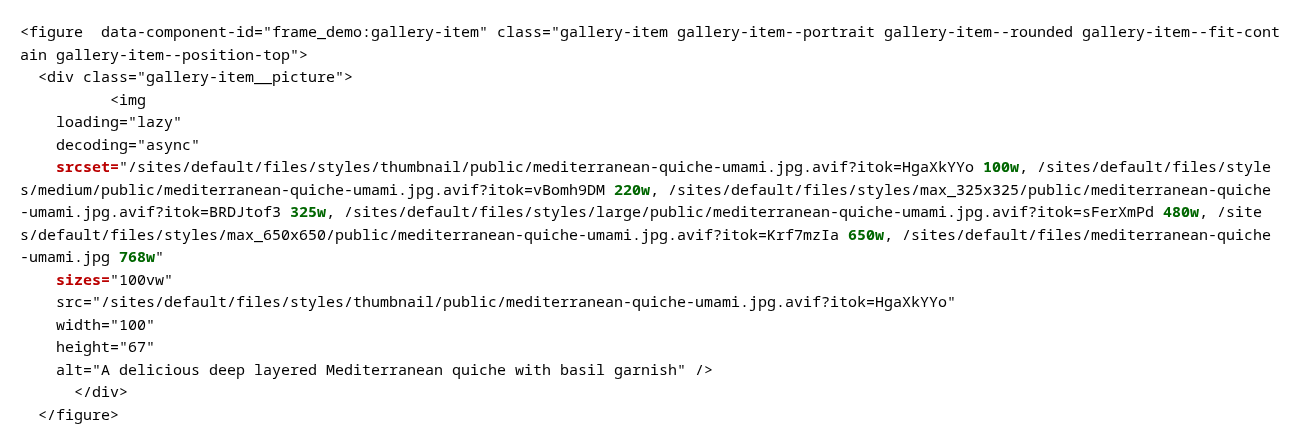
This is the second meaning of "responsive": how the picture fills its box when the box has other proportions. The Image component and the Gallery item of Frame Demo have:
- Fit: Cover (fills the box and crops), Contain (all of it), Fill (stretches), None (its own size) and Scale down. The CSS property is
object-fit. Automatic keeps the look the component had. - Position: Center, Top, Bottom, Left, Right (
object-position). It shows when Fit is Cover, Contain, None or Scale down. - Ratio (Image only): Automatic, 1:1, 4:3, 3:2, 16:9, 3:4, the proportions of the box, so Fit has something to fit into. With a ratio the picture covers the box unless Fit says otherwise. Gallery item has Shape for this.
Before, Fit Cover on portrait boxes, and after, Contain with Position Top:
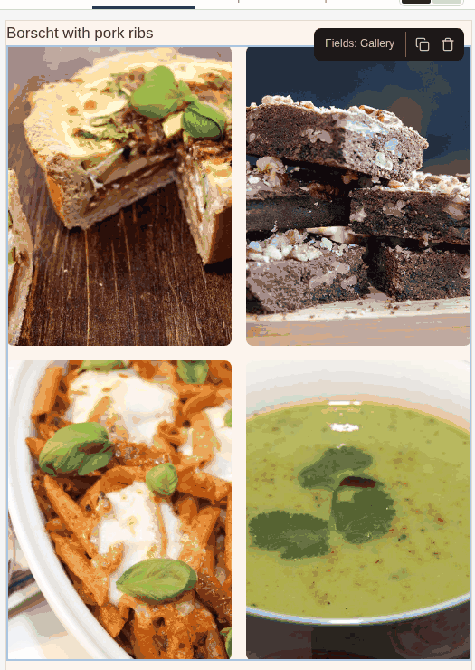
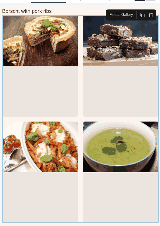
A component takes these as props (fit, position, ratio); a prop can be shown only for some values of another with x-builder-show-when: { fit: [cover, contain] }.
Item options
Under the item component the list settings show the fields of that component that the items do not fill: for a Badge its Colour and Shape, for an Image the Image style, Ratio, Fit, Position and Caption, for a Heading its level. What the item supplies (the text, the address, the image, the alternative text) and the spacing, size and alignment of the editor are not shown. A change is stored in list.props, the same for every item; list.props.image.style is the Image style.
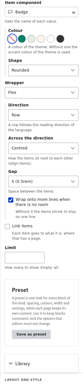
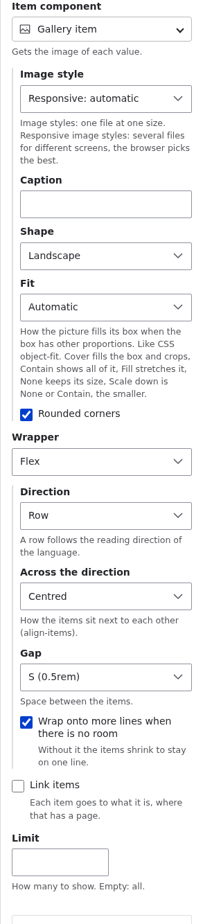
The address of an item comes from the item: with Link items a Badge is a link to what it is, so its Link is not an option. A component names the props the items fill with itemProps (see What an item is); the catalog sends them as filled of each component of the list.
Limitations
- Only fields with more than one value have List mode.
- The item component starts with its own defaults. Its options (choices, switches, numbers, lengths, colours and short texts) are in Item options; set the others in the layout file under
list.props(the same for every item). - Links (the Links component) takes a whole list of links, not one, so it is not offered as an item component.
- A media item without an image source has no
image: use a component that takesmediaorentity_label. - A media item has an address only when Standalone media URL is on (Media settings).