
Tabs and carousel
Two components of the Layout group of frame_demo_umami that hold other blocks in a slot. Both are Twig, CSS and a small plain script, no React: a script that changes the markup of a slot cannot run in the editor, so the markup without the script is made to be the one the editor needs.
Tabs
components/tabs and components/tab. Put Tab blocks into Tabs: each Tab is a tab, its title is on the tab and anything can go into it.
| Tabs | |
|---|---|
label | name of the tab list for screen readers |
look | Underline, Pills or Boxed |
vertical | tabs in a column at the start, from tablet width on |
stretch | the tabs share the width |
deep_link | the open tab is in the address (#desserts), so a link can open it |
slot tabs | the Tab blocks |
| Tab | |
|---|---|
title | text of the tab; also its address |
icon | icon picker |
slot content | what the tab shows |
On the page tabs.js builds the WAI-ARIA tabs pattern from the Tab blocks: a tablist with a button per tab, aria-selected, aria-controls, the arrow keys, Home and End. The panels are focusable. Every Tab keeps its own <h3> title, hidden once the tab list exists. A tab with the address of the page (#main-courses) opens when the page loads and when the address changes.
In the editor the script does not run (Tabs has a slot), so every tab is shown one under the other, each with its title and a dashed border. Drag Tab blocks to order the tabs.
Uses slots, a component meant for the slot of another, icons, a boolean that changes behavior, the features of Layout and style on Tabs and on each Tab (spacing, background, border).
Limitations. Any block can be dropped into Tabs; only Tab blocks become tabs (others stay below them). A tab inside a tab works, each level with its own list.
$schema: https://git.drupalcode.org/project/drupal/-/raw/HEAD/core/assets/schemas/v1/metadata.schema.json
name: Tabs
status: experimental
description: 'Content in tabs: one Tab block per tab, its title on the tab. Arrow keys move between tabs, and each tab has its own address (#its-title).'
group: Layout
help: |
  Put Tab blocks into Tabs: each one is a tab, its title is on the tab and anything can go into it.

  In Frame all tabs are shown one under the other, so that what is in them can be edited. On the page only the first one (or the one in the address) is open.
props:
  type: object
  properties:
    label:
      type: string
      title: 'Name for screen readers'
      description: 'What the tabs are about, read before the list of tabs: "Menu of the week".'
    look:
      type: string
      title: Look
      description: 'Underline is a line under the tabs; Pills are rounded buttons; Boxed puts the open tab and its content in a panel.'
      enum: [underline, pills, boxed]
      meta:enum: { underline: Underline, pills: Pills, boxed: Boxed }
      examples: [underline]
    vertical:
      type: boolean
      title: 'Tabs on the side'
      description: 'From tablet width on the tabs are a column at the start. On phones they are always a row.'
      examples: [false]
    stretch:
      type: boolean
      title: 'Tabs share the width'
      description: 'The tabs are as wide as the component together, each the same width.'
      examples: [false]
    deep_link:
      type: boolean
      title: 'Open tab in the address'
      description: 'The address of the page gets #the-tab, so a link can open a tab and the back button keeps it.'
      examples: [true]
slots:
  tabs:
    title: Tabs
    description: 'Tab blocks, one per tab.'
thirdPartySettings:
  frame_editor:
    icon: 'bi bi-segmented-nav'
    example: { type: 'frame_demo_umami:tabs', props: { label: 'Menu of the week', look: pills, tabs: [ { type: 'frame_demo_umami:tab', props: { title: Starters, icon: egg-fried, content: [ { type: 'frame:text', props: { text: '<p>Bruschetta with tomatoes from the market.</p>' } } ] } }, { type: 'frame_demo_umami:tab', props: { title: Mains, icon: fire, content: [ { type: 'frame:text', props: { text: '<p>Fresh pasta, made in the class.</p>' } } ] } } ] } }
libraryOverrides:
  dependencies:
    - core/drupal
- core/once{#
/**
* @file
* Tabs: the Tab blocks of the slot become tabs in the browser (tabs.js). Without JavaScript, and in Frame where
* behaviors do not run on components with slots, every tab is shown with its title as a heading.
*/
#}
{% set attributes = attributes.addClass('tabset', 'tabset--' ~ look|default('underline'), vertical ? 'tabset--vertical' : null, stretch ? 'tabset--stretch' : null).setAttribute('data-tabset', deep_link is same as(false) ? 'local' : 'hash') %}
{% if label %}{% set attributes = attributes.setAttribute('data-tabset-label', label) %}{% endif %}
<div {{ attributes }}>
<div class="tabset__panels">{% block tabs %}{% endblock %}</div>
</div>/**
* @file
* Tabs: builds an ARIA tab list from the Tab blocks inside, as the WAI-ARIA tabs pattern describes.
*/
((Drupal, once) => {
const slug = (text) => text.toLowerCase().normalize('NFKD').replace(/[̀-ͯ]/g, '')
.replace(/[^\w\s-]/g, '').trim().replace(/[\s_]+/g, '-') || 'tab';
/** An id for the panel that no other element of the page has. */
const uniqueId = (wanted, panel) => {
let id = wanted;
for (let n = 2; document.getElementById(id) && document.getElementById(id) !== panel; n++) id = `${wanted}-${n}`;
return id;
};
function init(root) {
const panels = [...root.querySelectorAll(':scope > .tabset__panels > .tabset-tab')];
if (!panels.length) return;
const useHash = root.dataset.tabset === 'hash';
const list = document.createElement('div');
list.className = 'tabset__list';
list.setAttribute('role', 'tablist');
if (root.dataset.tabsetLabel) list.setAttribute('aria-label', root.dataset.tabsetLabel);
if (root.classList.contains('tabset--vertical')) list.setAttribute('aria-orientation', 'vertical');
const tabs = panels.map((panel, index) => {
const title = panel.querySelector(':scope > .tabset-tab__title');
panel.id = uniqueId(panel.id || slug(panel.dataset.tabTitle || `tab-${index + 1}`), panel);
const tab = document.createElement('button');
tab.type = 'button';
tab.className = 'tabset__tab';
tab.id = `${panel.id}-tab`;
tab.setAttribute('role', 'tab');
tab.setAttribute('aria-controls', panel.id);
tab.innerHTML = title ? title.innerHTML : Drupal.checkPlain(panel.dataset.tabTitle || '');
panel.setAttribute('role', 'tabpanel');
panel.setAttribute('aria-labelledby', tab.id);
panel.tabIndex = 0;
if (title) title.hidden = true;
list.append(tab);
return tab;
});
const select = (index, { focus = false, push = false } = {}) => {
tabs.forEach((tab, i) => {
const selected = i === index;
tab.setAttribute('aria-selected', String(selected));
tab.tabIndex = selected ? 0 : -1;
panels[i].hidden = !selected;
});
if (focus) tabs[index].focus();
if (push && useHash) window.history.replaceState(null, '', `#${panels[index].id}`);
};
list.addEventListener('click', (event) => {
const index = tabs.indexOf(event.target.closest('[role="tab"]'));
if (index > -1) select(index, { push: true });
});
list.addEventListener('keydown', (event) => {
const current = tabs.indexOf(document.activeElement);
if (current < 0) return;
const last = tabs.length - 1;
const next = {
ArrowRight: current === last ? 0 : current + 1,
ArrowDown: current === last ? 0 : current + 1,
ArrowLeft: current === 0 ? last : current - 1,
ArrowUp: current === 0 ? last : current - 1,
Home: 0,
End: last,
}[event.key];
if (next === undefined) return;
event.preventDefault();
select(next, { focus: true, push: true });
});
const fromHash = () => panels.findIndex((panel) => `#${panel.id}` === window.location.hash);
if (useHash) {
window.addEventListener('hashchange', () => {
const index = fromHash();
if (index > -1) select(index);
});
}
root.prepend(list);
root.classList.add('tabset--ready');
select(useHash ? Math.max(0, fromHash()) : 0);
}
Drupal.behaviors.frameDemoTabs = {
attach(context) {
once('frame-demo-tabs', '[data-tabset]', context).forEach(init);
},
};
})(Drupal, once);{#
/**
* @file
* Tab: one tab of Tabs. On its own, or before tabs.js runs, it is a titled section.
*/
#}
<section {{ attributes.addClass('tabset-tab').setAttribute('data-tab-title', title) }}>
<h3 class="tabset-tab__title">
{%- if icon %}<i class="bi bi-{{ icon }}" aria-hidden="true"></i> {% endif -%}
{{ title }}
</h3>
<div class="tabset-tab__content">{% block content %}{% endblock %}</div>
</section>Carousel
components/carousel. Every block put into Slides is one slide: a Card, an Image, a Section with more inside.
| Prop | |
|---|---|
label | name of the carousel for screen readers (required) |
per_view | slides at a time on a desktop (1–4); tablets show at most two, phones one |
gap | space between slides, a step of the theme's spacing scale |
peek | a part of the next slide shows, a hint to swipe |
arrows, dots | the controls |
loop | after the last slide comes the first |
autoplay, interval | plays by itself, every 3–20 seconds |
slot slides | one block per slide |
Without a script the slides are a horizontal scroll with snap points (scroll-snap-type): they can be swiped on a phone and scrolled with a trackpad. carousel.js adds arrows, dots (one per position, the current one marked with aria-current), the arrow keys, and playing by itself with a pause button. The carousel is a region with aria-roledescription="carousel", each slide a group named "2 of 5". Playing stops while the pointer or the focus is on the carousel and while the browser tab is hidden, and never starts for visitors who prefer less motion. Changes are read out by screen readers when the visitor moves the slides, not while they play by themselves.
In the editor the carousel is a slider too: the same slides at a time, gap and peek, with working arrows and dots. All slides stay in the page of the editor, so each can be selected, edited and dragged; the ones out of view are only moved aside, not hidden. Four things are different from the page:
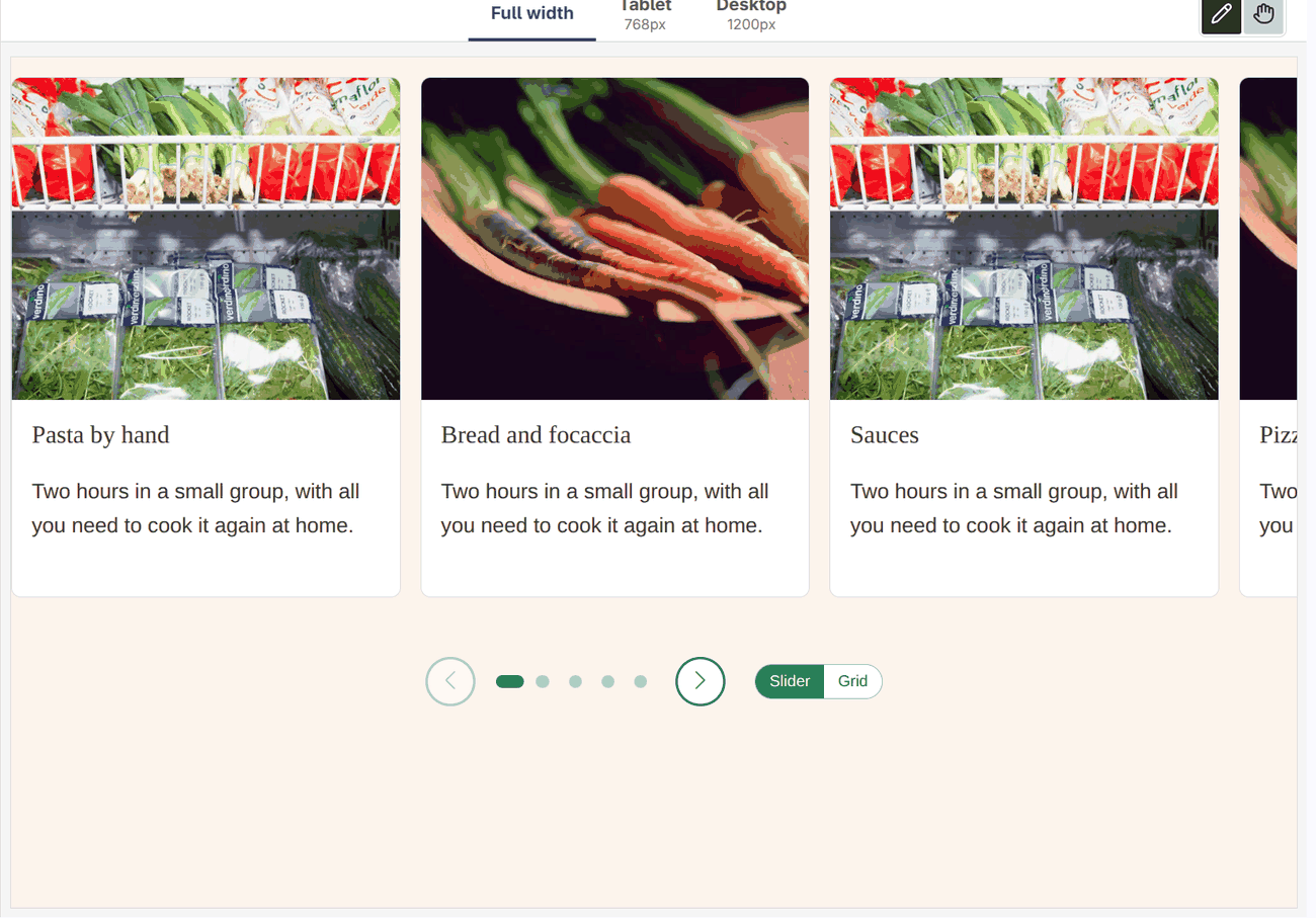
- Nothing plays by itself, so the canvas does not move while you edit.
- A slide you select, on the canvas or in Structure, comes into view.
- The slides are moved with a
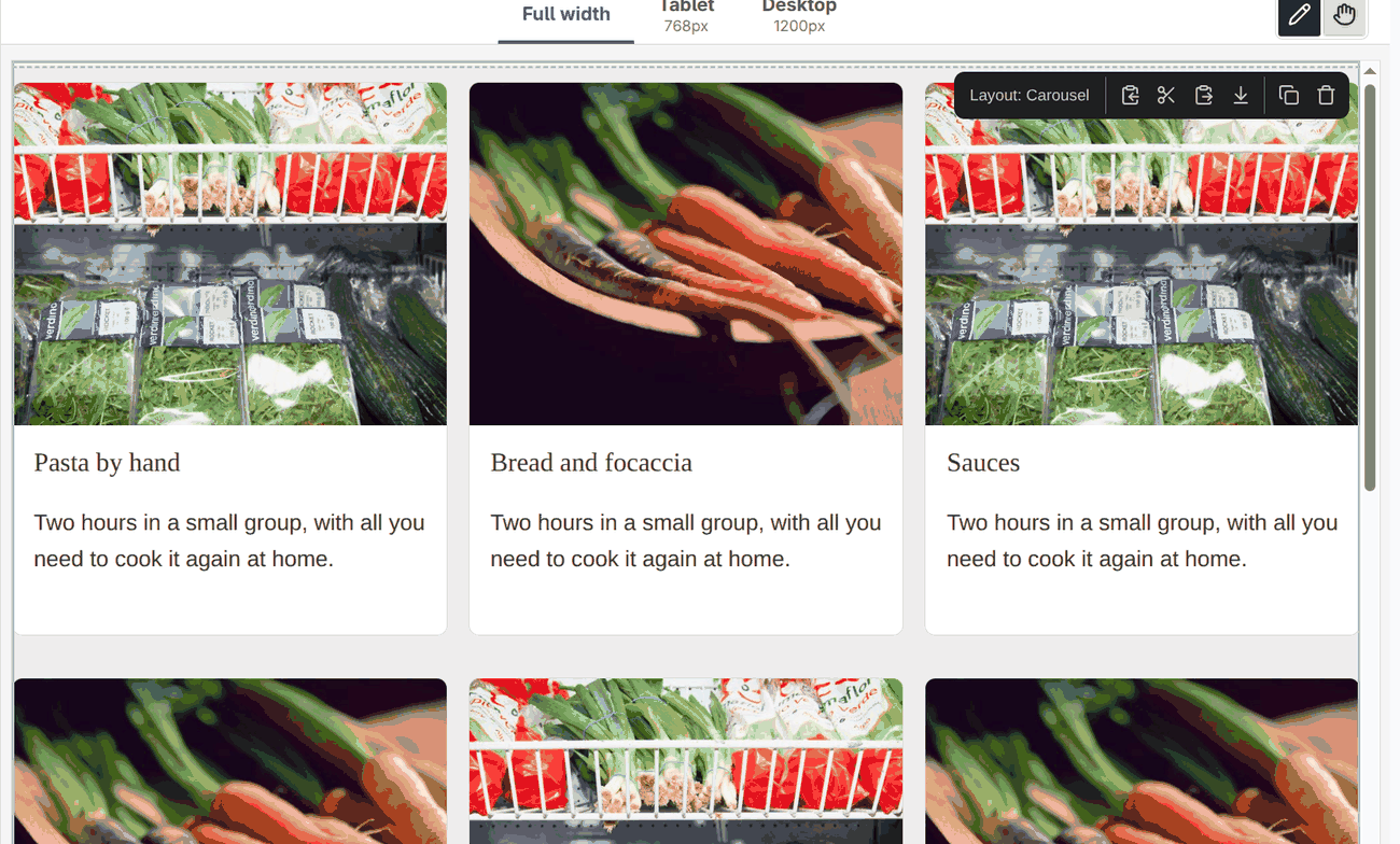
transform, not scrolled, and swiping does not work there. The editor draws the outline of the selected block from its place on the canvas, and it cannot follow a box that scrolls. - A small switch Slider / Grid under the carousel. Grid shows all slides at once, one row under another, to edit many of them or to drag a slide to a place that is out of view. The switch is only in the editor: it is not a prop, not saved, and the page never sees it. The editor remembers the choice for each carousel until you leave.
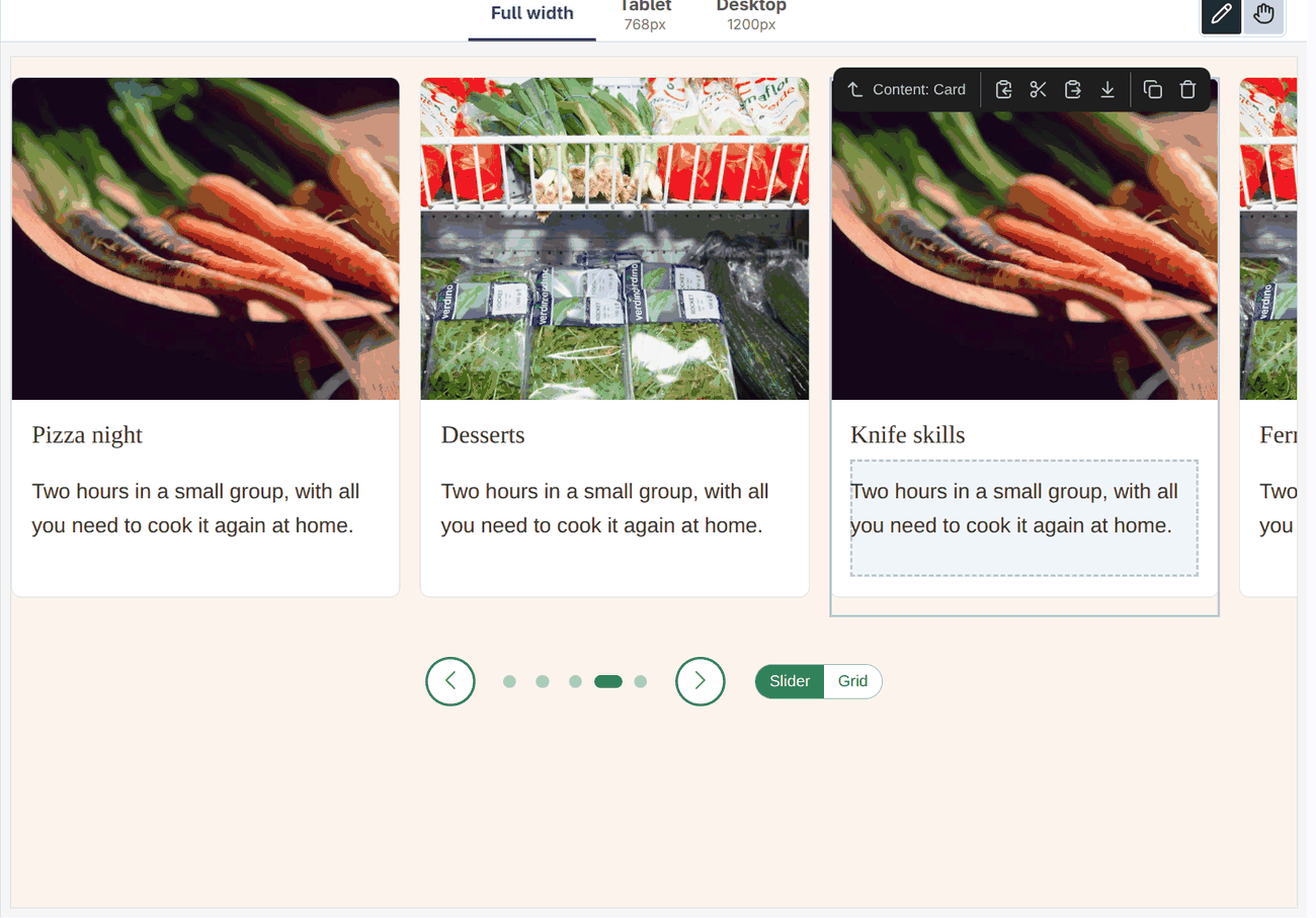
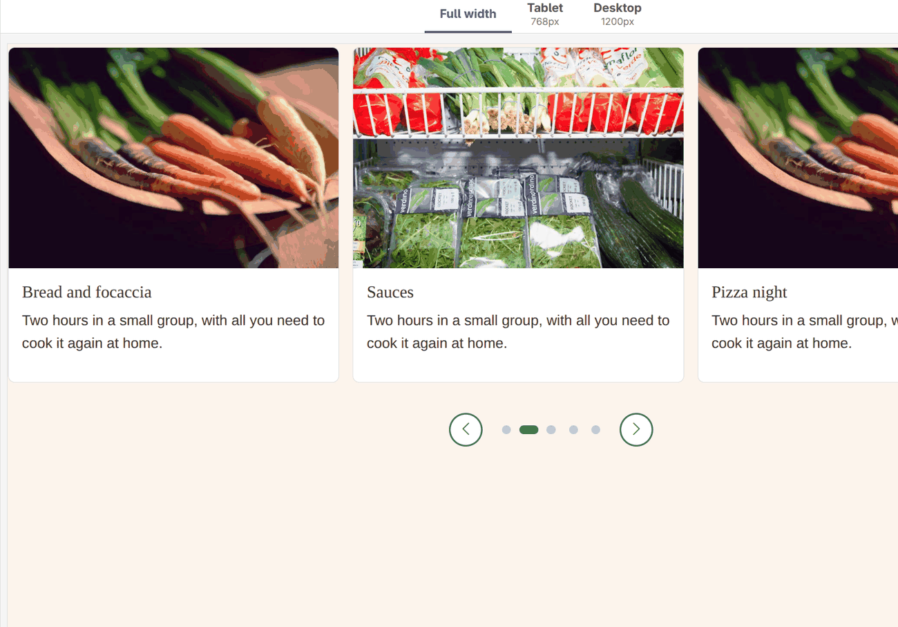
In Interact mode the carousel is used as on the page: arrows and dots work, nothing plays by itself, and there is no switch (there is nothing to edit). Going from Edit to Interact and back keeps the position of the slides.
carousel.js learns that it is in the editor from the frame-editor:rendered event, and listens to frame-editor:selected. See Scripts of a design system. The CSS for the editor is scoped to the slot markup (.carousel__track > [data-frame-editor-slot] > [data-puck-dropzone]).
Uses a slot of any blocks, a length of the spacing scale, numbers with labels (meta:enum on an integer enum), CSS custom properties per breakpoint, Width (Full width for a band of slides).
Limitations. The slides have the width the carousel gives them; a block with a fixed width of its own does not shrink. Slides of different heights are aligned at the top.
$schema: https://git.drupalcode.org/project/drupal/-/raw/HEAD/core/assets/schemas/v1/metadata.schema.json
name: Carousel
status: experimental
description: 'Slides of any blocks (cards, pictures, quotes) side by side, moved with arrows, dots, a swipe or the keyboard. Can play by itself.'
group: Layout
help: |
  Every block put into Slides is one slide: a Card, an Image, a Section with more inside.

  In Frame it is a slider too, with arrows and dots, and a selected slide comes into view. It does not play by itself there. The switch under it, Slider / Grid, is only for editing: Grid shows all slides at once. It is not saved. On the page the slides scroll, and playing by itself stops while the pointer or the keyboard is on the carousel, and for visitors who asked their system for less motion.
props:
  type: object
  properties:
    label:
      type: string
      title: 'Name for screen readers'
      description: 'What the slides are: "Our cooking classes".'
      examples: ['Highlights']
    per_view:
      type: integer
      title: 'Slides at a time'
      description: 'In a wide place. A narrower one shows at most two, a narrow one (a phone) one.'
      enum: [1, 2, 3, 4]
      meta:enum: { 1: One, 2: Two, 3: Three, 4: Four }
      examples: [3]
    gap:
      type: string
      title: 'Space between slides'
      x-builder-widget: length
      examples: ['1rem']
    peek:
      type: boolean
      title: 'Show a part of the next slide'
      description: 'A hint that there is more to swipe to.'
      examples: [true]
    arrows:
      type: boolean
      title: Arrows
      examples: [true]
    dots:
      type: boolean
      title: Dots
      description: 'One dot per position, the current one filled.'
      examples: [true]
    loop:
      type: boolean
      title: 'Start again after the last'
      examples: [true]
    autoplay:
      type: boolean
      title: 'Play by itself'
      description: 'With a button to pause. Never for visitors who prefer less motion.'
      examples: [false]
    interval:
      type: integer
      title: 'Seconds per slide'
      minimum: 3
      maximum: 20
      examples: [6]
  required: [label]
slots:
  slides:
    title: Slides
    description: 'One block per slide.'
thirdPartySettings:
  frame_editor:
    icon: slider
    example: { type: 'frame_demo_umami:carousel', props: { label: 'Our classes', per_view: 3, peek: true, arrows: true, dots: true, autoplay: true, interval: 6, slides: [ { type: 'frame:card', props: { heading: 'Pasta by hand', image: { media: 12 }, content: [ { type: 'frame:text', props: { text: '<p>Tagliatelle and ravioli in two hours.</p>' } } ] } }, { type: 'frame:card', props: { heading: 'Bread and focaccia', image: { media: 14 }, content: [ { type: 'frame:text', props: { text: '<p>Dough, proofing and baking.</p>' } } ] } } ] } }
libraryOverrides:
  dependencies:
    - core/drupal
- core/once{#
/**
* @file
* Carousel: the slot's items are slides of a horizontal scroll with snap points, which works without JavaScript.
* carousel.js adds arrows, dots, the keyboard and playing by itself.
*/
#}
{% set per_view = per_view|default(3) %}
{% set classes = ['carousel'] %}
{% if peek is not same as(false) %}{% set classes = classes|merge(['carousel--peek']) %}{% endif %}
{% set attributes = attributes
.addClass(classes)
.setAttribute('data-carousel', '')
.setAttribute('data-arrows', arrows is same as(false) ? 'false' : 'true')
.setAttribute('data-dots', dots is same as(false) ? 'false' : 'true')
.setAttribute('data-loop', loop is same as(false) ? 'false' : 'true')
.setAttribute('data-autoplay', autoplay ? 'true' : 'false')
.setAttribute('data-interval', interval|default(6))
.setAttribute('aria-roledescription', 'carousel'|t)
.setAttribute('aria-label', label|default('Carousel'|t)) %}
<section {{ attributes }}>
<div class="carousel__track" style="--carousel-k: {{ per_view }}; --carousel-k-tablet: {{ min(per_view, 2) }}{% if gap %}; --carousel-gap: {{ gap }}{% endif %}">
{%- block slides %}{% endblock -%}
</div>
</section>/**
* @file
* Carousel: arrows, dots, keyboard and playing by itself for the scroll track of the Carousel component.
*
* In the Frame editor the same carousel works as a slider too, with these differences: the slides are the items in the
* drop zone of the slot (the editor's own wrappers), the drop zone is moved with a transform and not scrolled (the editor
* measures its components by their place on the canvas and cannot follow a scrolled box), nothing plays by itself, a
* selected slide comes into view, and a switch Slider / Grid, which only the editor has and which is not saved, shows all
* slides at once for editing.
*/
((Drupal, once) => {
const reducedMotion = () => window.matchMedia('(prefers-reduced-motion: reduce)').matches;
function button(className, label, icon) {
const element = document.createElement('button');
element.type = 'button';
element.className = `carousel__button ${className}`;
element.setAttribute('aria-label', label);
element.innerHTML = `<i class="bi bi-${icon}" aria-hidden="true"></i>`;
return element;
}
// The view and the position of each carousel in the editor, by the id of its component: kept while the editor draws it
// again, and when it switches between Edit and Interact.
const editorState = new Map();
function init(root, editor = false) {
const track = root.querySelector(':scope > .carousel__track');
if (!track) return;
// The slides. On the page they are in the track. In the editor the slot has wrappers around them: in Edit mode Puck's
// drop zone (it mounts after the markup, and slides come and go), in Interact mode one plain element. Looked up each time.
const holder = () => {
const slot = editor && track.querySelector('[data-frame-editor-slot]');
return slot ? (slot.querySelector(':scope > [data-puck-dropzone]') || slot.firstElementChild || slot) : track;
};
const slides = () => [...holder().children];
if (!editor && slides().length < 2) return;
const options = root.dataset;
// The id of the component, which the editor puts on the element around it.
const id = editor ? (root.closest('[data-frame-editor-id]')?.getAttribute('data-frame-editor-id') || '') : '';
const loop = options.loop === 'true';
if (!editor) {
slides().forEach((slide, index, all) => {
slide.setAttribute('role', 'group');
slide.setAttribute('aria-roledescription', Drupal.t('slide'));
slide.setAttribute('aria-label', Drupal.t('@index of @count', { '@index': index + 1, '@count': all.length }));
});
track.tabIndex = 0;
// Changes are read out when the visitor moves the slides, not while they play by themselves.
track.setAttribute('aria-live', 'polite');
}
// How many slides show at once, from the CSS of the current width.
const perView = () => {
const first = slides()[0];
return first ? Math.max(1, Math.round(track.clientWidth / first.getBoundingClientRect().width) || 1) : 1;
};
const positions = () => Math.max(1, slides().length - perView() + 1);
let current = 0;
const controls = document.createElement('div');
controls.className = 'carousel__controls';
const previous = button('carousel__previous', Drupal.t('Previous slide'), 'chevron-left');
const next = button('carousel__next', Drupal.t('Next slide'), 'chevron-right');
const dots = document.createElement('div');
dots.className = 'carousel__dots';
let pause = null;
const goTo = (index, smooth = true) => {
// The editor mounts the slides a moment after the markup: until they are there, keep the position asked for.
if (editor && !slides().length) { current = index; return; }
const last = positions() - 1;
current = loop ? (index > last ? 0 : index < 0 ? last : index) : Math.min(Math.max(index, 0), last);
if (editor) editorState.set(id, { ...(editorState.get(id) || { view: 'slider' }), current });
const all = slides();
const left = all.length ? all[current].offsetLeft - all[0].offsetLeft : 0;
if (editor) {
// A transform, not a scroll. Tell the editor that things moved, so that it draws the outline of the selection again.
root.style.setProperty('--carousel-shift', `${left}px`);
root.dispatchEvent(new CustomEvent('frame-editor:moved', { bubbles: true }));
}
else {
track.scrollTo({ left, behavior: smooth && !reducedMotion() ? 'smooth' : 'auto' });
}
update();
};
const update = () => {
const count = positions();
if (dots.children.length !== count) {
dots.replaceChildren(...Array.from({ length: count }, (_, index) => {
const dot = document.createElement('button');
dot.type = 'button';
dot.className = 'carousel__dot';
dot.setAttribute('aria-label', Drupal.t('Go to slide @index', { '@index': index + 1 }));
dot.addEventListener('click', () => goTo(index));
return dot;
}));
}
[...dots.children].forEach((dot, index) => dot.setAttribute('aria-current', String(index === current)));
previous.disabled = !loop && current === 0;
next.disabled = !loop && current >= count - 1;
};
// The position after a swipe or a scroll with the keyboard: the slide nearest to the start.
let scrolling;
track.addEventListener('scroll', () => {
clearTimeout(scrolling);
scrolling = setTimeout(() => {
const start = slides()[0].offsetLeft;
const distances = slides().map((slide) => Math.abs(slide.offsetLeft - start - track.scrollLeft));
current = Math.min(distances.indexOf(Math.min(...distances)), positions() - 1);
update();
}, 80);
}, { passive: true });
previous.addEventListener('click', () => goTo(current - 1));
next.addEventListener('click', () => goTo(current + 1));
root.addEventListener('keydown', (event) => {
if (editor || (event.target !== track && !controls.contains(event.target))) return;
const step = { ArrowLeft: -1, ArrowRight: 1 }[event.key];
if (!step) return;
event.preventDefault();
goTo(current + (document.dir === 'rtl' ? -step : step));
});
if (options.arrows === 'true') controls.append(previous);
if (options.dots === 'true') controls.append(dots);
if (options.arrows === 'true') controls.append(next);
// Playing by itself: stops while the pointer or the focus is in the carousel, while the tab is hidden, and
// for good when the visitor pauses it.
if (!editor && options.autoplay === 'true' && !reducedMotion()) {
let timer = null;
let stopped = false;
const seconds = Math.min(Math.max(Number(options.interval) || 6, 3), 20);
const stop = () => { clearInterval(timer); timer = null; track.setAttribute('aria-live', 'polite'); };
const start = () => {
if (stopped || timer || !root.isConnected) return;
track.setAttribute('aria-live', 'off');
timer = setInterval(() => (root.isConnected && !document.hidden ? goTo(current + 1) : stop()), seconds * 1000);
};
pause = button('carousel__pause', Drupal.t('Pause the slides'), 'pause-fill');
pause.addEventListener('click', () => {
stopped = !stopped;
pause.setAttribute('aria-label', stopped ? Drupal.t('Play the slides') : Drupal.t('Pause the slides'));
pause.innerHTML = `<i class="bi bi-${stopped ? 'play-fill' : 'pause-fill'}" aria-hidden="true"></i>`;
if (stopped) stop(); else start();
});
controls.prepend(pause);
root.addEventListener('mouseenter', stop);
root.addEventListener('mouseleave', start);
root.addEventListener('focusin', stop);
root.addEventListener('focusout', (event) => { if (!root.contains(event.relatedTarget)) start(); });
document.addEventListener('visibilitychange', () => (document.hidden ? stop() : start()));
start();
}
if (editor) {
// The switch is the editor's own: not a prop, not saved. Grid shows every slide so that many can be edited at once.
const state = { view: 'slider', current: 0, ...editorState.get(id) };
// Interact mode: the carousel is used as on the page. There is nothing to edit, so no Grid and no switch.
const interacting = Boolean(root.closest('.is-interacting'));
const mode = document.createElement('div');
mode.className = 'carousel__mode';
mode.setAttribute('role', 'group');
mode.setAttribute('aria-label', Drupal.t('View in the editor'));
const views = { slider: Drupal.t('Slider'), grid: Drupal.t('Grid') };
const choose = (view) => {
state.view = view;
editorState.set(id, state);
root.classList.toggle('carousel--grid', view === 'grid');
[...mode.children].forEach((item) => item.setAttribute('aria-pressed', String(item.dataset.view === view)));
if (view === 'slider') goTo(current, false);
};
Object.entries(views).forEach(([view, label]) => {
const item = document.createElement('button');
item.type = 'button';
item.className = 'carousel__mode-button';
item.dataset.view = view;
item.textContent = label;
item.addEventListener('click', () => choose(view));
mode.append(item);
});
// The editor makes what is inside a component unclickable (a click selects it), except what is marked as a control.
controls.setAttribute('data-frame-editor-control', '');
if (!interacting) controls.append(mode);
current = state.current;
if (interacting) goTo(current, false);
else choose(state.view);
// The editor tells which component is selected (on the canvas or in Structure): a slide, or something inside one,
// scrolls into view when it is not.
root.addEventListener('frame-editor:selected', (event) => {
const index = slides().findIndex((slide) => slide.contains(event.target));
if (index < 0 || root.classList.contains('carousel--grid')) return;
const visible = perView();
if (index < current) goTo(index);
else if (index >= current + visible) goTo(index - visible + 1);
});
// Slides are added, moved and deleted in the editor; the width of the canvas changes with the breakpoint.
new MutationObserver((records) => {
// The slides and their wrappers, not what is typed in a slide.
if (records.some(({ target }) => target === track || target === holder() || target.hasAttribute?.('data-frame-editor-slot'))) goTo(current, false);
}).observe(track, { childList: true, subtree: true });
// Only when the width changes: the height changes with every edit, and moving the slides then would fight a swipe.
let width = root.clientWidth;
const resized = new ResizeObserver(() => {
if (!root.isConnected) resized.disconnect();
else if (root.clientWidth !== width) { width = root.clientWidth; goTo(current, false); }
});
resized.observe(root);
root.append(controls);
update();
return;
}
if (controls.children.length) root.append(controls);
window.addEventListener('resize', () => goTo(current, false));
update();
}
Drupal.behaviors.frameDemoCarousel = {
attach(context) {
once('frame-demo-carousel', '[data-carousel]', context).forEach((root) => init(root));
},
};
// The Frame editor does not run behaviors for a component with a slot, but tells when it has drawn one. The page never
// sends this event.
document.addEventListener('frame-editor:rendered', (event) => {
const root = event.detail;
if (root?.matches?.('[data-carousel]')) once('frame-demo-carousel', [root]).forEach((element) => init(element, true));
});
})(Drupal, once);/*
* Carousel. The track is a scroll container with snap points; carousel.js adds the controls.
* In Frame the slides are in the editor's drop zone: see the end of this file.
*/
.carousel { container-type: inline-size; --carousel-accent: var(--frame-accent, #008068); --carousel-gap: var(--frame-space-m, 1rem); position: relative; margin-block: 0 var(--frame-space-l, 2rem); }
.carousel__track {
--carousel-n: 1;
display: flex; gap: var(--carousel-gap); overflow-x: auto; overscroll-behavior-x: contain; scroll-snap-type: x mandatory;
scroll-behavior: smooth; scrollbar-width: none; padding-block: 0.25rem;
}
.carousel__track::-webkit-scrollbar { display: none; }
.carousel__track > * { flex: 0 0 calc((100% - (var(--carousel-n) - 1) * var(--carousel-gap)) / var(--carousel-n)); min-width: 0; margin: 0; scroll-snap-align: start; }
.carousel--peek .carousel__track > * { flex-basis: calc((100% - (var(--carousel-n) - 1) * var(--carousel-gap)) / (var(--carousel-n) + 0.2)); }
.carousel__track:focus-visible { outline: 3px solid color-mix(in srgb, var(--carousel-accent) 45%, transparent); outline-offset: 4px; }
/* The slides at a time follow the width of the carousel, not of the window: it can be in a column, or in the editor. */
@container (min-width: 28em) { .carousel__track { --carousel-n: var(--carousel-k-tablet); } }
@container (min-width: 44em) { .carousel__track { --carousel-n: var(--carousel-k); } }
.carousel__controls { display: flex; align-items: center; justify-content: center; gap: var(--frame-space-s, 0.5rem); margin-top: var(--frame-space-m, 1rem); }
.carousel__button {
display: inline-grid; place-items: center; width: 2.5rem; height: 2.5rem; padding: 0; border: 2px solid var(--carousel-accent);
border-radius: 50%; background: #fff; color: var(--carousel-accent); font-size: 1.1rem; cursor: pointer; transition: background-color 0.15s, color 0.15s;
}
.carousel__button:hover:not(:disabled) { background: var(--carousel-accent); color: #fff; }
.carousel__button:disabled { opacity: 0.35; cursor: default; }
.carousel__button:focus-visible, .carousel__dot:focus-visible { outline: 3px solid color-mix(in srgb, var(--carousel-accent) 45%, transparent); outline-offset: 2px; }
.carousel__dots { display: flex; flex-wrap: wrap; justify-content: center; gap: 0.15rem; margin-inline: var(--frame-space-s, 0.5rem); }
.carousel__dot { width: 1.5rem; height: 1.5rem; padding: 0; border: 0; background: none; cursor: pointer; }
.carousel__dot::before { content: ""; display: block; width: 0.65rem; height: 0.65rem; margin: auto; border-radius: 999px; background: color-mix(in srgb, var(--carousel-accent) 30%, transparent); transition: width 0.2s, background-color 0.2s; }
.carousel__dot[aria-current="true"]::before { width: 1.4rem; background: var(--carousel-accent); }
/*
* In Frame the slides are in one element inside the slot marker (in Edit mode Puck's drop zone, in Interact mode
* a plain div), and each has a wrapper (the wrapper is the slide). The same slider as on the page, with all slides in the DOM so that each can be selected and edited: the track
* clips, and the drop zone, as wide as all the slides, is moved with a transform (--carousel-shift, set by carousel.js).
* It is not scrolled, because the editor draws the outline of the selected component from its place on the canvas and
* cannot follow a box that scrolls. carousel.js adds the arrows and dots there too, and a switch Slider / Grid (only in
* the editor, not saved), which puts `carousel--grid` on the root: all the slides in a grid.
*/
.carousel__track:has(> [data-frame-editor-slot]) { display: block; overflow-x: clip; }
.carousel__track > [data-frame-editor-slot] > div {
display: flex; gap: var(--carousel-gap); width: max-content; min-width: 100%;
transform: translateX(calc(var(--carousel-shift, 0px) * -1));
}
.carousel__track > [data-frame-editor-slot] > div > * { flex: 0 0 calc((100cqw - (var(--carousel-n) - 1) * var(--carousel-gap)) / var(--carousel-n)); min-width: 0; margin: 0; }
.carousel--peek .carousel__track > [data-frame-editor-slot] > div > * { flex-basis: calc((100cqw - (var(--carousel-n) - 1) * var(--carousel-gap)) / (var(--carousel-n) + 0.2)); }
.carousel--grid .carousel__track > [data-frame-editor-slot] > div { display: grid; grid-template-columns: repeat(var(--carousel-n), minmax(0, 1fr)); width: auto; transform: none; }
.carousel--grid .carousel__track > [data-frame-editor-slot] > div > * { flex: none; }
.carousel--grid .carousel__previous, .carousel--grid .carousel__next, .carousel--grid .carousel__dots { display: none; }
.carousel__mode { display: inline-flex; margin-inline-start: var(--frame-space-m, 1rem); border: 1px solid color-mix(in srgb, var(--carousel-accent) 50%, transparent); border-radius: 999px; overflow: hidden; }
.carousel__mode-button { padding: 0.2rem 0.7rem; border: 0; background: #fff; color: var(--carousel-accent); font: inherit; font-size: 0.8rem; cursor: pointer; }
.carousel__mode-button[aria-pressed="true"] { background: var(--carousel-accent); color: #fff; }
.carousel__mode-button:focus-visible { outline: 3px solid color-mix(in srgb, var(--carousel-accent) 45%, transparent); outline-offset: -3px; }
@media (prefers-reduced-motion: reduce) {
.carousel__track { scroll-behavior: auto; }
.carousel__dot::before, .carousel__button { transition: none; }
}