
Components of the base theme
What it does
The base theme ships a set of general components in components/, so every subtheme can build complete pages before it has a component of its own. They are Twig and CSS only (no React), take their colours from the theme, and each has a description, an icon and an example for the editor and the AI assistant.
Turn them off
A subtheme that brings its own set does not have to offer these. Set inherit: false under frame_editor: components: in its .info.yml to leave all of them out, allow to keep some, deny to leave out some; the site can do the same on Frame components. Pages that already use one still show it. See Turn components off.
Limitations
- They are Twig and CSS only: no behaviour in the browser beyond what CSS does.
- Hero prints its heading as the
<h1>of the page. If the theme prints the title of the page as well, hide one of the two, or give the Hero another Heading level. - An Accordion item is always open on the canvas, so its content can be edited.
- They take their colours from a few custom properties with neutral fallbacks; a theme without a palette gets the fallbacks.
The set
Layout
| Component | What it is for | Options |
|---|---|---|
| Section | A titled container: one part of a page | heading; plain or tinted |
| Hero | The opening of a page: big heading, short text and buttons over a picture or a colour | picture, shade (dark, light, none), height, text position; slot Actions |
| Container | Keeps its content at a readable width, centred | narrow, normal, wide, full |
| Columns | A grid with a number of columns | Layouts |
| Flex | Items in a row or column | Layouts |
| Stack | Items under each other with an even gap | Layouts |
| Divider | A line between two parts | solid, dashed, dotted; full, half, short; space |
| Spacer | Empty space | height from the spacing scale |
Content
| Component | What it is for | Options |
|---|---|---|
| Heading | A heading on its own, with an optional line above | heading level (Heading 1 to Heading 6, the outline), size (the look) |
| Text | Formatted text, with the editor of a Drupal text format | — |
| Image | An image of the media library | image style, loading, link, caption |
| Links | A list of links: related pages, downloads, a footer column | heading; the links (text, link, new tab), added and ordered in a list; one per line or in a row; arrow, dot or no marker |
| Button | A link that looks like a button | filled, outline, text; size; colour of the palette; new tab |
| Card | Picture, heading with an optional link, free content | slot Content |
| Quote | A testimonial or pull quote with its source | name, role, portrait, size |
| Call to action | A highlighted band with heading, text and buttons | stacked or side by side; accent, soft, plain; slot Actions |
| Accordion + Accordion item | Titles that open to show content: FAQs | boxes or lines; item: open at the start; slot Content |
| Number with a label | A big number or short fact: "8 people per class" | — |
| Badge | A small label, to pin on a corner of a card or picture; a link when it has an address | link, colour, shape |
| Notice | A highlighted note: information, success, warning, error | title, text |
Heading level. Heading, Section, Hero, Card, Call to action and Links have a Heading level (Heading 1 to Heading 6). It sets the tag for search engines and screen readers and not the look: Heading has its own Size. Keep the levels in order (do not jump from Heading 2 to Heading 4) and use one Heading 1 per page: a Hero is Heading 1 by default.
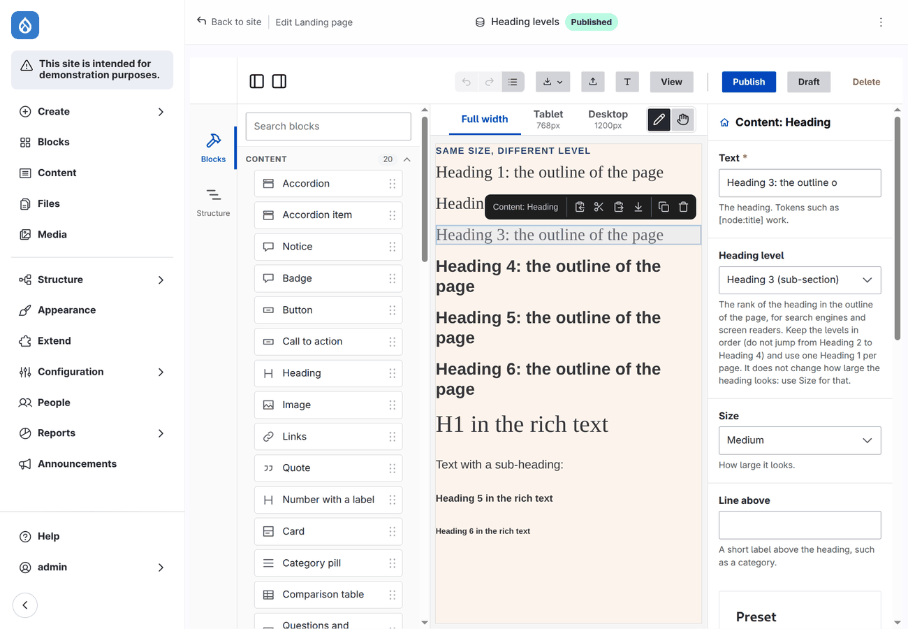
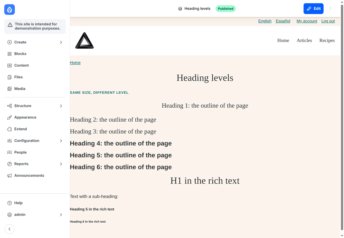
A typical landing page: Hero (with Buttons), a Section with Columns of Cards or Numbers, a Quote, an Accordion in a narrow Container, a Call to action.
What they provide
For slots that limit what they take (see What a slot accepts) the components of the base theme provide the standard interfaces: Heading heading and text, Badge text, Text rich_text, Image image and media, Button and Links link. A subtheme's component says the same in its thirdPartySettings.frame_editor.provides.
Colours and tokens
The components use a few CSS custom properties, with neutral fallbacks:
| Property | Used for | Default |
|---|---|---|
--frame-accent | buttons, the filled call to action, numbers, the line of a quote, a short divider | #1f4fd8 |
--frame-accent-contrast | text on the accent colour | #fff |
--frame-radius | corners of buttons, boxes, hero | 0.375rem |
With the editor module enabled, the tokens of your theme are on every page as custom properties, so the components pick up your colours without CSS: --frame-space-<name> and --frame-color-<name> for the spacing scale and the palette of the theme's .info.yml, and --frame-accent, which is the palette's colour named accent or primary, else its first colour. To choose otherwise, set them in your theme's CSS:
:root { --frame-accent: #b3261e; --frame-accent-contrast: #fff; --frame-radius: 0; }A Button and a Badge also take a colour of the palette as a prop.
Making them yours
They are ordinary components:
- Restyle them from your theme's CSS by their classes (
.button-link,.hero,.cta,.quote,.accordion-item,.notice,.stat,.badge,.heading-block,.container-block,.divider,.spacer,.card,.section,.rich-text). - Replace one with your own version: a component in your theme with the same props and slots and
replaces: frame:<name>in its*.component.yml. The editor then offers yours instead of the base theme's, and pages that used the base one show yours. The example subtheme does this for Card, Section and Text. - Hide what you do not want editors to use: replace it with a component that has
noUi: true, or leave it and describe in its place what to use.
In the editor
- An Accordion item is always open on the canvas, so its content can be edited; on the page it opens as set.
- Hero prints its heading as the page's
<h1>. If your theme prints the title of the page as well, hide one of the two (the page title block, or use a Heading instead of a Hero). - Badge with Position → Pinned sits on a corner of the component it is in.