Creating a component
Components live in your subtheme (see Base theme and subthemes). The base theme only provides the React runtime and helpers that frame/react attaches. Below, my_theme stands for your subtheme.
Each widget lives in its own folder under components/. Drupal discovers it because it contains <name>.component.yml (theme components are namespaced by the theme machine name: my_theme:pricing-table).
components/
  pricing-table/
    pricing-table.component.yml           # SDC metadata: props, slots, library
    pricing-table.twig                    # server markup: the mount point
    index.jsx                             # entry: Drupal behavior that mounts React
    PricingTable.jsx                      # the React component
    pricing-table.scss                    # imported from index.jsx
    pricing-table.story.twig              # optional, for Storybook
    __tests__/pricing-table.test.js       # optional, jest
The examples below are cut down from the pricing-table component of the example subtheme (examples/frame_demo_umami).
The three files that make a component
*.component.yml
$schema: https://git.drupalcode.org/project/drupal/-/raw/HEAD/core/assets/schemas/v1/metadata.schema.json
name: Pricing table
status: stable
group: Marketing
props:
  type: object
  properties:
    heading:
      type: string
      title: Heading
    currency:
      type: string
      title: Currency
    plans:
      type: array
      title: Plans
      items:
        type: object
        properties:
          name: { type: string }
          monthly: { type: number }
        required: [name, monthly]
  required:
    - plans
libraryOverrides:
  js:
    ../../assets/pricing-table.js: { attributes: { type: module } }
  css:
    theme:
      ../../assets/pricing-table.css: { }
  dependencies:
- frame/reactpropsare validated by core when the component renders. Wrong type or a missing required prop is an error, which is what you want while developing.libraryOverridesis the SDC way to attach assets. Core builds a library for the component and attaches it only on pages where the component renders. Paths are relative to the component folder, and the Vite output lives in the theme'sassets/, hence../../assets/. (Core turns them into/core/../themes/...URLs, which browsers normalize, this is core behavior.)dependenciespull the global React libraries in before your entry runs. Addframe/react-api-clienttoo if the component callsapiClient.- Because the Vite output is ES modules (shared chunks), the script needs
attributes: { type: module }. See Build.
Convention alternative
SDC also auto-attaches pricing-table.js and pricing-table.css found next to the twig file. That works if your build writes there. This scaffold writes everything to assets/ (one place to git-ignore and deploy), so it uses libraryOverrides.
*.twig: the mount point
{% set data = { heading: heading, currency: currency|default(''), plans: plans } %}
<section {{ attributes.addClass('pricing-table').setAttribute('data-props', data|json_encode) }}>
  <h2>{{ heading }}</h2>
  <ul>
    {% for plan in plans %}
      <li>{{ plan.name }}: {{ plan.monthly }}</li>
    {% endfor %}
  </ul>
</section>
Twig renders the markup that a visitor without JavaScript and a search engine read (the real component prints the plans in full), and passes the props to React in one JSON attribute, data-props. attributes is provided by SDC, so callers can add classes and attributes. For a few plain values you can use separate data-* attributes instead (.setAttribute('data-limit', limit)) and read them from element.dataset.
index.jsx: the Drupal behavior
import { createRoot } from 'react-dom/client';
import { PricingTable } from './PricingTable';
import './pricing-table.scss';

(function (Drupal, once) {
  const mount = (element) => {
    createRoot(element).render(<PricingTable {...JSON.parse(element.dataset.props || '{}')} />);
  };

  Drupal.behaviors.frameDemoPricingTable = {
    attach(context) {
      once('react', '.pricing-table', context)
        .forEach((element) => executeWhenVisible(element, mount, 'pricing-table'));
    },
  };
})(Drupal, once);
Keep index.jsx thin: it only wires Drupal to React. Why it is written like this is explained in React + Drupal behaviors.
Add a new component, step by step
- Folder:
components/my-widget/. my-widget.component.yml: name, props,libraryOverridespointing to../../assets/my-widget.jsand.css(the file names come from the folder name, see below), dependency onframe/react.my-widget.twig: the mount element with a class anddata-*props.index.jsx: copy the behavior above, change the selector, behavior name and the component.MyWidget.jsxandmy-widget.scss.npm run build. The Vite config scanscomponents/*/index.jsxand names the bundle after the folder, somy-widget/producesassets/my-widget.jsandassets/my-widget.css.drush cr, then place it in Twig.
The folder name is also the bundle name, so keep the three in sync: folder my-widget, bundle assets/my-widget.js, and the path in libraryOverrides.
Props or slots?
SDC gives you two ways to pass content in. Choose by what the value is:
| Use a prop when | Use a slot when |
|---|---|
| it is a value: string, number, boolean, enum, URL, ID | it is content: markup, links, a render array, translated rich text |
| you want core to validate it (type, enum, required, default) | the caller may want to put any HTML or other components inside |
React needs it as data (currency, variant, limit) | Drupal should render it (page title, field output, a block) |
| it is small and safe in an HTML attribute | it could contain user content you do not want to double-encode |
Rules of thumb:
- Config for React → props.
currency,variant,heading. They end up indata-*attributes andelement.dataset. - Anything Drupal renders → slots. Never pass rendered HTML as a prop string, it is escaped and bypasses Drupal's render pipeline.
- Enums over free text for anything that changes behavior (
variant: light | dark), the schema documents and enforces them. - Optional props need
|default()in twig. Thedefault:incomponent.ymldocuments the value, but core SDC does not apply it to the Twig variables: an omitted prop is simply undefined, anddata-start="{{ start }}"becomes an empty attribute (Number(undefined)isNaNin JS). Writestart|default(0)in the template and, for numbers,Number(el.dataset.start) || 0inindex.jsx. Keep the same default incomponent.ymlso the documentation matches. - Prop values are strings in the browser.
data-limit="10"arrives as"10". Parse numbers and booleans inindex.jsx, or send structured data as one JSON attribute andJSON.parseit. - Slot content is server markup. React replaces the element's children when it mounts, so read what you need first (
element.innerText,element.innerHTML) and render it yourself. Better still, keep slot content out of the React root: a component with slots, like Tabs, is plain Twig and CSS, with a small script (tabs.js) that only adds behavior to the server markup.
Slot example (tabs)
# tabs.component.yml
props:
  type: object
  properties:
    label: { type: string, title: 'Name for screen readers' }
    vertical: { type: boolean, title: 'Tabs on the side' }
slots:
  tabs:
    title: Tabs
description: 'Tab blocks, one per tab.'<div {{ attributes.addClass('tabset').setAttribute('data-tabset-label', label) }}>
<div class="tabset__panels">{% block tabs %}{% endblock %}</div>
</div>label and vertical are values, tabs is whatever Drupal wants shown inside: in the editor, the Tab components dropped into it. The tab component has a slot of its own (content), so tabs nest slots two levels deep.
Gotchas and advice
Naming and wiring
- The folder name is the bundle name: folder
my-widget→assets/my-widget.js/.css. The path inlibraryOverrides, the folder and the component ID (my_theme:my-widget) must agree. A typo gives a 404 for the script, not an error. index.jsxis required for the build to pick the folder up (index.jsalso works). Other files are free.- One behavior per component, named uniquely (
Drupal.behaviors.myWidget). A clashing name silently replaces another behavior. - Use a specific mount class (
.my-widget) inonce(). A generic selector mounts React into unrelated markup. - The
once()id ('react') can be shared:oncetracks element and id together, different elements never conflict.
Libraries
- Always depend on
frame/react(andframe/react-api-clientif you callapiClient). Without itReact,apiClientandexecuteWhenVisibleare undefined and the component fails silently. - If the HTML you render contains ajax links or dropbuttons, add
core/drupal.ajax/core/drupal.dropbutton, see Ajax. These pull jQuery in through core, your code does not need it. - Scripts that are ES modules need
attributes: { type: module }, see Build.
JavaScript
import './my-widget.scss'inindex.jsx. Vite extracts the CSS intoassets/my-widget.css. Third-party CSS (for examplesome-library/dist/style.css) must be imported the same way, it is not automatic.- Use
Drupal.t()/Drupal.formatPlural()for text.Drupal,onceanddrupalSettingsare globals, do not bundle them. - React is an external, so it is not bundled:
import { useState } from 'react'is fine, it resolves to the globalReact. Do not add a second React to a component's dependencies. - Keep React component files free of Drupal globals where you can. Pass the data and the text in as props, so Jest tests do not need Drupal.
- Handle loading, error and empty states. The server markup is a bare mount element, users see it until your first render.
Markup and accessibility
- Put server-rendered fallback inside the mount element (
<noscript>, or real content that React replaces). It is what search engines and no-JS users get. - Prefer real form controls, labels and
aria-livefor results. React does not add them for you. - SDC
attributeslets callers add classes and attributes, keepattributes.addClass(...)in twig instead of hardcoding a bare<div>.
Workflow
- After editing
*.component.yml, twig orlibraries.yml:drush cr. After editing JSX/SCSS: rebuild (npm run watchdoes it). - Component props are validated on every render, a wrong type is a visible error. Fix the schema or the caller, do not loosen the schema to silence it.
- If something does not show up, follow the checklist in Build.
Variants with html_cva()
When a prop is a choice (enum in the component.yml), map it to classes with html_cva(), a Twig function of Drupal 11.4 and later (Frame needs 11.4, so it is always there). One place lists the base class, the classes of each value and the defaults. Name the variants like the values of the prop: the editor shows the enum as a select, so what the editor picks is what the template looks up.
# button.component.yml
variant: { type: string, enum: [primary, outline, text], meta:enum: { primary: Filled, outline: Outline, text: 'Text only' } }
size: { type: string, enum: [s, m, l] }{% set cva = html_cva('button-link', {
variant: { primary: 'button-link--primary', outline: 'button-link--outline', text: 'button-link--text' },
size: { s: 'button-link--s', m: 'button-link--m', l: 'button-link--l' },
}, [], {variant: 'primary', size: 'm'}) %}
<a {{ attributes.addClass(cva.apply({variant: variant|default(null), size: size|default(null)}|filter(v => v is not null))) }} href="{{ url }}">{{ label }}</a>- The arguments are the base classes, the variants, the compound variants and the default variants.
apply()returns the classes as one string. - Pass
|default(null)and drop the empty ones with|filter(v => v is not null): a prop that is left out then gets the default variant (anullvalue would trigger a PHP deprecation). A value that is not a variant adds no class. - A class may be a Frame utility, for example
'frame-px-m frame-py-s'for a size, next to your own classes. - A compound variant adds classes for a combination:
[{variant: 'outline', size: ['l'], class: 'button-link--wide-outline'}]. It needs both props to be given, the default variants do not count. - One chain:
component.yml-> the editor -> the template. Mark the look prop withvariant_prop: variant(see Variants) and the editor offers itsenumas the Variant select and as looks in the Blocks panel. The template looks the same name up inhtml_cva(). A component with core'svariants:gets the chosen one asvariantin the template, the same way. Adding a look is one line in the YAML and one in thehtml_cva()call, with the same name. - The test
ComponentCvaTest::testEveryEnumValueHasAVariantchecks that every value of an enum prop given toapply()has a key in the call. - The classes Frame adds from the editor (spacing, background, position) are not classes of the template: Frame passes them as
styleanddata-*inattributes, soattributes.addClass(cva...)keeps both and the variant classes never clash with them. Frame utility classes written in thehtml_cva()call are fine too.
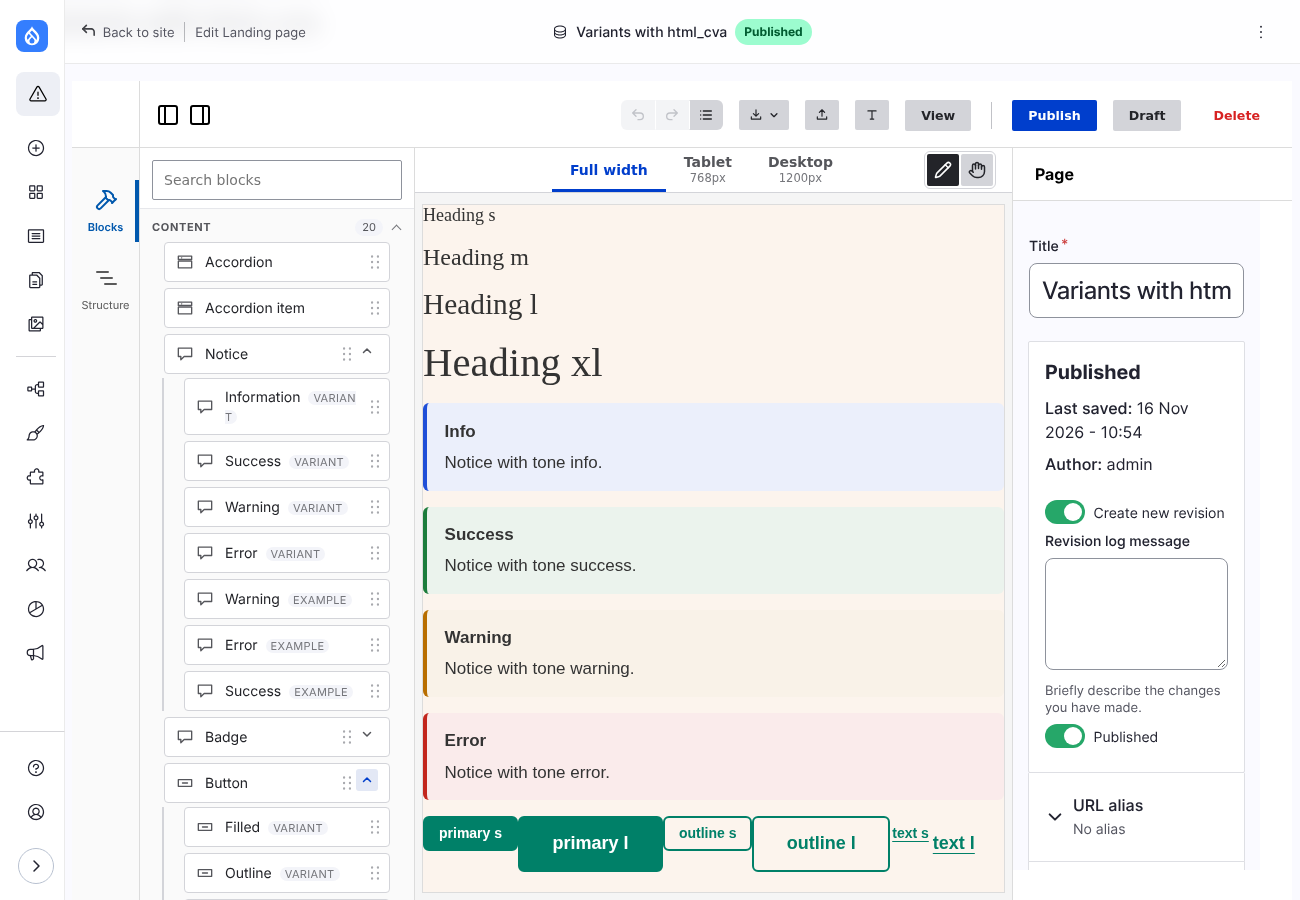
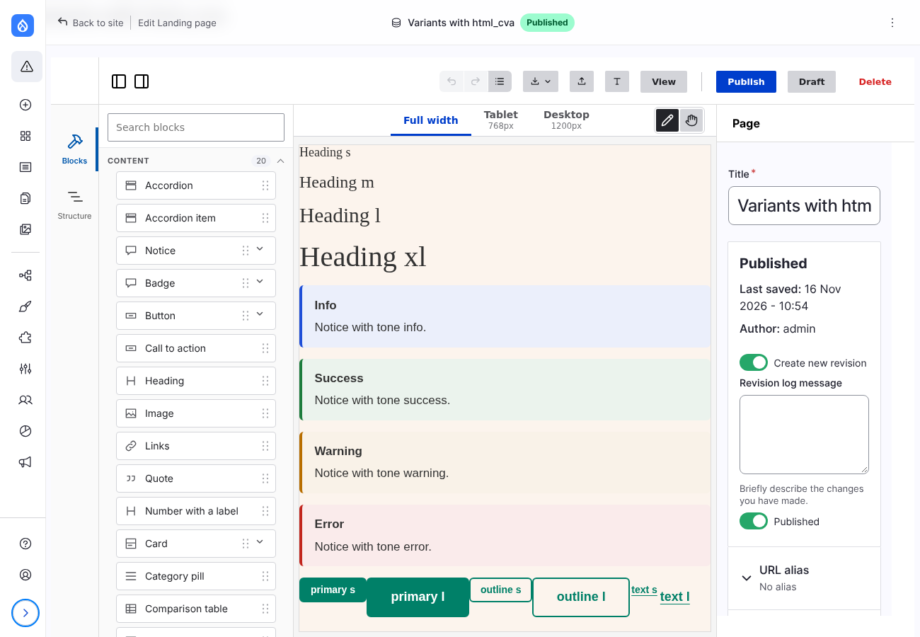
Notice, Badge, Button and Heading of the base theme are written like this. In the editor each look is a choice of the Variant select, and the Blocks panel lists them under the block: