
Tokens, features and global styling
The editor has no styling options of its own. Everything an editor can choose is a value your theme declares, and everything it prints is your theme's CSS plus a few declarations made from those values. This page is about that contract.
Who styles what
| Layer | Where | Decides |
|---|---|---|
| Global look | the theme's global CSS (scss/global.scss in a subtheme) | fonts, colours, page layout, base elements |
| Component look | components/<name>/*.css or .scss | everything inside a component |
| Tokens | frame_editor: uikit: in the theme's .info.yml | the values editors can pick |
| Features | the same block, and a component's thirdPartySettings | which adjustments editors can make to a component |
| Editor chrome | the module's css/builder.css | the editor's own UI, never the page |
An editor cannot type a colour, and cannot type CSS. The most free value is a length such as 12px or 5%, which is checked before it is printed.
Tokens
Declared in the .info.yml of a theme. A subtheme overrides what its base theme declares; a scale or a palette is replaced as a whole.
frame_editor:
  uikit:
    # Spacing scale: name => CSS length. Used for margin, padding, gaps and offsets.
    spacing:
      xs: 0.25rem
      s: 0.5rem
      m: 1rem
      l: 2rem
      xl: 4rem
    # Type scale: name => CSS length. The sizes an editor can give text.
    font_sizes:
      s: 0.875rem
      m: 1rem
      l: 1.25rem
      xl: 1.5rem
    # Line heights of text: name => a number (times the font size), a length or a custom property.
    line_heights:
      tight: 1.2
      normal: 1.5
      relaxed: 1.75
    # Sizes: name => CSS length. How wide a component may be, how tall it is at least.
    sizes:
      s: 30rem
      m: 45rem
      l: 60rem
      xl: 75rem
      full: 100%
    # Palette: the only colours an editor can pick (text, background, border).
    colors:
      green: { label: 'Green', value: '#008068' }
      cream: { label: 'Cream', value: '#fcf4ed' }
    # Widths of a border: name => CSS length.
    border_widths:
      thin: 1px
      medium: 2px
      thick: 4px
    # Rounded corners: name => CSS length.
    radii:
      s: 0.25rem
      m: 0.5rem
      l: 1rem
      full: 9999px
    # Image styles offered for images: an image style, or "responsive:<responsive image style>".
    # Leave the key out to offer all of them.
    image_styles:
      - large
      - 'responsive:wide'
    # The content width of a page and the wide width, for the Width feature. CSS lengths, or var()/calc() of them.
    layout:
      content: var(--page-max-width, 75rem)
      wide: calc(var(--page-max-width, 75rem) * 1.2)
  # Offered on every component (see below).
  features:
    spacing: true
    size: true
    align: true
    text: true
    background: true
    border: true
    position: true
    width: true
Without the block a theme gets the spacing scale above (XS to XL), a type scale from XS (0.75rem) to 3XL (3rem), the border widths and radii above, no colours, all image styles and all features. The starterkit puts a block with defaults into a new subtheme. After changing it, rebuild caches (drush cr).
The names are what is stored in a layout ("size": "m", "color": "green"), not the values. Changing m from 1rem to 1.25rem changes every page that uses it; removing a name makes the places that used it fall back to nothing.
The module also prints the tokens on every page of the theme as CSS custom properties: --frame-space-<name> for each step of the scale, --frame-font-<name> for each font size, --frame-color-<name> for each colour, --frame-border-<name> and --frame-radius-<name> for each border width and radius, and --frame-accent (the colour named accent or primary, else the first one), which the components of the base theme use. Your CSS can use them: padding: var(--frame-space-m).
Tokens in SCSS
The tokens are declared once, in YAML, and the theme's stylesheets read the same file. The build of the theme gives them as a Sass module:
@use 'frame/tokens' as frame;

.teaser {
  padding: frame.space(m);
  color: frame.color(green);
  font-size: frame.font-size(l);

  @include frame.breakpoint(tablet) {
    padding: frame.space(l);
  }
}
So "padding M" chosen by an editor and frame.space(m) in a component are the same 1rem, and changing the scale in the .info.yml changes both. A name the theme does not declare stops the build with the list of the names it has.
| In the module | Is |
|---|---|
frame.space($name), frame.color($name), frame.font-size($name), frame.size($name), frame.border-width($name), frame.radius($name) | a value of the spacing scale, the palette, the type scale, the sizes, the border widths, the radii |
@include frame.breakpoint($name) { … } | the media query of a breakpoint of <theme>.breakpoints.yml; the name is the part after the theme (my_theme.tablet is tablet). A breakpoint without a media query applies always |
frame.$spacing, frame.$colors, frame.$font-sizes, frame.$sizes, frame.$border-widths, frame.$radii, frame.$breakpoints, frame.$features | the same as maps, to loop over |
@include frame.custom-properties; | :root { --frame-space-m: 1rem; … }: the custom properties the module prints, for pages and tools that load only your CSS |
@include frame.utilities; | a class for every choice an editor has (below) |
@include frame.rules; | both of the above |
Values are merged as the editor does: the theme's own block, else its base theme's, else the defaults. Breakpoints are those of the first theme in the chain that has a .breakpoints.yml; the base theme has mobile, tablet (48em) and desktop (75em).
Rules for the features
frame.utilities writes one class per value of each feature the theme offers, so templates and components can use what editors use in the editor:
| Feature | Classes (prefix frame) |
|---|---|
| spacing | .frame-m-<step>, .frame-p-<step>; a side with x, y, t, b, s, e (.frame-px-m, .frame-mt-l); -0 and, for margin, -auto (.frame-mx-auto); .frame-gap-<step> |
| size | .frame-w-<size> (max-width), .frame-h-<size> (min-height) |
| align | .frame-align-start, -center, -end |
| text | .frame-text-<size>, .frame-weight-normal/-medium/-bold, .frame-leading-<name> (the line heights of the theme), .frame-valign-baseline/-top/-middle/-bottom/-text-top/-text-bottom/-sub/-super, .frame-italic, .frame-uppercase/-lowercase/-capitalize, .frame-color-<colour> |
| background | .frame-bg-<colour>, .frame-bg-cover/-contain/-stretch/-auto |
| border | .frame-border-<width> (a solid line in the colour of the text), .frame-border-color-<colour>, .frame-rounded-<radius> |
| width | .frame-width-content, -wide, -full, -band (needs the page, or the column beside a sidebar, as a size container: Frame's page is one) |
| position | .frame-relative, .frame-pin-top-left/-top-right/-bottom-left/-bottom-right |
Sides are logical (s is the start of the line: left in English, right in Arabic). A feature switched off in the theme's features: writes no classes.
@include frame.utilities($prefix: 'u', $responsive: true);$prefix changes frame; $responsive adds each class per breakpoint that has a media query, as .u-p-l\@tablet (class="u-p-m u-p-l@tablet").
The editor itself does not need these classes: what an editor chooses is printed as inline declarations on the component. They are for the markup you write.
Outside the shared build
@use 'frame/tokens' is resolved by the base theme's Vite config (vite.base.js). With your own build, write the module to a file and import that:
node ../../contrib/frame/bin/frame.mjs tokens --out scss/_tokens.scssRun it again after changing the YAML (or in a prebuild script). Without --out it prints the SCSS.
Features
A feature is an adjustment an editor can make to any component, in the Layout and style part of the right column. A section there is folded while nothing is set in it.
| Feature | The editor chooses | What is printed on the root element |
|---|---|---|
| spacing | margin and padding: a step of the scale or a custom length; all sides, horizontal or vertical. Margin can also be Auto | margin, margin-inline or margin-block; the same for padding |
| size | width and height, each at most, at least or exactly one of the theme's sizes or a custom length. Width, at most and Height, at least are shown; Advanced shows the other four, Simple hides them again and clears them, Reset clears every size | max-width, min-width, width, min-height, max-height, height |
| align | start, centre or end | text-align: start | center | end |
| text | size (a step of the type scale, or a custom length), weight, italic, case, line height (a step of the theme's line_heights), vertical alignment (only on components made for it), a colour of the palette | font-size, font-weight, font-style, text-transform, line-height, vertical-align, color |
| background | a colour of the palette; an image with fill and visible part | background-color; background-image, -size, -repeat, -position |
| border | a width of the theme (or a custom length) on all sides, one side, top and bottom, or start and end; solid, dashed, dotted or double; a colour of the palette, else the colour of the text. And rounded corners, with or without a line | border-width, -style, -color, or the same for a side (border-block-end-…); border-radius with overflow: clip |
| position | placed or pinned | see Layouts |
| width | Content (default), Wide, Full width, or Full width, content aligned | width and margin-inline from the width of the page (100cqi); content aligned adds padding-inline that keeps what is inside at the content width |
All but position can differ from a breakpoint of the theme on, see Per breakpoint.
They are inline declarations on the root element of the component, passed through its attributes. A component therefore needs no code for them, only {{ attributes }} on its root element (Components). Fields, views and Drupal blocks have no root element of their own, so they get a wrapping <div> when a feature is set.
Which features a component has:
- the theme's
features:(default: all on); - changed per component in its
*.component.yml:
thirdPartySettings:
  frame_editor:
    features: { background: false }
Switch a feature off where it makes no sense or would fight the component's own CSS: a background on a component that draws its own, padding on one whose layout depends on exact spacing.
Per breakpoint
Above the features are tabs with All and the breakpoints of the theme that start at a width (Tablet, Desktop); the same tabs are at the top of the canvas (where All is Full width), with the width each starts at, and both show the same choice. All is what the component has at every width. With a breakpoint chosen, the features show and change what the component has from that width on: what is set there replaces the value of All, what is left empty keeps it. A feature that has such values says so (differs from Tablet).
- Widths go up: a value from Tablet on also holds on a desktop, unless Desktop sets its own. So set the phone's look under All and add what changes on wider screens.
- The canvas shows the breakpoint that is chosen: it becomes as wide as the breakpoint starts (768px for Tablet in the base theme) and shows the values of that breakpoint and of the narrower ones. When the window is narrower, the canvas scrolls sideways; closing a column of the editor gives it room. All gives the canvas its whole width back. The Preview shows the whole page at real widths, with the theme's own media queries.
- On the page these are rules with the media query of the breakpoint, in the head of the page, for a
data-frame-editor-atattribute on the component. They are!important, since what a component has at every width is inline. - The choice is one for the whole editor: select another component and its features are for the same breakpoint.
- Position is the same at every width.
Stored, a feature's value has the values per breakpoint under at, by the name of the breakpoint without its theme: "_spacing": { "padding": { "size": "s" }, "at": { "tablet": { "padding": { "size": "l" } } } }. The alignment is a word, and { "value": "start", "at": { "desktop": "center" } } when it differs.
Things to know about each
Size: prefer "at most" for widths. A component with an exact width does not shrink on a narrow screen. Exactly is for the cases that need it: an icon, a fixed sidebar from a breakpoint on. A layout saved before there were six choices had width (at most) and height (at least); it is read as those.
Width breaks out of the content. A hero or a band reaches the edges of the page while the rest keeps the content width. It needs a size container around the page: Frame's
.page__body(the wrapper of<main>inpage.html.twig) is one (container-type: inline-size), and beside a sidebar the content column is one, so nothing covers the sidebar. The header, the footer and the regions around<main>are outside it on purpose: some browsers make a size container the containing block of itsposition: fixeddescendants, and a mobile menu, a consent banner or a sticky header there must stay positioned against the window. A theme with its own page template puts the container on a wrapper of the main part only, never on the whole page, and a modal that is part of the content should be moved to the end of<body>by its script (or opened as a<dialog>, whose top layer is not affected). Without a container,100cqiis the width of the window (with its scrollbar). Its horizontal margins win over those of Spacing; at a breakpoint Content brings a component back to its place. The canvas of the editor is a size container too, so it shows what the page does; in those browsers a modal or banner of a component then opens inside the canvas, not over the window.Spacing and your CSS. Inline declarations win over your stylesheet. A margin set by an editor replaces the margin your component has on that side.
Alignment is logical.
startis the left in English and the right in Arabic or Hebrew; the control says so. It setstext-align, so it aligns text and inline content inside the component, not the component itself (that is position, or a horizontal margin of Auto for a component with a width). Block-level content does not followtext-align: a component that shows an image or a button as a block should make it inline (display: inline-block), as the base theme's Image does.Vertical alignment (
vertical-align: baseline, top, middle, bottom, top of the text, bottom of the text, subscript, superscript) only does something on inline, inline-block and table cell content. A component offers it when it is such content and asks for it in its file:features: { vertical_align: true }. Base theme: Badge and Button.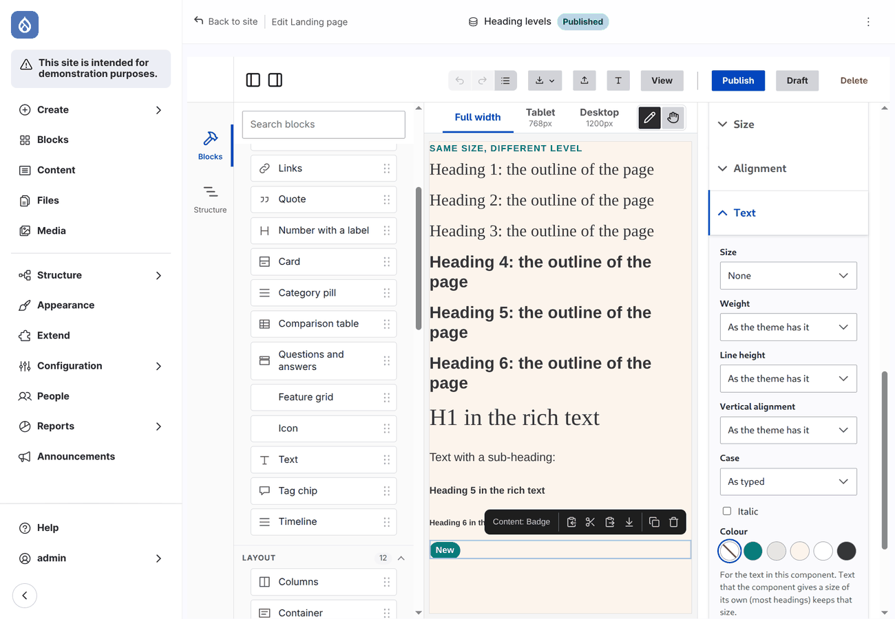
Text is inherited. The Text feature sets the look on the root element of the component; what is in it follows, except elements your CSS gives a size or colour of their own (most headings have a size). Use sizes relative to the parent (
em) in a component if its heading should follow.Background colour does not change the text colour. Choose a text colour with it (the Text feature), or give components a variant prop that sets a matching one.
Border and the size of a component. A border adds to the size of a component unless its CSS has
box-sizing: border-box. Its sides are logical, as the alignment: Start is the left in English, the right in Arabic. With rounded corners what is inside follows them (overflow: clip): the image at the top of a card is rounded too, and a pinned badge that sticks out of the component is cut at its edge.Components that wrap another one. The features are on the root element. A component that is a wrapper around a box of its own (a UI kit's card in a
<div>) shows a background or text colour only if its CSS lets the box inside take it:.my-wrapper[style*="background-color"] > * { background: transparent; }.Background image. Cover fills and crops, Fit shows the whole image, Stretch distorts it to the box, Original size does not scale. The small picture with a frame chooses which part shows (
background-position).Responsive background. With a responsive image style the image is not inline: it is set by media queries in the head of the page, on a
data-frame-editor-bgattribute. The queries are the breakpoints of the responsive image style, or for a style that usessizes, steps by the width of each image.
Images
- Image styles offered to editors are the
image_stylestoken. - Responsive image styles are rendered by Drupal exactly as configured: a
<picture>with a source per breakpoint, or an<img srcset sizes>. Define the breakpoints in your theme's<theme>.breakpoints.ymlas usual. A component opts in withx-builder-picture(Components). - For a media field of the page there is the field formatter Responsive image (added by the module, also on Manage display): the image of the media item with a responsive image style, lazy or eager loading, and a link to the page, the media item, the image file or a custom URL.
Breakpoints
<theme>.breakpoints.yml (Drupal's Breakpoint module) does three things here: responsive image styles are built on it, the editor's Preview offers one width per breakpoint, and the layout and style of a component can differ from each breakpoint that has a min-width on (Per breakpoint). A breakpoint with a min-width gives that width; one without gives a phone width (375px).
my_theme.mobile:  { label: Mobile,  mediaQuery: '',                          weight: 0, multipliers: [1x] }
my_theme.tablet:  { label: Tablet,  mediaQuery: 'all and (min-width: 48em)', weight: 1, multipliers: [1x] }
my_theme.desktop: { label: Desktop, mediaQuery: 'all and (min-width: 75em)', weight: 2, multipliers: [1x] }
A subtheme without the file uses the breakpoints of its base theme; Frame has mobile, tablet (48em) and desktop (75em). In SCSS they are @include frame.breakpoint(tablet), see Tokens in SCSS.
The preview is a real page in a frame of that width, so your media queries apply.
The canvas of the editor has tabs too: Full width and one per breakpoint (Tablet, Desktop). Choosing a breakpoint makes the canvas as wide as that breakpoint starts (768px for Tablet), and the same breakpoint is chosen in the tabs of the right column (All, Tablet, Desktop), which decide the breakpoint that a value you set is for. When the window is narrower than the canvas, it scrolls sideways. Your own media queries in the component's CSS follow the width of the canvas, so they apply there as they do on the page; the layout and style set per breakpoint in the editor follow the breakpoint that is chosen.
Rich text
Rich text props use the text formats of the site. The editor shows the CKEditor 5 toolbar of the format, and Drupal filters the text with that format on output. Style the result in the component (.rich-text p { … }), and decide per prop whether editors may switch format (x-builder-format pins one).
However the text is stored (the editor stores { value, format }; a story, a script or AI may give a plain string), it reaches the template as Drupal markup, never as escaped text. A text without a format, or with one that is gone, goes through the first format of the site that limits the tags (filter_html); only a site with no such format uses its plain text format, which escapes every tag. Scripts that store layouts should store { value, format } like the editor.
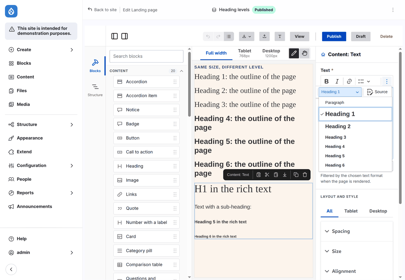
The Heading button of the toolbar offers the heading levels that the format allows. The frame_editor recipe gives Basic HTML Heading 1 to Heading 6; see Settings for the config action frameHeadings and for other formats. Keep the levels in order and use one Heading 1 per page.
Field labels
A Field block prints a field of the page with a formatter and a label position. Its Label style sets the size, weight, case, line height and colour of the label alone, from the same type scale and palette; the Text feature of the block applies to label and value together. The label style reaches the label as custom properties (--frame-editor-label-font-size, --frame-editor-label-color…), which a field template of your own can use too. Core's field template has no classes, so the editor wraps a field in .frame-editor-field and styles the label by position: bold; inline puts label and value on one line with a colon. If your theme has its own field template with .field__label, that styling is left alone. Override either in your theme's CSS:
.frame-editor-field--label-inline > div > div:first-child { font-weight: 400; text-transform: uppercase; }Right-to-left
Everything the editor prints is logical: margin-inline, text-align: start, positions by start and end. A page in a right-to-left language mirrors without separate values. Do the same in your component CSS (margin-inline-start, not margin-left).
What exists only in the editor
The editor adds a little CSS to the canvas, scoped to #frame-editor, and two attributes your CSS can see:
[data-frame-editor-slot] | the marker Drupal renders in a slot, where the editor mounts its drop zone |
[data-puck-dropzone] | the drop zone; the items of a slot are inside it |
| a 12px strip above and below the content of a slot | room to drop next to a child that has a slot of its own |
| a placeholder for an empty Image, field, view or block | so that it can be seen and selected |
None of it is on the published page. The only CSS of yours that needs to know about it is a slot that is laid out, see Layouts.
One limitation follows from where the editor runs: it is a page of your theme, so very broad rules in your global CSS (button { … }, label { … }, * { … }) also reach the editor's own controls. Scope such rules to your page markup (.page button) if the editor looks off.