
Placing components in Twig
This follows the standard Drupal SDC documentation. The component ID is <provider>:<folder name>; for a theme the provider is the theme machine name. The snippets below use the example subtheme frame_demo_umami, use your own subtheme's name.
include
{{ include('frame_demo_umami:pricing-table', {
  heading: 'Choose your membership'|t,
  currency: 'EUR',
  plans: [
    { name: 'Basic', monthly: 9, features: ['50 recipes'] },
    { name: 'Pro', monthly: 19, features: ['All recipes', 'Live classes'], highlight: true },
  ],
}, with_context = false) }}
or the tag form:
{% include 'frame_demo_umami:stats-counter' with { stats: stats } only %}Always pass only / with_context = false, otherwise the whole template context leaks into the component and its props.
embed (for slots)
{% embed 'frame_demo_umami:tab' with { title: 'Desserts' } %}
  {% block content %}<p>Tiramisu, the way the nonna makes it.</p>{% endblock %}
{% endembed %}
Render array (PHP)
$build['pricing'] = [
  '#type' => 'component',
  '#component' => 'frame_demo_umami:pricing-table',
  '#props' => [
    'heading' => 'Membership',
    'plans' => [['name' => 'Basic', 'monthly' => 9]],
  ],
];
With slots, and in a preprocess hook (this is what the theme does for the page title):
function frame_demo_preprocess_page_title(&$variables) {
  $title = $variables['title'];
  // Slots accept render arrays or scalars only, titles may be markup objects.
  if (!is_array($title) && !is_scalar($title)) {
    $title = ['#markup' => $title];
  }
  $variables['title'] = [
    '#type' => 'component',
    '#component' => 'frame_demo_umami:tab',
    '#props' => ['title' => 'Title'],
    '#slots' => ['content' => $title],
  ];
}
From a Views template
A view template can mount a component too, for example templates/views/views-view--gallery.html.twig in your subtheme, to show a view's rows as a gallery:
{% set classes = ['view', 'view-' ~ id|clean_class, 'view-id-' ~ id, 'view-display-id-' ~ display_id] %}
<div{{ attributes.addClass(classes) }}>
  {% include 'frame_demo_umami:gallery' with {
    heading: 'Photos'|t,
    images: images,
  } only %}
</div>
Build images in a preprocess function from the view's rows. For a component that fetches its own data from a view, see An interactive view: path('view.<view_id>.<display_id>') gives the REST URL including the language prefix, so a multilingual site keeps working.
A component as a form element
Since Drupal 11.4 #type => 'component' is also a form element, so an input made as a component (a switch, a rating, a colour swatch) can sit in any form:
$form['news'] = [
  '#type' => 'component',
  '#component' => 'frame_demo_umami:toggle',
  '#props' => ['label' => 'Send me the newsletter', 'checked' => TRUE],
  '#default_value' => '1',
  '#required' => FALSE,
  '#element_validate' => [[static::class, 'validateNews']],
];
The value is whatever the input sends under the name of the element. Rules:
- Supported:
#default_value,#value,#required,#element_validate. Not supported:#process,#after_build,#value_callback,#ajax. - Drupal gives the component the prop
form_statewithvalue.name(the name of the input) andvalue.required. The component must declare it in itsprops, or the props do not validate. In Twig:{% set name = form_state.value.name|default(null) %}. - Drupal does not put the default value in the component: pass what the input shows in
#props(checked,value).#default_valueis the value when nothing is sent. - An unchecked box sends nothing, and Drupal then uses
#default_value. Print a hidden input with the same name and value0before the checkbox, as Toggle does. A switched off toggle is"0", which is a value for#required: check it in#element_validateif it must be on. - Declare
form_statewithx-builder-widget: hidden. The Frame editor then shows no field for it (it never showsform_stateas a field). - A component that is only an input should say
thirdPartySettings.frame_editor.offer: false: it is not in the list of blocks, and a page that has one still shows it. - Outside a form there is no
form_state: print the same markup withoutnameandrequired, and disable the input, so the preview of the editor and of Storybook is harmless. In a story, give a sample:form_state: { value: { name: 'news', required: false } }.
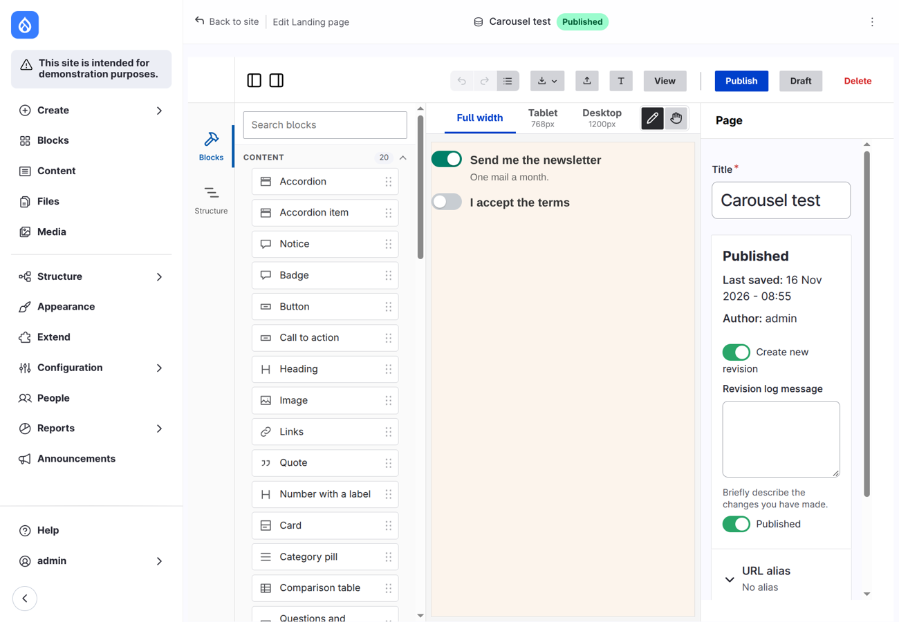
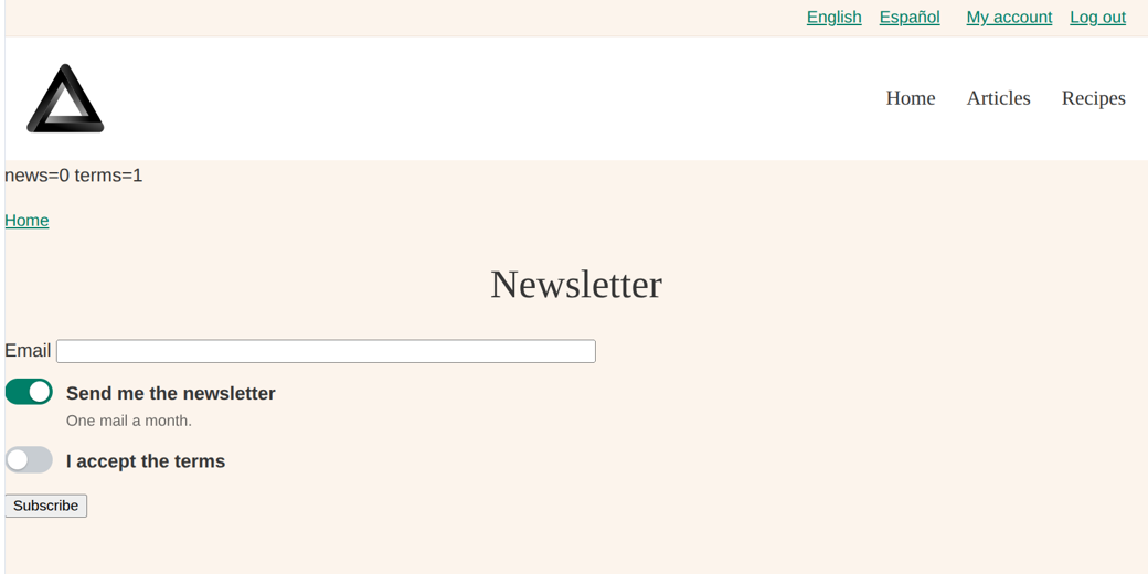
Frame Demo has the example: the component frame_demo_umami:toggle. Below: Toggle as a preview in the editor, then as the widget of a yes/no field on Manage form display, then in the node form.
As the widget of a field
The widget Component (frame_editor_component) of Frame Editor shows a field with such a component, on "Manage form display". It works for boolean, text, number and list fields. Choose the component (one that declares form_state) and the prop that gets the current value of the field (checked for Toggle). The label and the description of the field go to the props label and description when the component has them.
Other places
- Block / node / paragraph template: the same
include, with values from the template's variables. - Another theme or a module: use the provider that owns the component:
my_module:component,other_theme:component. - Storybook:
*.story.twigfiles useinclude('frame_demo_umami:...'), they are meant for a Storybook setup with a Drupal/Twig addon. The files are provided, Storybook itself is not configured here.