
Layout and style
What it does
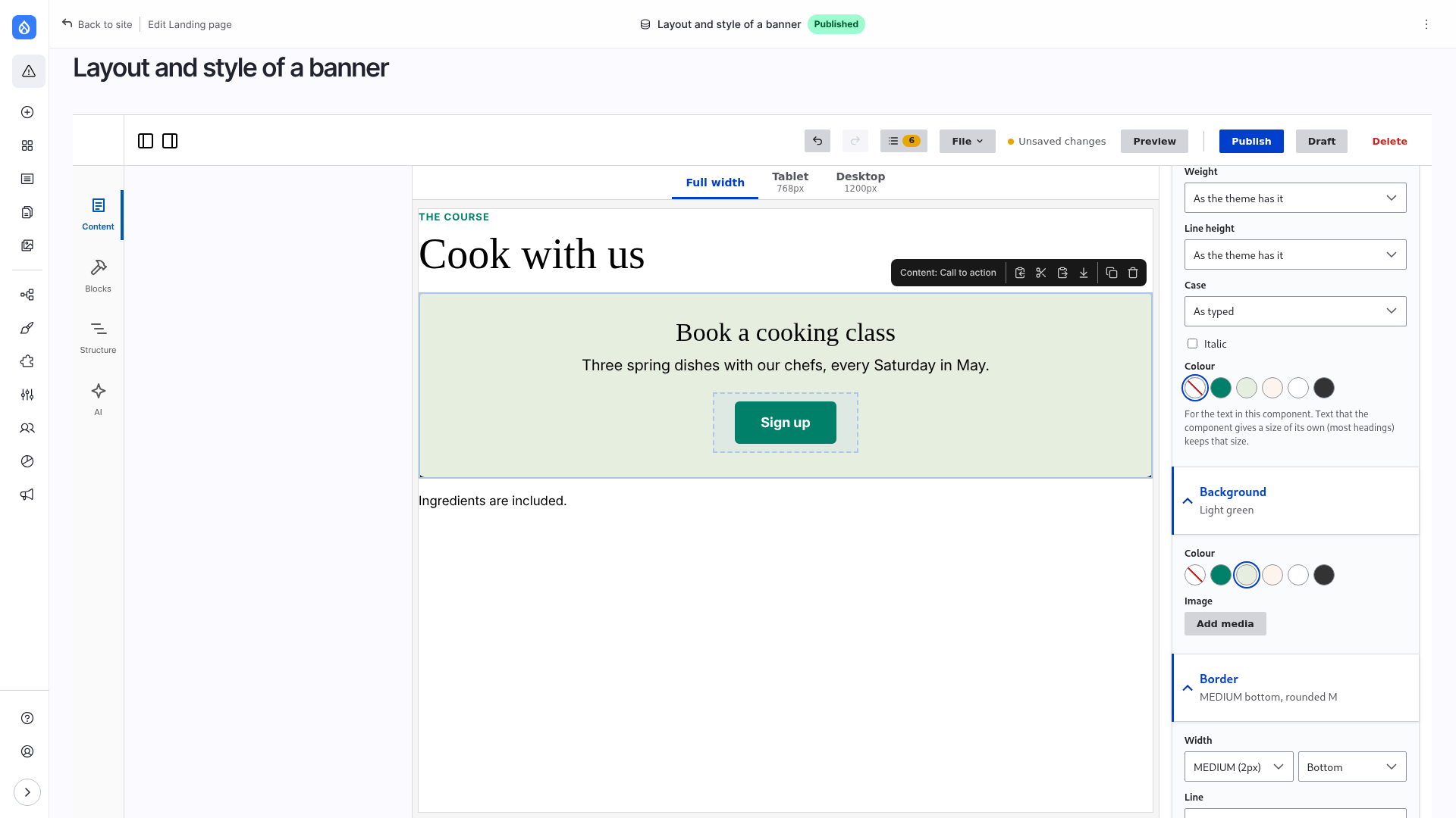
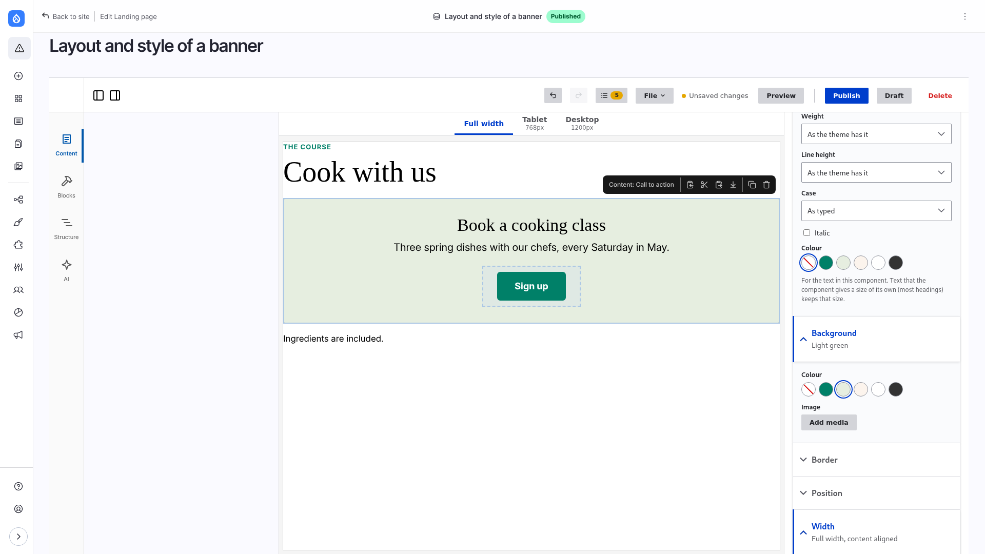
Every component, field, view and block has a Layout and style part in the right column, under its own fields. An editor sets there, from the values the theme declares:
| Section | Sets |
|---|---|
| Spacing | margin and padding: a step of the scale or a custom length; all sides, horizontal or vertical; margin Auto |
| Size | width and height, each at most, at least or exactly one of the theme's sizes or a custom length |
| Width | Content (default), Wide, Full width, or Full width, content aligned |
| Alignment | start, centre or end |
| Text | size from the type scale, weight, italic, case, line height, a colour of the palette |
| Background | a colour of the palette and/or an image, with how it fills the component and which part shows |
| Border | a width, a side, a style and a colour of the palette; rounded corners |
| Position | in the flow, placed in the free space of its spot, or pinned to a corner of its parent |
A section is folded while nothing is set in it. The component needs no code for any of this: the values are printed as inline styles on its root element.
Limitations
- There is no free colour and no free CSS: colours are the theme's palette, lengths are a step of a scale or a number with a unit (
12px,5%), checked before it is printed. - A theme or a component can switch any section off; then it is not shown.
- Alignment sets
text-align: it aligns text and inline content inside the component, not the component itself. - A Background colour does not change the text colour: choose one with Text.
- Text reaches what is inside the component, except elements the theme's CSS gives a size or colour of their own (most headings).
- Position is the same at every width; the other sections can differ per breakpoint.
- Width needs a size container around the page. Frame's page is one; a theme with its own page template must set
container-type: inline-sizeon a wrapper of its main part (Frame's is.page__body), not on the whole page, or100cqiis the width of the window. Keepposition: fixedparts (menus, banners) outside that wrapper. - A component that wraps a box of its own shows a background only if its CSS lets the inner box take it.
Width: wide, full and band
Width lets a component break out of the content column of the page:
- Wide: up to the theme's wide width (by default 1.2 times the content width).
- Full width: edge to edge.
- Full width, content aligned: the background goes to the edges, what is inside stays at the content width. A band.
It works in CSS only: .page__body is a size container and 100cqi is its width. Beside a sidebar it stays in its column. At a breakpoint, Content brings the component back to its place. The theme sets the two widths under uikit.layout.
Per breakpoint
Above the sections are tabs with All and the breakpoints of the theme that start at a width (Tablet, Desktop); the same tabs are at the top of the canvas. All is what the component has at every width. With a breakpoint chosen, the sections show and change what the component has from that width on: what is set there replaces the value of All, what is left empty keeps it. A section that has such values says so (differs from Tablet).
- Widths go up: set the phone's look under All and add what changes on wider screens.
- The canvas becomes as wide as the chosen breakpoint starts and shows its values. When the window is narrower, the canvas scrolls sideways.
- The choice is one for the whole editor: select another component and its sections are for the same breakpoint.
Position
| Kind | What it does |
|---|---|
| In the flow | the default: where its container puts it |
| Placed | one of nine places in the free space of its spot: top / middle / bottom and start / centre / end |
| Pinned | on a corner of the component it is in, over its content: badges, labels |
More in Layouts: Position.
What each section prints, and how a theme declares the values: Tokens, features and styling.