
Editing a component
What it does
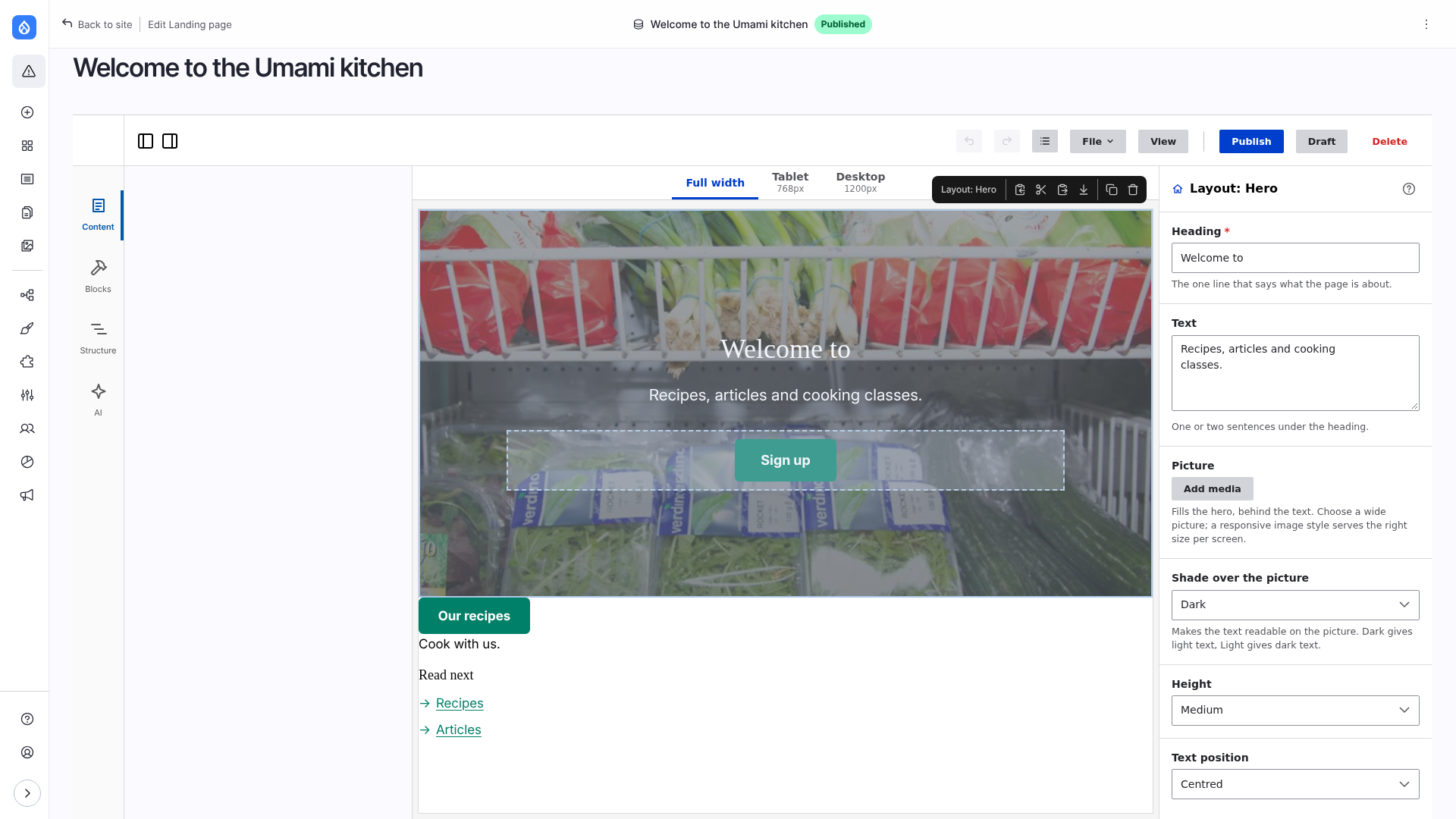
Select a component and the right column shows its fields. They are made from the props of its *.component.yml: a text prop is a text field, a list of choices is a select, an image is a pick from the media library, rich text is CKEditor 5 with a Drupal text format, a link is an autocomplete of the site's content. The canvas changes as you type. Under the fields are the Library and Preset boxes, then Layout and style.
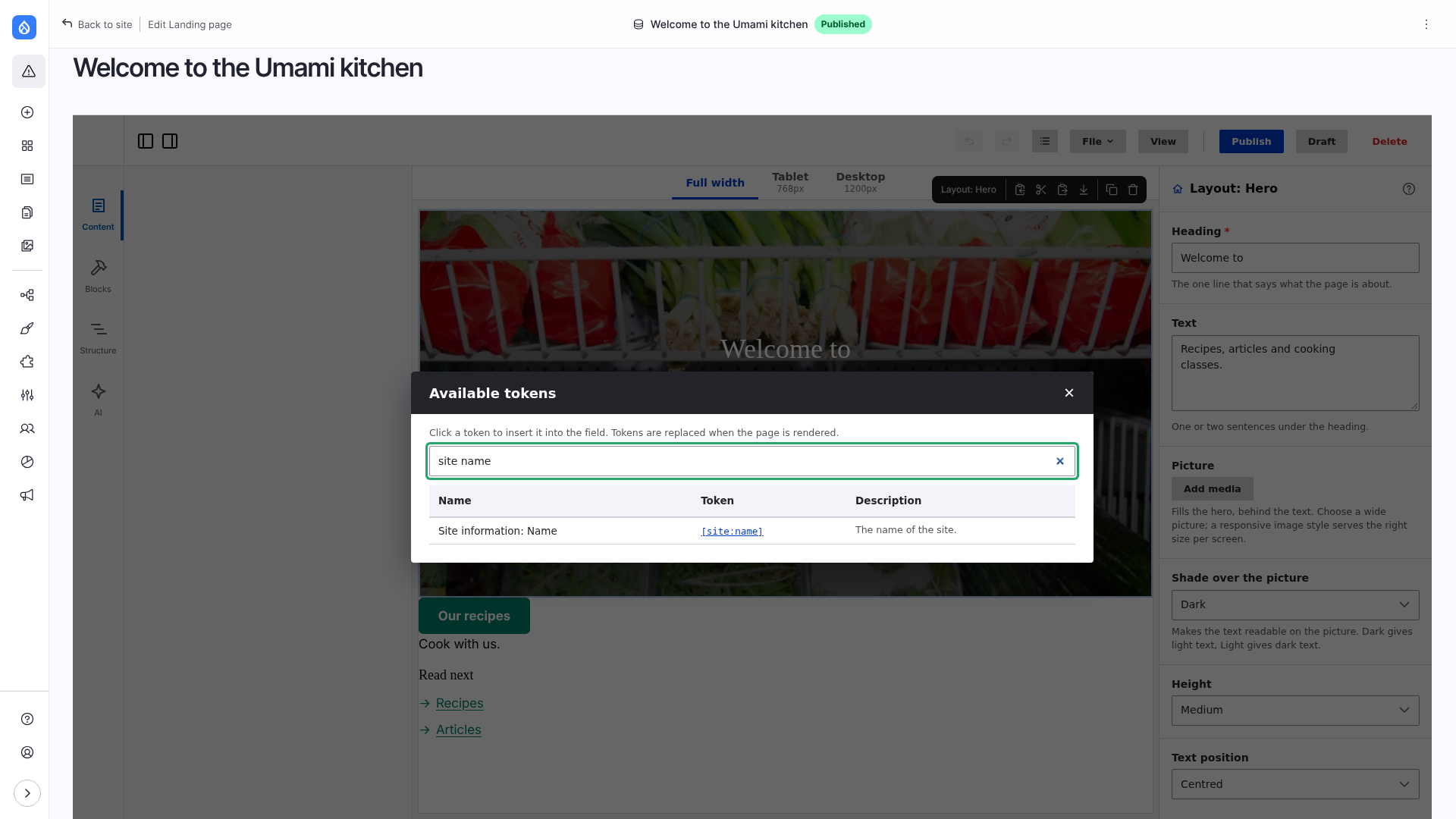
[ in a text field suggests tokens.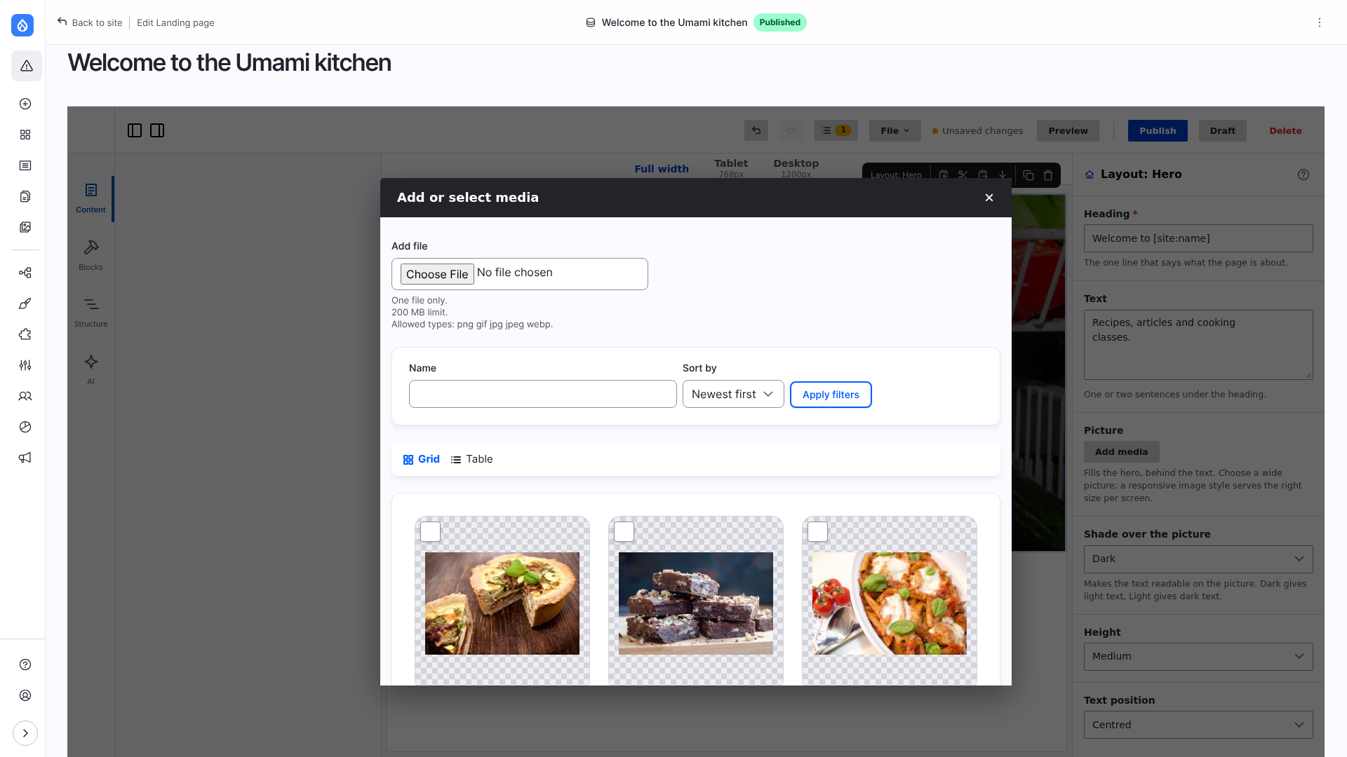
Limitations
- A prop whose schema the editor cannot read has no field: an
objectwithoutproperties, anarraywithoutitems, a prop that only points elsewhere ($ref), and lists or groups deeper than four levels. - Limits of the schema (
required,minLength,pattern…) are checked when the page is saved, not while typing. Text with a token in it is not measured. - Tokens are replaced when the page is rendered. A token with no value on this page leaves nothing. Tokens are not replaced in paragraph fields.
- A rich text prop offers only the text formats the user may use.
- A prop that points to content, a term or a user (
x-builder-widget: entity) is not offered to the AI assistant.
The fields
| A prop that is | Is edited with |
|---|---|
| text | a text field, with tokens |
a choice (enum) | a select; several choices: checkboxes |
| yes or no | a checkbox |
| a number | a number field |
| a link | text, or content of the site by title or by path (type /) |
| an image | the media library, an image style (image styles, responsive image styles, automatic), loading, link |
| rich text | CKEditor 5 with the toolbar of a Drupal text format |
| a length | a step of the theme's spacing scale, or a custom length |
| an icon | an icon picker |
| a colour | swatches of the theme's palette |
| content, a term or a user | an autocomplete by label, shown as a chip with Clear |
| a date, a time, an e-mail address | the browser's input for it |
| a list | a table of values: add, drag into order, remove |
| a group | the fields of its properties together |
The schema keywords for each are in Components for the editor.
- Help. The description of a prop is the help under its field. A ? at the end of the name of the component shows the help of the whole component.
- Required fields are marked; a page is not saved while one is empty, and the message names the component and the field.
- Tokens work in text, link and rich text fields: typing
[suggests them step by step. The T button of a text or link field (shown on hover and focus) lists every token, filtered by the words typed; the × button clears the field. Tokens of Drupal core, of the Token module and of other modules are offered, and replaced in the language of the page. - Links picked from the suggestions are stored as
entity:node/Nand printed as the URL of that page in the language of the page being viewed, so they need no translating. Up and down move through the suggestions, Enter or Tab takes one, Escape closes them. - Images come from the media library, with one of the image styles or responsive image styles the theme offers (see UI kit settings), or Responsive: automatic, a
srcsetmade of the image styles of the site. A prop can be shown only for some values of another withx-builder-show-when: { fit: [cover, contain] }. The images of an image field in a list take the same styles, see Fields with many values.