
Storybook stories as examples
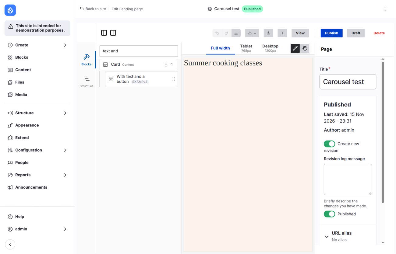
A component can come with stories: ready-made states of it, such as "a warning with a title" or "a card with a text and a button". Storybook shows them, and Frame offers them as examples in the Blocks panel. One piece of YAML serves both.
The same as a video.
What it does
Frame reads the stories that the Storybook addon for Drupal SDC reads. Open the arrow next to a component in the Blocks panel: its stories are listed with the tag example, with their name, and their description as a tooltip. Drag one onto the page. Frame adds the component with the values of the story, and fills its slots with the content of the story.
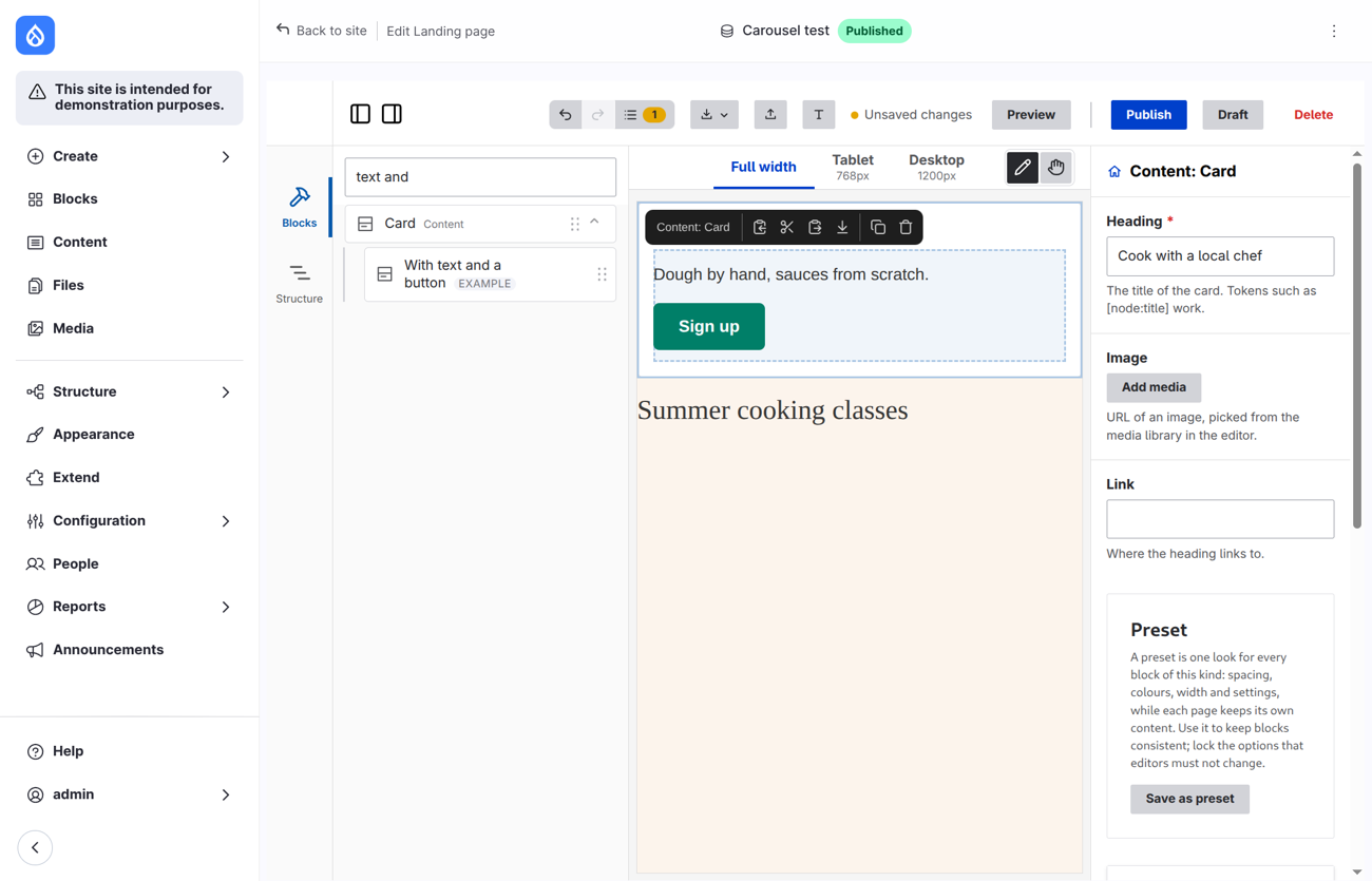
An example is a starting point. The block you get is an ordinary block: nothing links it to the story, and changing the story later does not change it.
Where a story lives
In the component.yml, under thirdPartySettings.sdcStorybook:
thirdPartySettings:
  sdcStorybook:
    disabledStories: [old]
    stories:
      with_button:
        name: With a button
        description: A card with a text and a button.
        props:
          heading: Cook with a local chef
        slots:
          content:
            - 'Dough by hand, sauces from scratch.'
            - type: component
              component: 'my_theme:button'
              props: { label: Sign up, url: /contact }
Or in a file of its own, {component}.{story}.story.yml, in the folder of the component or below it. It has the keys of one story, without the nesting:
# components/alert/stories/alert.success.story.yml
name: Success
props:
  tone: success
  text: '<p>See you on Saturday.</p>'
The key of a story is its key in stories, or the part of the file name between the component name and .story.yml. When both places have a story with the same key, the one in the component.yml is used. disabledStories hides stories by key; all hides every one. name is the label, description the tooltip. The other keys of a story (parameters, globals, library_wrapper) are for Storybook, and Frame ignores them.
What goes in a slot
A slot is a text, a node or a list of them. Frame maps the nodes that it has an equivalent for.
| Node | In Frame |
|---|---|
| a text | the text component, as a paragraph (a text that starts with < is HTML as it is) |
type: markup | the text component, with the markup |
type: element (html_tag) | the text component, with <tag attributes>value</tag>; only text inside, no scripts or event handlers |
type: component | the component, from the story named in story (by key or name), then its own props and slots; the rest starts as a new block does |
type: image, type: icon, nodes of your own | left out: Frame has no image from a URL, and the icon is a prop of a component |
Frame never stops for a story it cannot use. What it leaves out (a prop or slot the component does not have, a node it has no equivalent for, a component that is not available) is a warning in the log of the browser, Frame examples: ..., with the component and the story. frame check lists the same.
Default values
A new block, a story and a preview start from the same value of a prop, in the order of the Storybook addon:
- the value in the story,
defaultin the schema,- the first of
examplesin the schema.
Frame used the first example before default; if a component has both and you want the example, remove the default.
Examples, presets, the library and templates
| What it is | Linked afterwards | |
|---|---|---|
| Example | a story of a component: values and content, as a starting point | no |
| Preset | one look (styling) for the blocks of a kind | yes |
| Library | a block with its content, reused as it is | yes |
| Template | a whole page that new pages start from | no |
Stories are not presets: a preset is styling only, and the stories are content.
One YAML for Storybook and Frame
The component files of a theme can serve both tools:
- Props and slots (the schema,
default,examples,variants) are read by both. - Stories are written once and used by both: Storybook shows them, Frame offers them as examples.
- Design tokens in
{theme}.tokens.yml, icons in{theme}.icons.ymlandhtml_cva()in a template are features of Drupal core. The addon draws them in Storybook and Drupal draws them on the page, in Frame too; there is nothing to repeat. See Design tokens, Icons and Variants withhtml_cva(). - What only Frame reads (
x-builder-*,thirdPartySettings.frame_editor) is ignored by Storybook, and what only Storybook reads (parameters,globals,library_wrapper,tags) is ignored by Frame. Both live underthirdPartySettings, which Drupal leaves to other tools.
Check the YAML
node web/themes/contrib/frame/bin/frame.mjs check            # in your theme folder
node web/themes/contrib/frame/bin/frame.mjs check components/card --strict
frame check reads every *.component.yml and *.story.yml below the folder (or the file) and prints what it finds, one line each: the file, where in it, and what to change. It checks:
- the file against the schema for component files of Drupal core (the one in the
core/folder around the theme, else a copy that comes with Frame), and that prop and slot names can be Twig names; - the keys Frame reads:
x-builder-*andthirdPartySettings.frame_editor, with a hint for a misspelled one ("did you meanx-builder-widget?"), widgets,x-builder-show-when,accepts, adefaultthat the type or theenumdoes not allow; - the stories: their keys, props and slots against the component, and their nodes.
The output for a card with a misspelled key, a wrong default, and stories that do not fit:
$ frame check components
warning components/card/card.component.yml: props.properties.heading.x-builder-widgit is not a key Frame reads: did you mean "x-builder-widget"?
warning components/card/card.component.yml: props.properties.tone.default is not one of the values the prop allows (info, warning).
warning components/card/card.component.yml: thirdPartySettings.sdcStorybook.stories.warn.props.title is not a prop of the component: Frame and Storybook ignore it.
warning components/card/card.component.yml: thirdPartySettings.sdcStorybook.stories.warn.slots.content[0] has the type "image": Storybook draws it, Frame leaves it out of an example.
warning components/card/stories/card.broken.story.yml: nam is not a key of a story: did you mean "name"?

0 errors, 5 warnings.
An error means Drupal or Frame cannot use the file; the command ends with exit code 1. A warning means it works but probably not as meant; --strict makes it an error too. Add it to the scripts of your theme ("check": "node ../../contrib/frame/bin/frame.mjs check") or to the CI.
What Frame does not take from the addon
| Feature of the addon | In Frame |
|---|---|
Stories in the YAML and in *.story.yml | examples |
Story nodes component, element, markup, a text | mapped |
Story nodes image, icon, custom nodes | left out with a warning |
disabledStories | honoured |
Defaults: story, default, examples | the same order |
| Mock data from the schema (json-schema-faker) | no: Frame starts a prop empty without default or examples; give the props that matter one |
validate | frame check |
parameters, globals, tags, library_wrapper, Controls, the sidebar | Storybook only |
Namespaces, dependencyMap, libraries from a CDN | Storybook only: Drupal loads the libraries on a real page |
Icon API, design tokens, html_cva(), form_state | features of Drupal; used as they are, not by the stories |
Limitations
- Only the components of the theme and its base themes have examples, as only those are in the Blocks panel.
- A component that the theme replaces (
replaces) is offered as the replacement, with the stories of the replacement only. Copy the stories into it when you replace one. - A story that names a component that is not offered by the theme is left out.
- Examples of a field, a view or a block of Drupal do not exist.