
Building a page
What it does
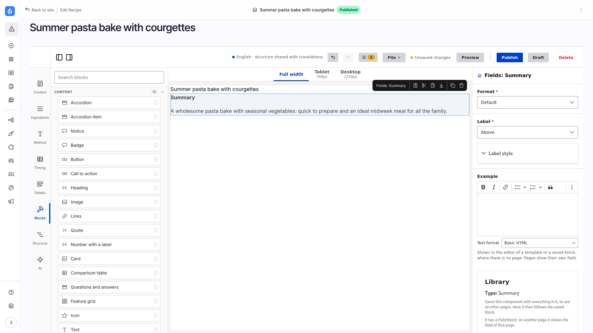
The edit page of a content type that uses Frame is the editor. Drag blocks from the left onto the canvas, select one to change it on the right, and save with Publish or Draft. The canvas shows the HTML Drupal renders for each component, so it looks as the page will.
Edit and Interact
The switch at the right end of the bar of widths above the canvas (two icon buttons, a pencil and a pointing hand; their titles say what they do) has two modes. Edit selects and moves components. In Interact the components work as on the page: open an accordion, switch a tab, open a modal, try a React component. Nothing is selected while interacting; Edit brings the selection back. Ctrl or Cmd + I switches too. Themes can style the canvas for each mode, see The canvas.
A component that draws nothing in Edit mode (a closed dialog, a visually hidden link, an empty separator, a bar fixed to the window) shows a dashed placeholder with its name, so a click can select it. The placeholder is only in the editor; on the page the component is as it is, and in Interact mode there is none.
Limitations
- The editor works only when the default theme is the Frame theme or one of its subthemes.
- A new page needs a title before anything is stored: the first save makes the page (see A new page).
- Interactive (React) components that have a slot are shown without their behaviour in the editor, so their slot stays editable.
- Very broad rules in the theme's global CSS (
button { … },* { … }) also reach the controls of the editor, which is a page of the theme. Scope such rules to the page markup (.page button). - Without core's HTMX (before Drupal 11.2) the settings of a formatter or of a Drupal block open in a dialog with an Apply button.
Switch it on
Switch the editor on for a content type: Structure → Content types → (type) → Frame. It has no permission of its own: who may edit a page of that type builds it, and who may create one starts it in the editor. The module adds a ready content type, Landing page.
- Edit is the editor.
/node/N/editopens it; other content types keep the normal form. - The full page is the layout. Once a page has a layout, its full view shows only that layout. Fields appear where an editor places them. Teasers and other view modes keep their display.
The screen
| Where | What |
|---|---|
| Left: Content, Menu | The fields of the page and its menu settings, Drupal's node form. See Content and page settings. |
| Left: your field groups | With the Field Group module, each top-level group of the form is a panel. See Field groups. |
| Left: Blocks | What can be placed, by group. See The Blocks panel. |
| Left: Structure | The tree of the layout. See Structure. |
| Left: AI | With the module Frame Editor AI: a chat that composes the page. See AI assistant. |
| Right | The selected component: its fields, then Layout and style. With nothing selected: the page settings. |
| Top | Undo, redo and History, Export, Import (export and import) and Template (save as template), Preview (or View when nothing is unsaved), Publish, Draft, Delete. |
Links inside the forms of the editor and inside the preview (help links of a field, links of the page) open in a new tab, so the editor keeps its place.
The Blocks panel
What can be placed, by group:
- Components of your theme and its base themes, in the groups of their
*.component.yml. Each prop is a field, each slot takes other components. See Editing a component. - The base theme's set: Hero, Section, Container, Heading, Text, Image, Button, Card, Quote, Accordion, Call to action and more. See Components of the base theme and Layouts.
- Fields of the page and Drupal Blocks. See Fields and Drupal blocks.
- Views with a display of the type Component. See Views.
- Paragraphs, with the Paragraphs module. See Paragraphs.
- Library: saved blocks. See Library. Presets, theme presets and variants of a component are in a group that folds under it (the arrow on its row). See Presets and Variants.
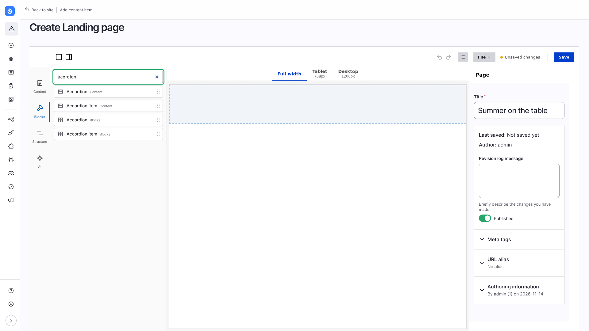
The search at the top forgives typos ("acordion" finds Accordion) and also finds saved blocks of the library, by name and by the component they are made of. It looks in the name, the group and what a block is made of, not in its description; a typo is forgiven in words of four letters or more.
Drag and drop
- Drop into a slot by dragging a block onto it. An empty slot shows as a dashed area.
- Drop next to a component that has a slot of its own by aiming at the gap between items, or at the strip at the top or bottom of the container. A drop on the component goes into it.
- Reorder by dragging on the canvas or in the Structure panel.
- The action bar of a selected component has Copy, Cut, Paste, Paste after, Duplicate and Delete. See Copy and paste.
An empty page shows a hint in the middle of the canvas: drag blocks from the left, or start from one of the page templates of its content type.
A new page
The add page of such a content type is the editor too. The title goes in the page settings (on the right, with nothing selected). Components can be added at once; nothing is stored until the first Save, which makes the page as a draft. Leaving before that leaves nothing behind. Required fields other than the title are checked when the page is saved or published, as on the edit page.
Unsaved changes
While you edit, nothing is saved to the page. Changes to the layout and to the forms are kept per user in the background, so the canvas follows what you type, a reload brings everything back, and Preview shows the page with them. Publish and Draft save. How it works: Architecture: the editor.