Theming
Fieldset
Section titled “Fieldset”The element renders as a fieldset with a legend. The legend holds the #title. Screen readers announce it as the name of the group.
CSS classes
Section titled “CSS classes”Use these classes to restyle the element.
| Class | Where |
|---|---|
element-multiple |
The wrapper of the element, which is also the container the layout follows. It has a stable data-drupal-selector, the id of the element plus -table. |
element-multiple-table |
The div around the table. |
element-multiple-table-responsive |
Added to that div for composite elements. |
element-multiple-table--header-hidden |
Added to that div when the header holds no visible text. The header stays in the markup for screen readers and takes no space on screen. |
element-multiple-table--handle |
The drag handle cell. |
element-multiple-table--weight |
The weight cell. |
element-multiple-table--operations |
The cell with the row buttons. |
element-multiple-table--<child> |
The header cell of a child, for example element-multiple-table--first_name. |
element-multiple-sort-weight |
The weight input. |
element-multiple-operation |
The add and remove buttons of a row. |
element-multiple-operation--add |
The button that adds a row after this one. |
element-multiple-operation--remove |
The button that removes this row. |
element-multiple-add |
The div with the “Add more” control. |
element-multiple-table--no-items-message |
The message shown when there are no rows. |
Header cells also get a class made of the table id and the child name.
/* Give the first column more room. */.element-multiple-table .element-multiple-table--first_name { width: 40%;}Add your own classes with #table_wrapper_attributes. See Custom attributes and labels.
Custom properties
Section titled “Custom properties”The colors, sizes and spacing are CSS custom properties. Override them on .element-multiple, in your theme or in a rule of your own. The module declares them with :where(), so any rule of yours wins whatever its specificity.
.element-multiple { --em-operation-color: rebeccapurple; --em-operation-size: 2rem; --em-gap: 1rem;}| Property | Default | What it sets |
|---|---|---|
--em-operation-color |
currentcolor |
The color of the add and remove icons. |
--em-operation-hover-color |
var(--em-operation-color) |
The color of an icon under the pointer. |
--em-focus-color |
currentcolor |
The color of the focus ring of an operation button. |
--em-border-color |
color-mix(in srgb, currentcolor 20%, transparent) |
The line between stacked rows. |
--em-operation-size |
1.5rem |
The width and height of an operation button. |
--em-operation-size-narrow |
2.75rem |
The size of an operation button in a narrow container, big enough for a finger. |
--em-handle-size |
1.625rem |
The minimum width of the drag handle cell. |
--em-weight-input-size |
4em |
The width of the weight input. |
--em-datetime-input-size |
12em |
The width of the text inputs of a date and time. |
--em-focus-width |
2px |
The width of the focus ring. |
--em-focus-offset |
2px |
The space between a button and its focus ring. |
--em-gap |
0.5rem |
The space between buttons, between the parts of the “Add more” control and between stacked rows. |
--em-field-gap |
0.2em |
The space between the form items of one cell. |
--em-cell-padding-block |
0.5rem |
The vertical padding of a stacked cell. |
--em-cell-padding-inline |
0.5rem |
The horizontal padding of a stacked cell and of the handle. |
--em-transition-duration |
150ms |
The duration of the motion of a button. It is 0s when the user asks for reduced motion. |
Narrow containers
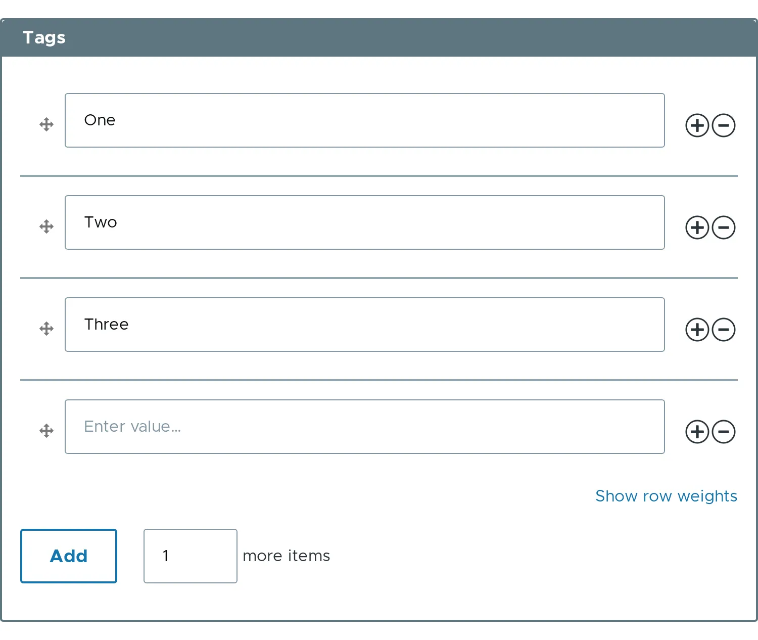
Section titled “Narrow containers”The layout follows the width of the wrapper of the element, not the width of the screen. The wrapper is a size container, so the same element stacks in a sidebar of a wide page and keeps its columns in the main column.
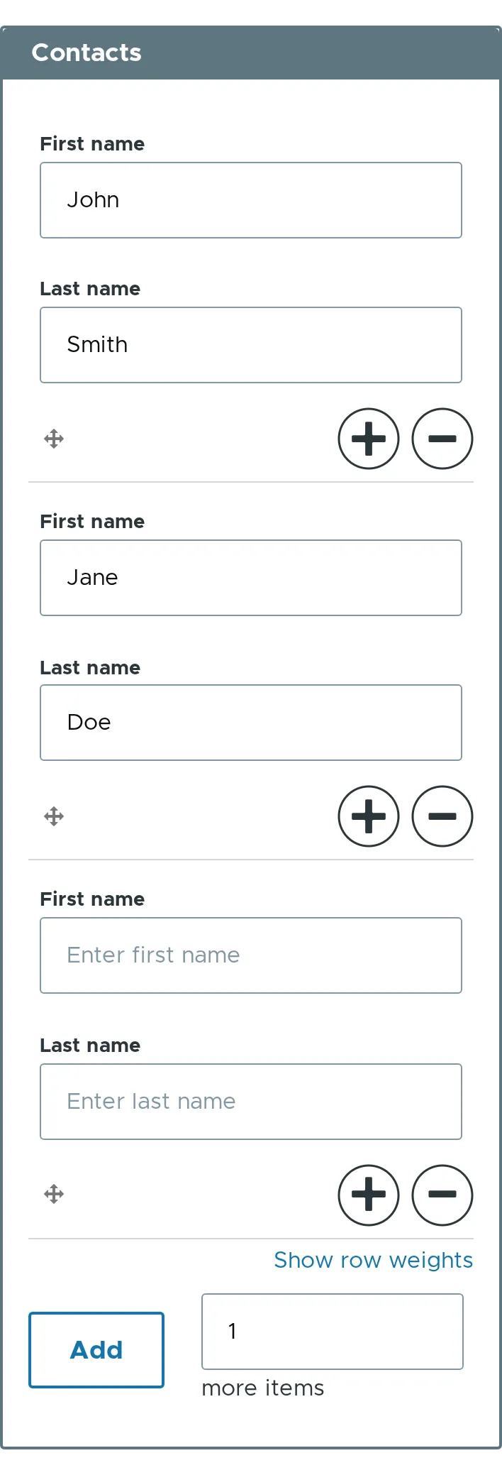
When the container is narrower than 36rem, a composite element stacks its cells. The header is hidden, and each child shows its label. The handle and the add and remove buttons share the last line of each row, and the buttons grow to --em-operation-size-narrow. A person can add, remove and reorder rows on a phone and in a sidebar. A single element keeps its table, with the handle, the field and the buttons on one line.
The width of 36rem is fixed, because a container query cannot read a custom property. To change it, copy the rules of the @container element-multiple block of the stylesheet into your theme with your own width.
A size container takes no width from its content. Put the element in a block, a grid track or a flex item that has a width, and not in a table cell or an inline block that sizes itself to its content.
Buttons, motion and color modes
Section titled “Buttons, motion and color modes”- The add and remove buttons are native
buttonelements. Each holds its label as visually hidden text, so screen readers read “Remove item 2”, and the icon is drawn by the stylesheet in the text color. They are still the submit elements of the form, with the same names and AJAX settings. :focus-visibleshows a focus ring on the buttons for the keyboard and not for the mouse.- With
prefers-reduced-motion: reduce, the buttons do not animate. - With
forced-colors: active, the icons take the system colorsButtonText,HighlightandGrayText. - The stylesheet uses logical properties, so a right to left page needs no extra rule.
- The module adds one library,
element_multiple/element.element_multiple. Override its CSS in your theme withlibraries-overrideorlibraries-extend. - The module does not ship a Twig template for the table.