Property Panel
The Property Panel is the single panel on the right side of the modeler. It provides all the tools needed to configure the selected element, and it can also switch into Review flow mode to inspect past executions and run live tests.
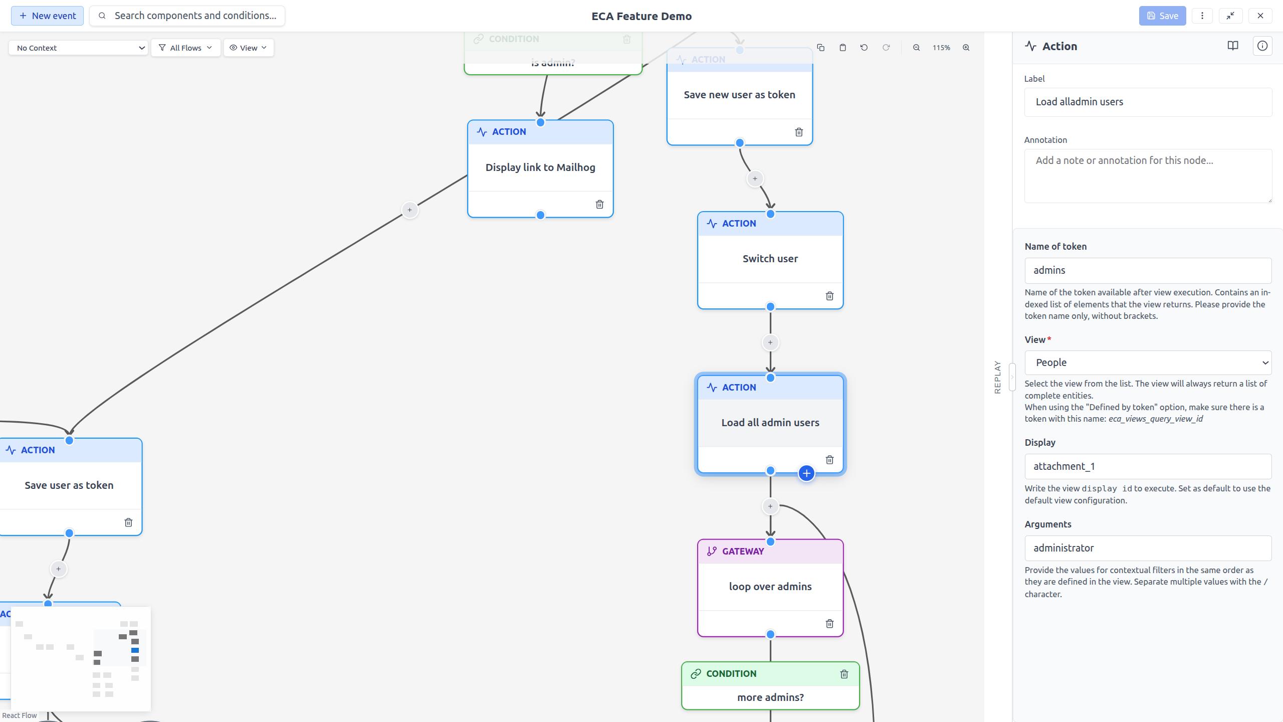
Properties and Review flow: two coexisting views
The panel has two views:
- Properties view shows the configuration of the currently-selected canvas component (any node or edge). Its header shows a context label on the left and a Review flow button on the right.
- Review flow view shows execution replay and live testing for the event the session is linked to. Its header holds exactly one control: a Back button (a left arrow with the label Back) that returns to the Properties view.
You can switch back and forth freely without losing the replay session — the current step, selected execution entry, and the running listener are all kept.
Alt+Shift+R (Option+Shift+R on macOS) toggles between the two views from
the keyboard. See Keyboard Shortcuts.
Starting a review session
When you select an event node (and the model is saved with replay or test capability), the Properties header shows a Review flow button. Clicking it starts a review session for that event: the modeler starts listening for its executions and loads its history at the same time (a live session). See Review flow mode.
Switching while a session is active
Once a session is active, the Review flow button is available from any selected component — so you can inspect a different node's properties and jump back to the running replay at any time. From the Review view, the Back button returns to the currently-selected component's properties while the session keeps running.
Walking replay steps
Stepping through a replay (auto-play or manual) selects each step's component on the canvas. The Properties view updates in the background to match, but the panel stays in the Review view — step navigation never kicks you out of the replay.
Unsaved changes
If you click Review flow to start a session while the model has unsaved changes, a confirmation dialog appears: "This model has unsaved changes. Save before reviewing the flow." Choose Save and review flow to save first and then start the session, or Cancel to keep editing.
Single element selection
When a single node or edge is selected, the Property Panel shows:
Label
The display name of the element. Click the label to edit it inline.
Configuration form
A dynamic form generated by the backend, specific to the selected component's plugin. Form fields vary depending on the component type and may include:
- Text fields: For string values.
- Select lists: For choosing from predefined options.
- Checkboxes: For boolean settings.
- Number fields: For numeric values.
- Text areas: For multi-line text.
Token support
Some configuration fields accept tokens -- dynamic values from the
workflow execution context. In a token-supporting field you can type
[ to open a categorized token picker and insert a token from its step
data, global, and template categories. See
Replay & Testing > Tokens for details.
Annotation
An optional text note that documents what this element does.
Info popup
Click the i button in the panel header to view metadata about the selected element, including:
- Component ID
- Plugin ID
- Provider module
- Component type
- Documentation link (if available)
Replay data
When replay data is available for the model, an event node's Property Panel includes a Load replay data button. Clicking it fetches execution history for that event. See Replay & Testing for details.
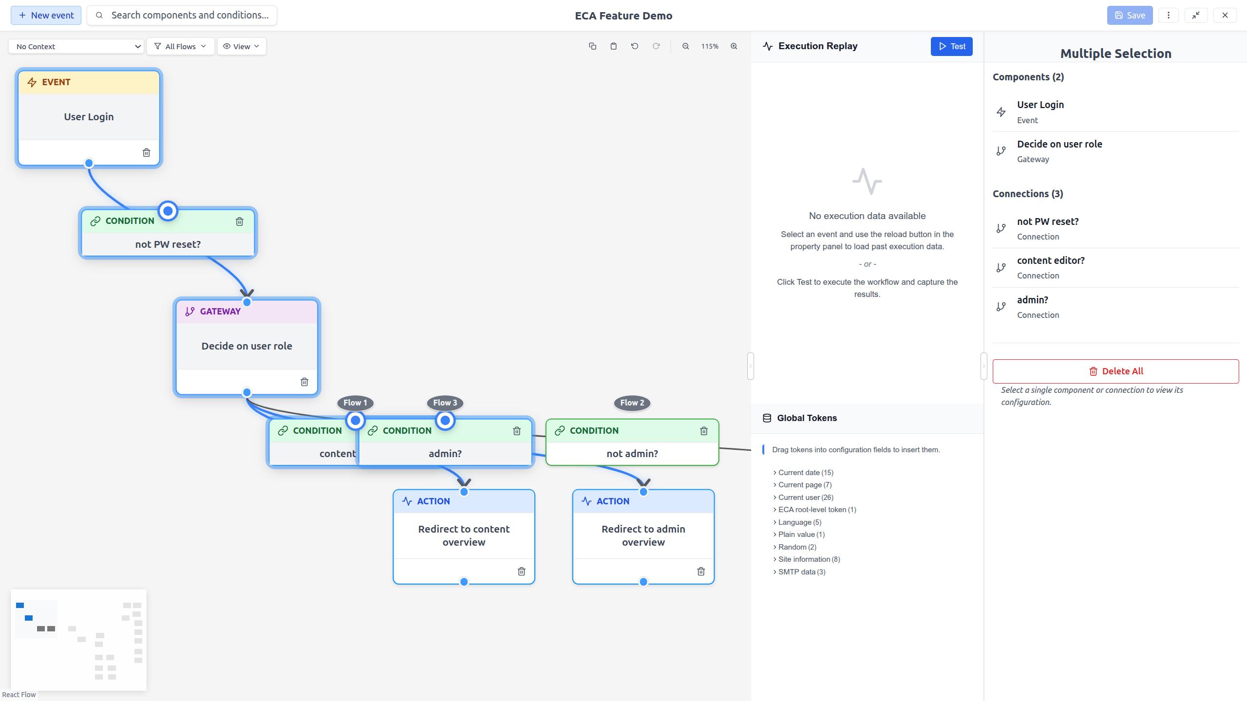
Multi-selection
When multiple elements are selected (using Shift+click or box selection), the Property Panel shows a Multi-Selection Panel with:
- Selection summary: Count of selected nodes and edges.
- Delete all: A danger-styled button that deletes all selected elements after a confirmation dialog.
Panel resizing
Drag the left edge of the Property Panel to resize it. This gives you more space for long configuration forms.