Interface Overview
The Modeler uses a two-panel layout designed for efficient workflow editing: a Canvas on the left and a single, unified Property Panel on the right. Each panel has a specific role and they work together to provide a seamless experience.
Unified right-hand panel
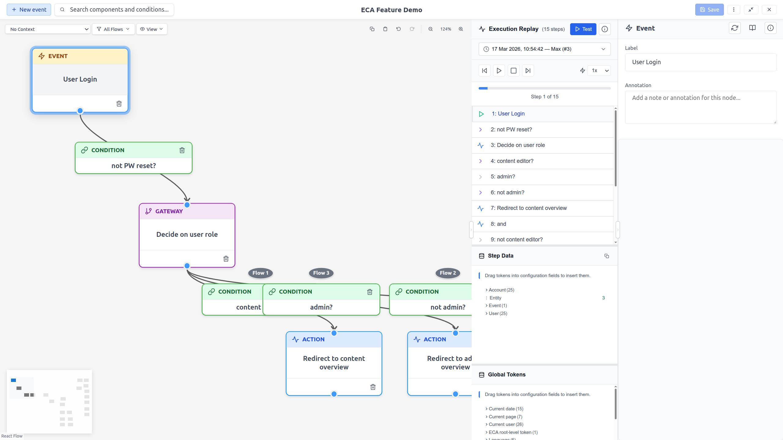
The right-hand panel hosts two coexisting views — Properties (the
selected component's configuration) and Review flow (past executions,
live testing, and step data). The Properties header shows a context label
plus a Review flow button; the Review header holds a single Back
button that returns to Properties. Alt+Shift+R (Option+Shift+R on
macOS) toggles the two views from the keyboard. Switching between them
keeps the replay session running. There is no longer a separate replay
column.
Layout
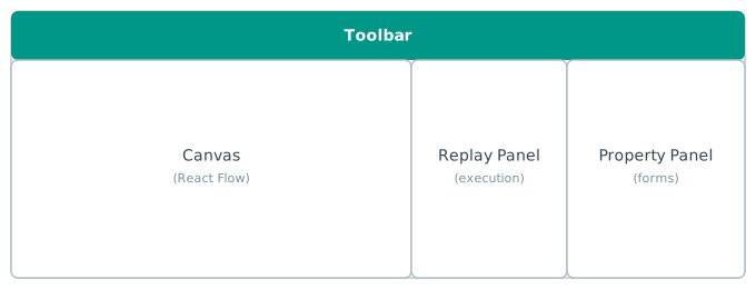
The panels
Canvas (center)
The Canvas is the main editing area where you build your workflow visually. It is powered by React Flow and provides:
- Node placement: Use the toolbar or quick-add buttons to place components.
- Edge connections: Click an output port and drag to an input port to create connections.
- Panning & zooming: Scroll to pan; Ctrl+wheel to zoom (Figma-like gestures).
- Selection: Click to select, Shift+click for multi-select, drag on the background for box selection.
- Snap to grid: Nodes snap to a 20px grid for clean alignment.
Property Panel (right)
The unified Property Panel appears on the right. By default it shows the properties of the selected node or edge; selecting an event node adds a Review flow button that switches into Review flow mode.
Properties — configure the selected node or edge:
- Label editing: Change the display name of any element.
- Configuration form: Dynamic form fields specific to the selected component.
- Annotation: Add a documentation note to any element.
- Component info: View metadata like plugin ID, provider, and documentation links.
[token picker: Type[in a token-supporting field to insert tokens.
Review flow mode — inspect and test execution (replaces the old replay column):
- Start from an event node: Click Review flow; the live listener starts and history loads automatically.
- Step through: Navigate execution steps one by one to see which path was taken.
- Token inspection: Select a step to see the data (tokens) available at that point, expanded inline underneath the step.
- Live testing: Observe a triggered execution and see results immediately.
- Switch views: The Back button returns to the selected component's properties while the replay session keeps running.
Learn more about the Property Panel · Review flow mode
Toolbars
The modeler has two toolbars that work together:
The Main Toolbar runs across the top and provides global actions:
- Quick-add event: Add a new event node.
- Search: Inline search bar (focus with
Ctrl+F). - Model title: Shows the model name with an unsaved-changes indicator.
- Save: Save the current model.
- Kebab menu: Access model settings, export, and dark mode.
- View mode: Toggle between fullscreen and restored display.
The Canvas Toolbar is a semi-transparent bar on the canvas surface:
- Context selector: Filter available components by workflow context.
- Flow filter: Show or hide individual flows when a model has multiple events.
- View menu: Fit view and auto layout.
- Copy/Paste: Clipboard operations for selected elements.
- Undo/Redo: Step back and forward through editing history.
- Zoom controls: Zoom in, zoom out, and see the current zoom level.
Panel resizing
The Property Panel can be resized by dragging its edge. This lets you adjust the layout to focus on the canvas or on configuration, depending on your current task.
Responsive behavior
The modeler is designed to work in full-screen browser windows. For the best experience, use a screen width of at least 1280px. Panels will adapt to available space, and touch targets are sized for touch devices (minimum 44x44px).
The Main Toolbar adapts to the available screen width. See Toolbar for details on responsive behavior.
The modeler also supports View Modes -- you can switch between fullscreen and a resizable floating window.