Code Components - Concepts
Code Components use props and slots to define how they receive data and how other components can be placed inside them.
Props and slots can be managed in the Canvas UI. When you work with a local codebase, the same definitions live in component metadata.
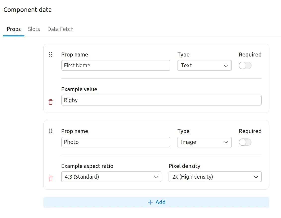
Props allow the component to define inputs when an instance of it is used on a page. Each prop can specify its type, whether it is required, and provide an example value.
In the Canvas UI, prop definitions appear in the Component Data pane.
In a local codebase, prop definitions live in component.yml under props. See
prop metadata for the
supported schema types.
Props are automatically converted to camelCase when passed as parameters to the Code Component.
const Hello = ({ firstName }) => {  return <div className="text-3xl">Hello, {firstName}!</div>;};
export default Hello;
Slots allow you to place other Code Components, or any other Drupal Canvas provided component, inside your component.
In the Canvas UI, slot definitions also appear in the Component Data pane.
In a local codebase, slot definitions live in component.yml under slots. See
slot metadata for the
local metadata shape.
const Jumbotron = ({ header, buttonFooter }) => {  return (    <section>      <div>{header}</div>      <div>        <button>          <a href="#">CTA Button</a>        </button>        {buttonFooter}      </div>    </section>  );};
export default Jumbotron;
Like props, slot names are camelCased when passed as parameters to the component code.
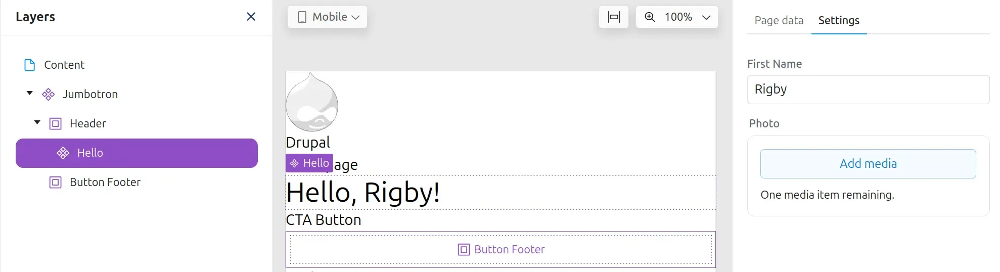
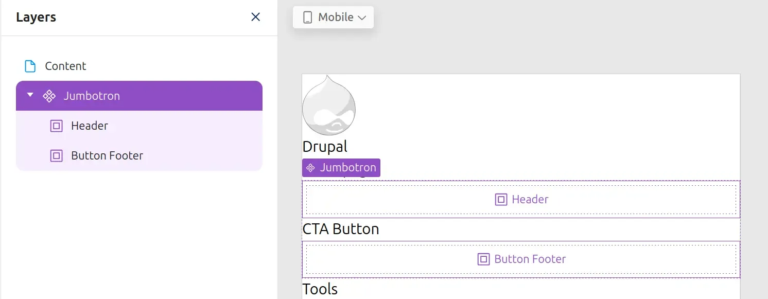
Once a slot has been added to a component, saved, and added to a page, the slot becomes visible as a place where other components can be added.
In the page-building UI, saved slots appear in the Layers panel and the page preview as places where components can be dropped.
Components can now be added to the slot by dragging them in from the Library. When a component is added to the slot, you can configure its props in the Settings panel on the right side.
After a component is placed in a slot, Canvas shows the nested component in Layers and lets you configure its props in the Settings panel.