SDC components - Props
Props allow SDC components to define configurable inputs that users can configure in the Canvas interface. Each prop specifies its type, validation rules, and provides example values.
Props can be used to:
- Insert content (text, images, etc.)
- Configure component appearance (colors, alignment, state)
- Control component behavior (animations, interactions)
Canvas automatically generates a form based on the props.
Prop types and examples
Section titled “Prop types and examples”String
Section titled “String”Basic text input for short text content.
Schema Definition:
title: type: string title: 'Component title' examples: ['Hello World']Twig Usage:
<h2>{{ title }}</h2>String with HTML
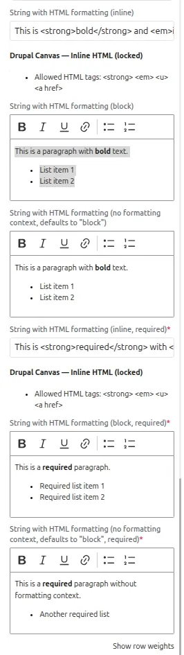
Section titled “String with HTML”Rich text editor for formatted content with HTML markup.
Schema Definition:
content: type: string title: 'Rich text content' contentMediaType: text/html x-formatting-context: block examples: ['<p>This is <strong>formatted</strong> text</p>']Twig Usage:
<div class="content"> {{ formatted_content }}</div>Textarea
Section titled “Textarea”Textarea input for longer text content that spans multiple lines.
Schema Definition:
description: type: string title: 'Description' $ref: json-schema-definitions://canvas.module/textarea examples: ['A longer description\nthat spans multiple lines']Twig Usage:
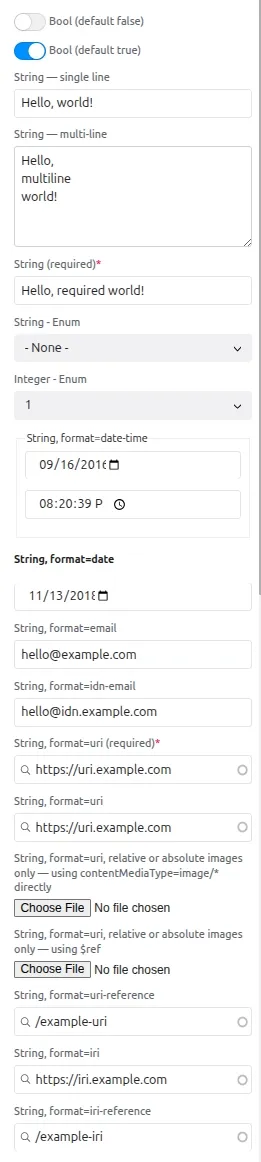
<div class="description"> {{ description|nl2br }}</div>Boolean
Section titled “Boolean”Checkbox input for true/false values.
Schema Definition:
show_image: type: boolean title: 'Show image' examples: [true]Twig Usage:
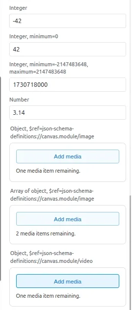
{% if show_image %} <div class="image-section">...</div>{% endif %}Integer
Section titled “Integer”Numeric input with optional validation constraints.
Schema Definition:
spacing: type: integer title: 'Spacing in pixels' minimum: 0 examples: [20]Twig Usage:
<div style="padding-top: {{ spacing }}px"> Content with spacing</div>URL input for internal or external links. Choose the format based on what you accept:
format: uri— Absolute URLs only. The value must include a scheme (e.g.https://example.com,internal:/node/1). Use when the link must always be a full URI.format: uri-reference— Absolute or relative. The value may be a full URI or a path such as/aboutor../page.html. Use when relative paths or mixed link types are allowed.
Schema Definition (absolute only):
link: type: string format: uri title: 'Link URL' examples: ['https://example.com/path']Schema Definition (absolute or relative):
link: type: string format: uri-reference title: 'Link URL' examples: ['/about', 'https://example.com']Twig Usage:
<a href="{{ link }}">Link text</a>Enum (Dropdown)
Section titled “Enum (Dropdown)”Renders as a dropdown with predefined options. Use meta:enum to customize display labels:
Schema Definition:
alignment: type: string title: 'Text alignment' enum: ['left', 'center', 'right'] meta:enum: left: Left aligned center: Center aligned right: Right aligned examples: ['center']Twig Usage:
<h2 class="heading heading--{{ alignment }}"></h2>Image Object
Section titled “Image Object”Image selection from media library or image upload.
Schema Definition:
image: title: 'Component image' $ref: json-schema-definitions://canvas.module/image type: object examples: - src: '/path/to/image.jpg' alt: 'Component image' width: 800 height: 600Twig Usage:
{% include 'canvas:image' with image only %}Date picker input for selecting dates.
Schema Definition:
event_date: type: string format: date title: 'Event date' examples: ['2024-12-25']Twig Usage:
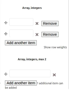
<time datetime="{{ event_date }}"> {{ event_date|date('F j, Y') }}</time>List input allowing multiple values.
Schema Definition:
numbers: type: array title: 'List of numbers' items: type: string maxItems: 10 examples: [['One', 'Two', 'Three']]Twig Usage:
{% for number in numbers %} <span class="number">{{ number }}</span>{% endfor %}Additional resources
Section titled “Additional resources”For a comprehensive overview of all available prop types and their widgets, refer to the “All-Props” Test SDC module which demonstrates every supported prop type with examples.
| Boolean, strings with different formats | Integer, image, video, array of integers | Enriched HTML |
|---|---|---|
 |   |  |