SDC components - Slots
Slots allow you to place other SDC components, or any other Canvas component, inside your component. They define regions where content can be dynamically inserted.
For example, a List component can define a slot called Items that accepts
any other SDC component to display as list items.
Creating components with slots
Section titled “Creating components with slots”Let’s create a list component to display multiple artists. This component will
act as a container where you can add multiple Singer components.
Directorymy_theme
Directorycomponents
Directorylist
- list.component.yml
- list.twig
- list.css
Component structure
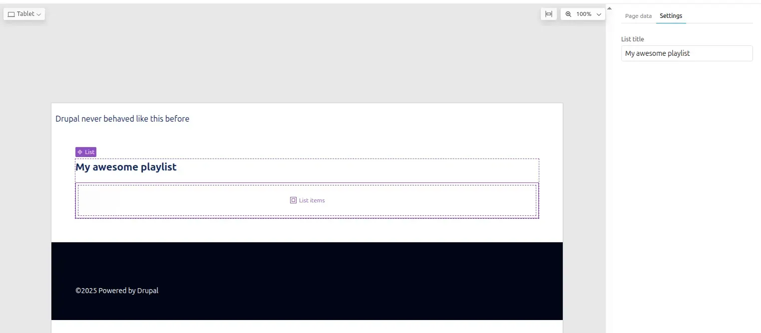
Section titled “Component structure”- A prop
titleto show the name of the list - A slot
contentto contain the list items
To define a slot, add it under the slots key in your component metadata. You can define multiple slots.
This List component is generic and can contain any type of component, not just Singers.
Component metadata
Section titled “Component metadata”The List component defines one prop and one slot:
'$schema': 'https://git.drupalcode.org/project/drupal/-/raw/HEAD/core/assets/schemas/v1/metadata.schema.json'name: Liststatus: stablegroup: Musicdescription: List component, displays sdc children as a vertical numbered list.props: type: object properties: title: type: string title: List title description: > Title of the list examples: ["My awesome list"]slots: content: title: List items description: > Place any SDC in this slot, to add them to the list.The title key of each slot is used as the placeholder text in Canvas.
Twig template
Section titled “Twig template”The template should use unique classes for each section to facilitate styling. Using BEM methodology is recommended to avoid CSS collisions:
{# list.twig #}<div class="sdc-list"> <h2 class="list-title">{{ title }}</h2> <div class="list-items {{ classes }}"> {{ content }} </div></div>Styling
Section titled “Styling”Let’s add some CSS:
- The list will be vertical
- An automatic scrollbar when many items
.list-title { font-size: 1.3rem; font-weight: 700; margin-block-end: 1rem;}
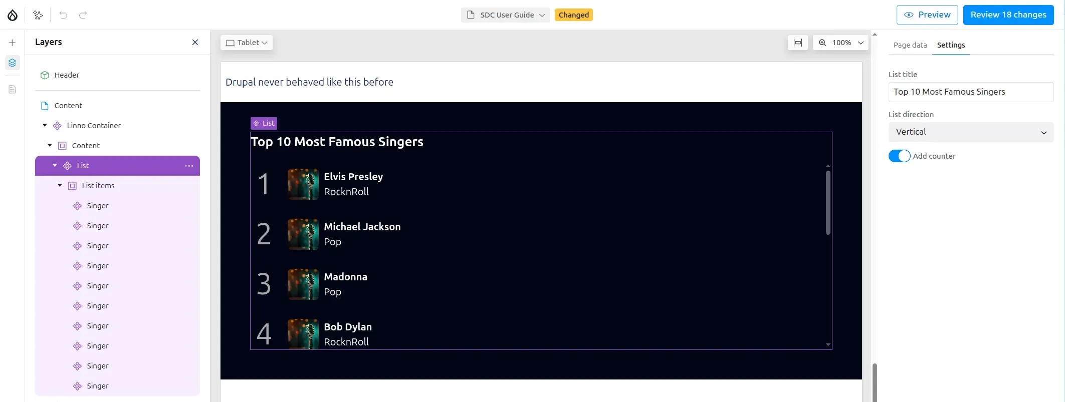
.list-items { display: flex; gap: .5rem; counter-reset: list-number; flex-direction: column; max-block-size: 300px; overflow-y: auto; & > *:hover { background-color: lightgrey;; }}Enhanced list component
Section titled “Enhanced list component”Let’s enhance the list component by adding props to control its appearance:
- Display the list horizontally or vertically
- Display an optional Counter
...direction: type: string title: List direction enum: ['vertical','horizontal'] meta:enum: vertical: Vertical horizontal: horizontal examples: ['vertical']with_counter: type: boolean title: Add counter description: Add a number to each list item examples: [false]Here is one way to add multiple css classes according prop values:
{# list.twig #}{% set classes = [  direction ? 'list-direction-' ~ direction,  with_counter ? 'list-with-counter']|join(' ') %}
<div class="sdc-list">  <h2 class="list-title">{{ title }}</h2>  <div class="list-items {{ classes }}">    {{ content }}  </div></div>
And let’s add more CSS for our new props
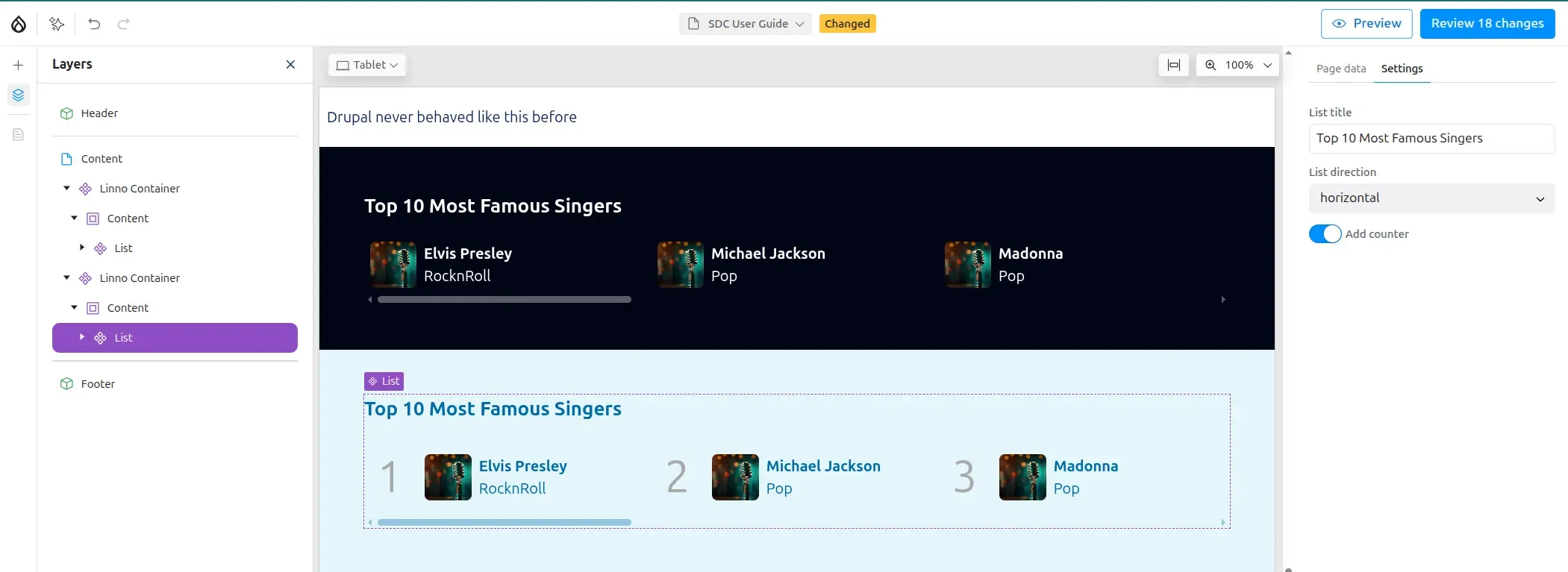
....list-direction-horizontal {  flex-direction: row;  overflow-x: auto;
  &>* {    flex-shrink: 0;    flex-basis: 300px;    padding: 6px;  }}.list-with-counter >* {  counter-increment: list-number;  &:before {    font-size: 3rem;    color: darkgrey;    content: counter(list-number);    padding-inline: .5rem;    margin-inline-end: .5rem;  }}
Using the enhanced list
Section titled “Using the enhanced list”Your enhanced List component is now ready to display multiple items in various layouts:
The component supports horizontal and vertical layouts, with optional counters:
To learn about integrating AI capabilities with Canvas, see Canvas with AI.