SDC components
Single Directory Components (SDC) contain your own Twig, JavaScript, and CSS. They can be provided as part of a Drupal module or theme and can be reused across your Canvas projects.
Components are built using Drupal’s native Twig templating system with optional JavaScript and CSS files for enhanced functionality and styling.
Creating a new SDC component
Section titled “Creating a new SDC component”Inside your custom theme, create a folder for your new SDC.
- Inside a
components/folder, create asinger/folder for your new Single Directory Component.
This directory should contain at least:
singer.component.ymlthat defines the component metadata (props and slots)singer.twigthat defines the markup
Optionally in the same folder add:
singer.cssfor stylingsinger.jsfor behaviors- Extra assets: images, SVG icons, fonts, etc.
README.mdfile for documentation
Required Drupal libraries should be defined in the libraryOverrides
section of the singer.component.yml file.
Structure
Section titled “Structure”my_theme/└── components/ └── singer/ ├── singer.component.yml ├── singer.twig ├── singer.css └── micro.jpgOur SDC defines 3 content props:
nameof the singer (string)imageof the artist (image object)genreof music (predefined string values)
Component metadata
Section titled “Component metadata”The component metadata is defined in the .component.yml file:
'$schema': 'https://git.drupalcode.org/project/drupal/-/raw/HEAD/core/assets/schemas/v1/metadata.schema.json'name: Singerstatus: stablegroup: Musicdescription: Singer component, could be used to display one singer.props: type: object required: - name properties: name: type: string title: Name description: Name of the singer. examples: ['Michael Jackson','Bruno Mars'] genre: type: string title: Genre description: Main music Genre of the singer enum: - Pop - Jazz - Soul - Funk - "Rock and Roll" - Electro examples: ['Pop'] image: $ref: json-schema-definitions://canvas.module/image type: object title: Image description: > Image of the singer examples: - src: 'micro.webp' alt: 'Nice picture of the singer' width: 200 height: 300You can use this image for the default image of a new Singer

Twig template
Section titled “Twig template”{# singer.twig #}<div class="singer"> <img class="singer-image" src="{{ image.src }}" alt="{{ image.alt }}" width="{{ image.width }}" height="{{ image.height }}" /> <div> <h3 class="singer-name">{{ name }}</h3> <div class="singer-genre">{{ genre }}</div> </div></div>Styling
Section titled “Styling”.singer { display: flex; align-items: center; gap: 0.5rem;}.singer-image { height: 50px; width: 50px; object-fit: cover; border-radius: 6px;}.singer-name { font-weight: bold; }.singer-genre { font-weight: normal; }Using the component
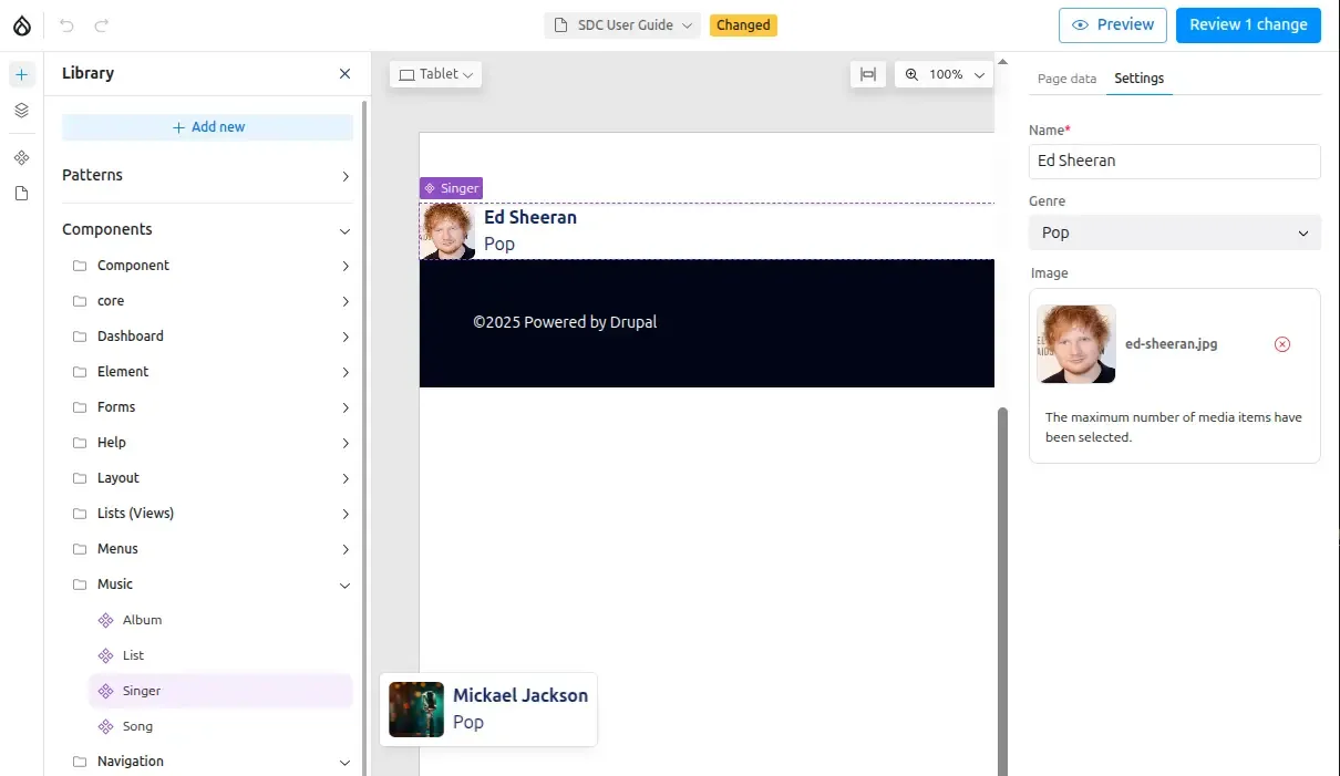
Section titled “Using the component”Once created, your Singer component is ready to be used in Canvas:
- The component appears in the sidebar under the “Music” group (as defined in metadata)
- Hovering over the component shows a preview with default prop values.
- Drag the component to the Canvas and configure its properties
Creating collections
Section titled “Creating collections”To display multiple singers, you can use Slots to create container components that accept multiple child components.