Review brief: admin theme
Try it yourself
Everything in this brief runs on the demo site: Drupal 11.5.0-beta1 with the module, its adapters, the Media Library pilot and demo content. You need DDEV 1.25 or newer:
git clone https://github.com/d34dman/design_system_api_demo.git
cd design_system_api_demo
ddev start && ddev install-demo   # prints a one-time login link
Why this reaches your area
In Drupal 12, Default Admin is the only admin theme in core, so it's the reference
implementation of the contract. An adapter maps every contract token to Default
Admin's own --admin-* custom properties, so module UI built on the contract picks up
Default Admin's look, its accent color setting and its dark mode, without the module
knowing which theme is active. The Media Library pilot then replaces Default Admin's
own Media Library CSS. Both depend on choices you'd make differently, or might not
want to support.
Questions for you
- Are the
--admin-*variables API? The adapter maps all but two tokens to them (the focus ring's width and offset map to--outline-sizeand--outline-offset), for examplecolor.bg.surface: 'var(--admin-color-bg-surface)'. If they get renamed the adapter breaks quietly. Can they be treated as stable, or should the theme expose a smaller, documented set? - Should Default Admin implement the contract itself? The adapter is a submodule
of this project. The alternative is for the theme to carry the mapping and declare
its color schemes in its info file (
design_system_api: { color_schemes: [light, dark] }), making the adapter unnecessary. Which would you prefer, eventually? → Q2, Q4 - Gaps.
focus.ring.widthandfocus.ring.offsetwere literal values (3px, 2px) until we found Default Admin's--outline-size(4px) and--outline-offset(2px); they now map to those. Are there other variables we missed, or tokens in the vocabulary that don't fit how Default Admin thinks? - Replacing the theme's Media Library CSS. With the pilot on, Default Admin's Media Library CSS is removed (its JavaScript stays) and the pilot's contract-based CSS is used instead. Compare the screenshots below: is anything lost that you'd consider part of the theme's design?
- Gin and Claro on Drupal 12. The concept's placement rule already says that adapters for contrib themes are separate projects, until the theme absorbs them. Gin runs on Drupal 11.5, which the module now supports, so a Gin adapter can start there. Claro is contrib on Drupal 12, yet its adapter is still a submodule here: an exception we'll resolve before an alpha. Does the rule work for you, and should the Claro adapter move to its own project or into Claro?
What we built
- Adapter (
modules/design_system_api_default_admin/design_system_api_default_admin.design_system_adapter.yml): every token mapped once, in the base context. A layer that sets a token owns it in every context, so the contract's own dark values never apply under Default Admin: Default Admin'slight-dark()does. So contract-based UI follows each user's Appearance setting (auto, light or dark), which Default Admin applies ashtml.dark-modeandcolor-scheme. The adapter declarescolor_schemes: [light, dark], which allows a contract dark block, anddark_selector: ':root.dark-mode', so that block follows the user setting too, not the OSprefers-color-scheme. - Claro adapter (
modules/design_system_api_claro/): the same for Claro 3. Claro has no dark mode, so contract-based UI stays light under it. Five tokens have no Claro variable and get literal values: a spacing step, a radius, two font weights and a shadow. - The pilot removes the CSS of whatever library a theme attaches to
media_library/*withlibraries-extend, keeping its JavaScript and dependencies. No theme is named in its code. Dialog chrome is styled at two-class specificity, to beat jQuery UI's base theme and lose to a theme's own dialog CSS. That holds only where the theme also uses two classes. Default Admin styles the dialog root with one (.ui-dialog), so the pilot's root rule wins there: a 12px radius instead of 8px, a larger shadow, andoverflow: hidden. Default Admin's border, padding, titlebar and content rules tie with the pilot's and win.
See it
| Default Admin's own CSS (pilot off) | Pilot on | |
|---|---|---|
| Light | 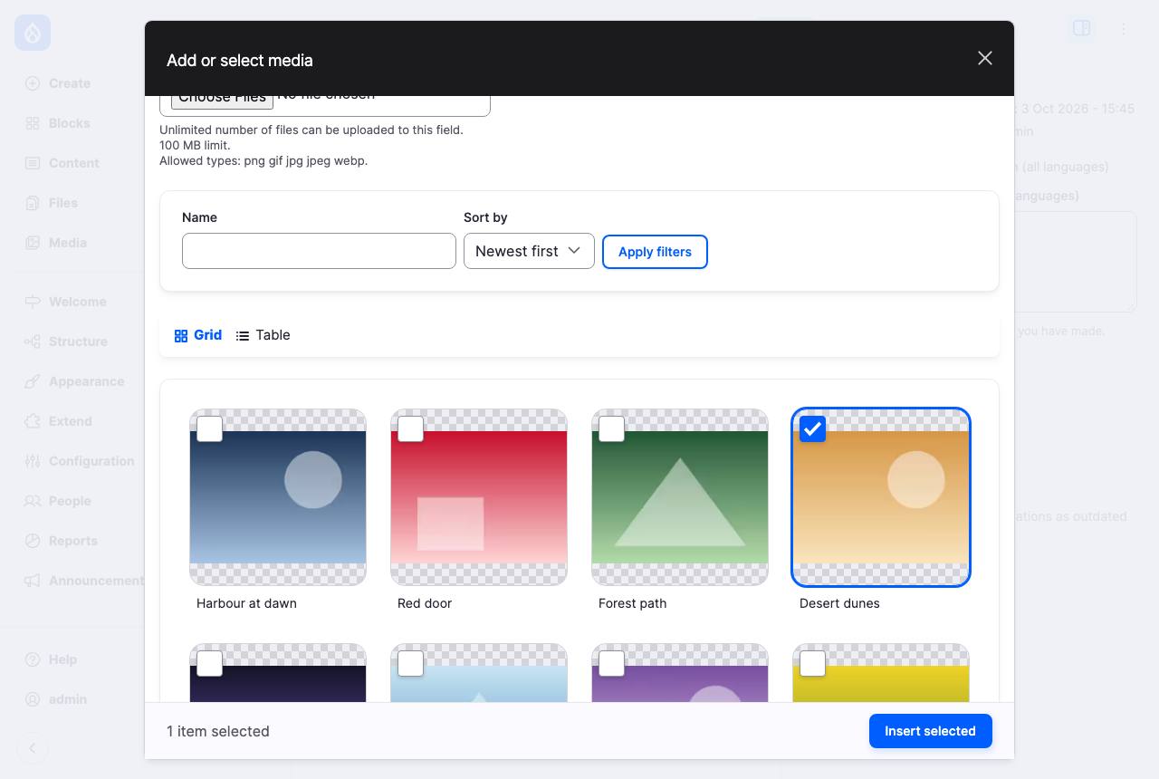 |
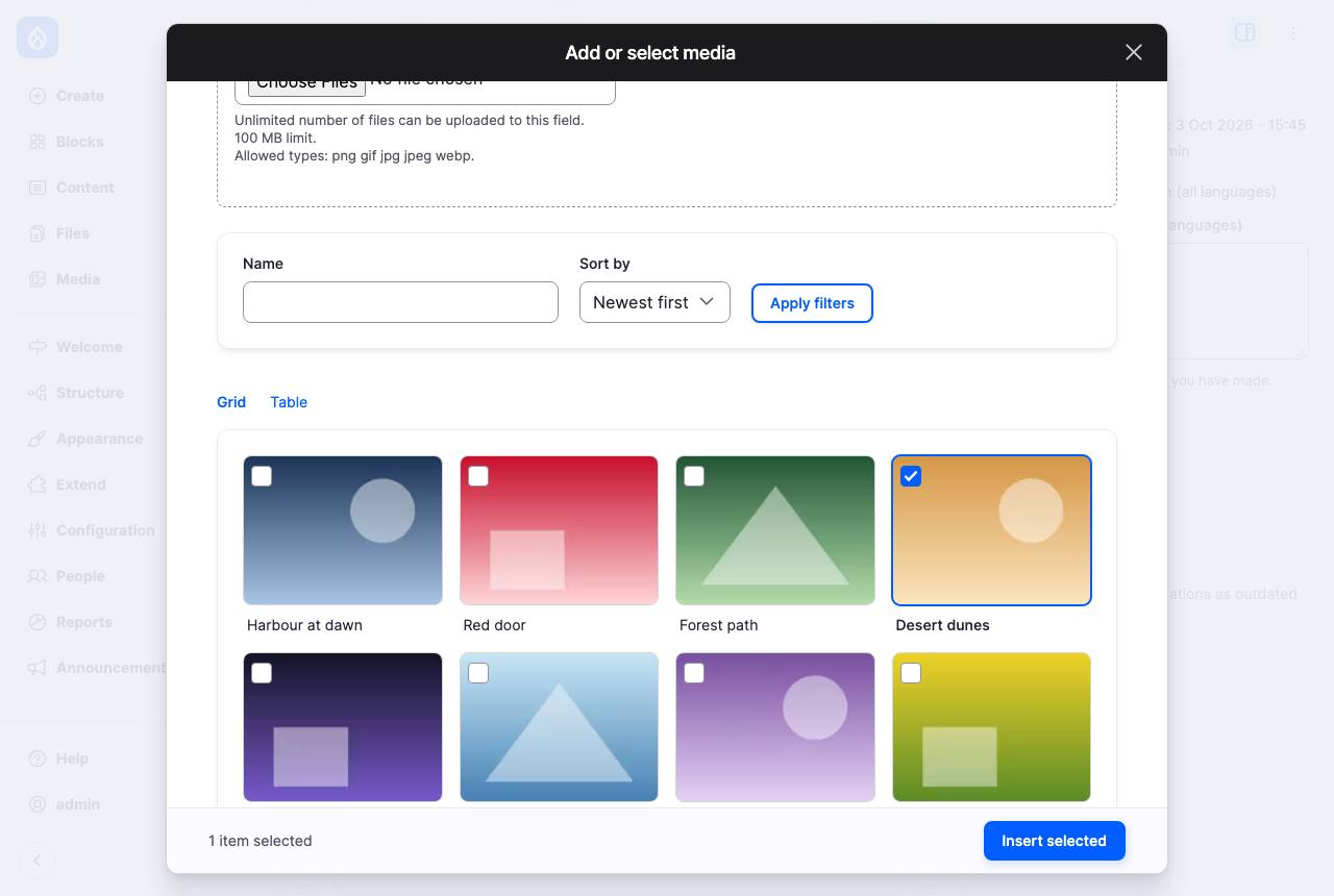 |
| Claro | 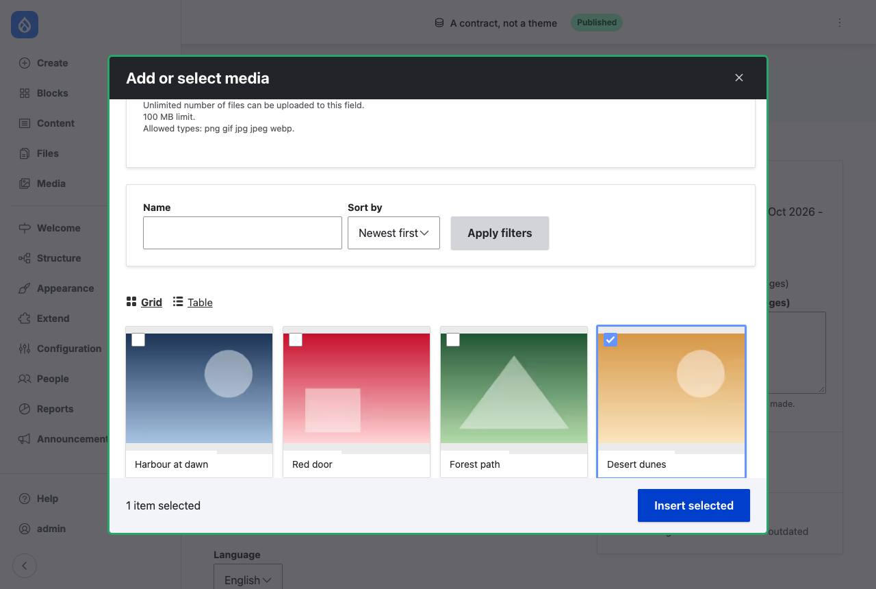 |
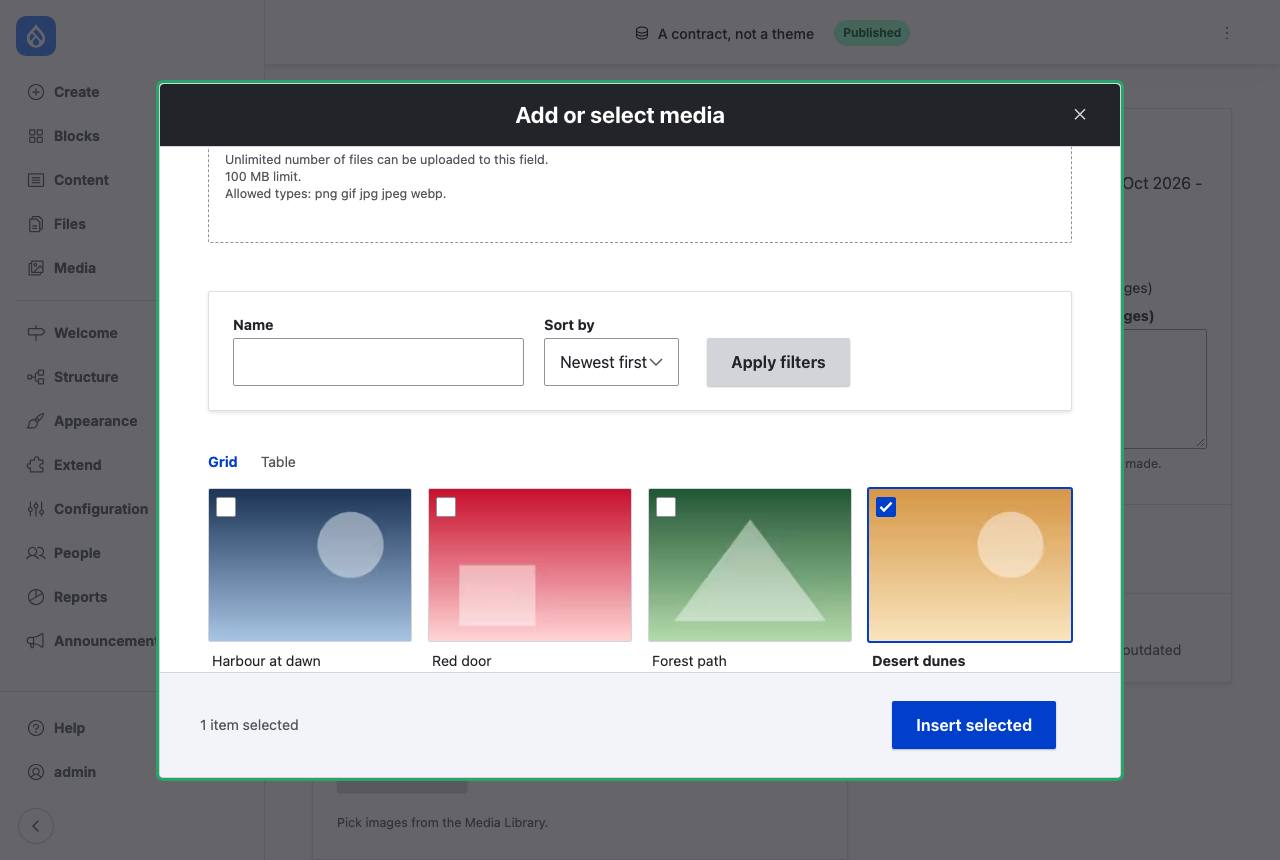 |
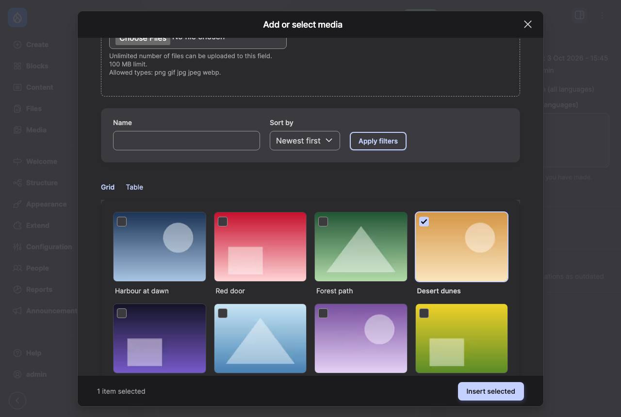
Default Admin in dark mode with the pilot on: the colors are Default Admin's own, through the adapter.
In the demo: ddev admin-theme default_admin or claro, then edit an article and
open the Media Library from the image field. ddev drush ds:tokens --theme=default_admin
lists every token and the variable it maps to.
Known issues
Found in our own check of the code. Items marked Fixed name the commit that fixed them. We track the open ones ourselves; if one matters for your review, say so in this brief's issue.
- The pilot's dialog root rule overrides Default Admin's radius and shadow (above).
- Fixed (
e37d733): the focus ring's width and offset map to Default Admin's--outline-size(4px) and--outline-offset, not a literal 3px. - Fixed (
b8ffdc0): the focus ring shows on selected cards (selected styles sit in:where()), and only for keyboard focus (:has(:focus-visible)), not mouse clicks. - Fixed (
b8ffdc0): disabled items (selection limit reached) can no longer be clicked; the pilot setspointer-events: noneitself. A FunctionalJavascript test covers it. - Fixed (
e37d733):color.bg.selectedmaps to--admin-color-primary-soft, not a hover variable. - Fixed (
e37d733): thecolor.status.*tokens map to Default Admin's text colors (--admin-color-text-error,-warning,-success), not its icon and border colors. - No test fails when an
--admin-*name the adapter uses disappears. - Fixed (
e37d733): an authormode=darkvalue under Default Admin follows the user's Appearance setting (the newdark_selectoradapter key), not the OS. - Fixed (
8d66732): Default Admin's high-contrast setting means the contract'scontrast=more. Default Admin keeps its own high-contrast values for the tokens the adapter maps.
Read only these sections
What we heard
Nothing yet.
Edit note (2026-10-03): Corrected the dialog specificity claim, the focus ring gap (Default Admin has --outline-size and --outline-offset) and the dark mode description (per-user setting, html.dark-mode), reworded Q5 as a confirmation of the concept's placement rule, and added Known issues, all found in a pre-review check of the code.
Edit note (2026-10-03, later): Updated Q1, Q3, the adapter's dark-mode description and Known issues for the fixes in b8ffdc0 (focus ring on selected cards, clicks past the selection limit) and e37d733 (focus ring, status and selection mappings, dark_selector). Open known issues are now tracked by the maintainers instead of as separate issues.
Edit note (2026-10-18): Marked Default Admin's high-contrast mapping fixed (8d66732); Q5 now says a Gin adapter can start on Drupal 11.5; the demo site now runs Drupal 11.5.0-beta1 (the module supports ^11.5 || ^12).