Review brief: accessibility¶
Try it yourself
Everything in this brief runs on the demo site: Drupal 11.5.0-beta1 with the module, its adapters, the Media Library pilot and demo content. You need DDEV 1.25 or newer:
git clone https://github.com/d34dman/design_system_api_demo.git
cd design_system_api_demo
ddev start && ddev install-demo   # prints a one-time login link
Why this reaches your area¶
The contract makes some accessibility behavior must-level rules instead of optional theme features: forced colors, visible focus, reduced motion, logical properties for RTL, and later the keyboard behavior of each pattern. It also delivers high-contrast values for some tokens (6 of the 24 color tokens in v0). Once modules build on the contract, those rules and values decide the baseline of a lot of contrib UI, so we need them right from the start.
Questions for you¶
- Which rules must the contract own? v0 has three must-level accessibility rules: state shown by color alone also gets a border or outline that survives forced colors, every interactive element has a visible focus ring, and transitions only run when the user hasn't asked for reduced motion (as concept Q6 leans). What's missing at must level? Target size is one candidate. → §8, Q6
- High contrast as a context.
prefers-contrast: more(ordata-ds-contrast="more"on any element) switches six color tokens to higher-contrast values, such as darker borders and black text. Dark plus more contrast has its own combined values (white text, lighter borders), on one element or nested either way. Adapter themes still keep their own values (see Known issues). Are these the right values, and is the media query plus an attribute the right way to deliver it? - Guaranteed contrast pairs. The vocabulary has background and foreground tokens
meant to be used together (
color.bg.*withcolor.fg.*). Concept §5 already says must rules block publishing text below 4.5:1. A test now checks the default values (text pairs at 4.5:1, UI pairs such as borders and focus at 3:1, in every context), but author values are only checked for the right type. Should the resolver check each pair for every theme and context and refuse author values that fail, and is 3:1 the right threshold for non-text pairs? → §5 Guard rails while editing - What automated checks miss. The demo runs axe-core on every screenshot: 51 cells, zero violations, with the pilot on and also with it off. That covers only axe's WCAG 2.0/2.1 A and AA rules (no 2.2, no best practice), only the field widget and the Media Library dialog, with one item selected by mouse, and the run records results without failing. So axe doesn't show what the pilot changes, and it can't test focus visibility or forced colors. Forced colors is checked by eye in the screenshots; no cell captures keyboard focus yet, but a browser test now checks the focus ring on a selected grid card. For patterns (Dialog first, in v1) we plan conformance tests built on the APG keyboard tables, graded must/should like ARIA-AT. Is that the right basis, and what should stay a manual check? → Q13
- Who reads the rules. Rules are data with IDs, so a linter, a test, an AI assistant and eventually a content author can all read the same rule. Would that help accessibility reviews in contrib? → Q10
What we built¶
- Rules (
design_system_api.rules.yml):a11y/forced-colors,a11y/focus-visibleanda11y/reduced-motionat must level, pluslayout/logical-propertiesandcolor/tokens-only, each with a summary and the check listed for it. Forced colors is checked by a screenshot, focus-visible by a FunctionalJavascript test of the pilot (PilotSelectionTest), and reduced motion by manual review. - High-contrast values in the contract defaults for six of the 24 color tokens:
text (
fg.default,fg.soft), borders (border.default,border.loud), the primary action and focus, each also with a combined dark plus more-contrast value and the same values for the admin role.border.inputhas none. - The Media Library pilot has a
forced-colorsblock: selected items keep a visible outline, and its focus rings use thecolor.focusandfocus.ring.*tokens, also on a selected grid card. Card transitions only run underprefers-reduced-motion: no-preference. RTL comes from logical properties, tested with Arabic content. - Proof capture (Playwright with
@axe-core/playwright): 4 themes × 6 contexts (light, dark, RTL, more contrast,data-ds-mode="dark"on<html>with more contrast, forced colors) × pilot off and on, plus 3 cells of an author rebrand: 51 cells.
See it¶
| More contrast | Forced colors |
|---|---|
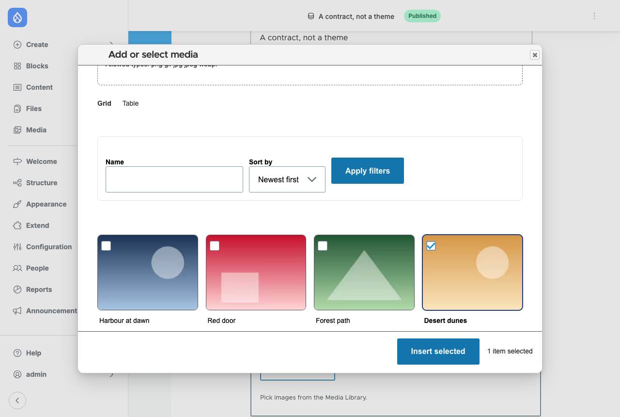 |
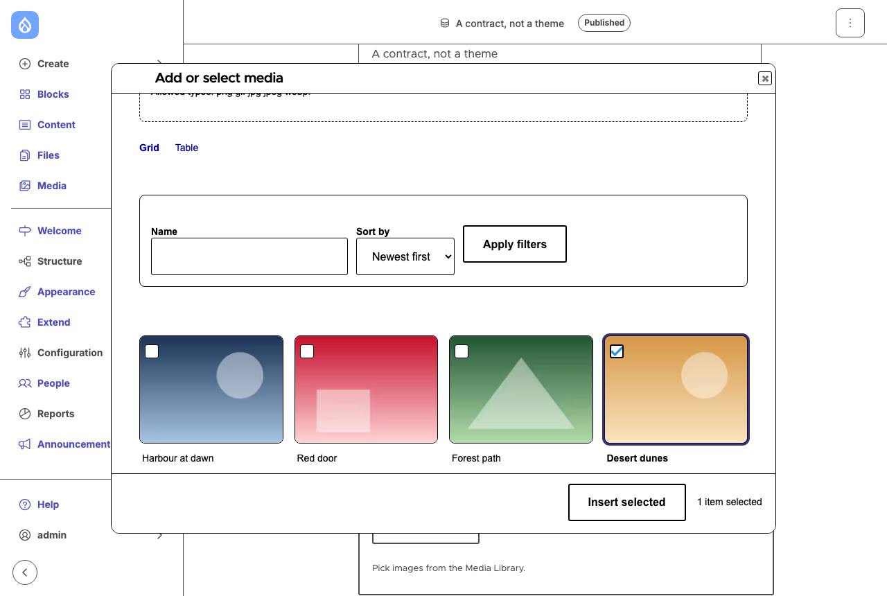 |
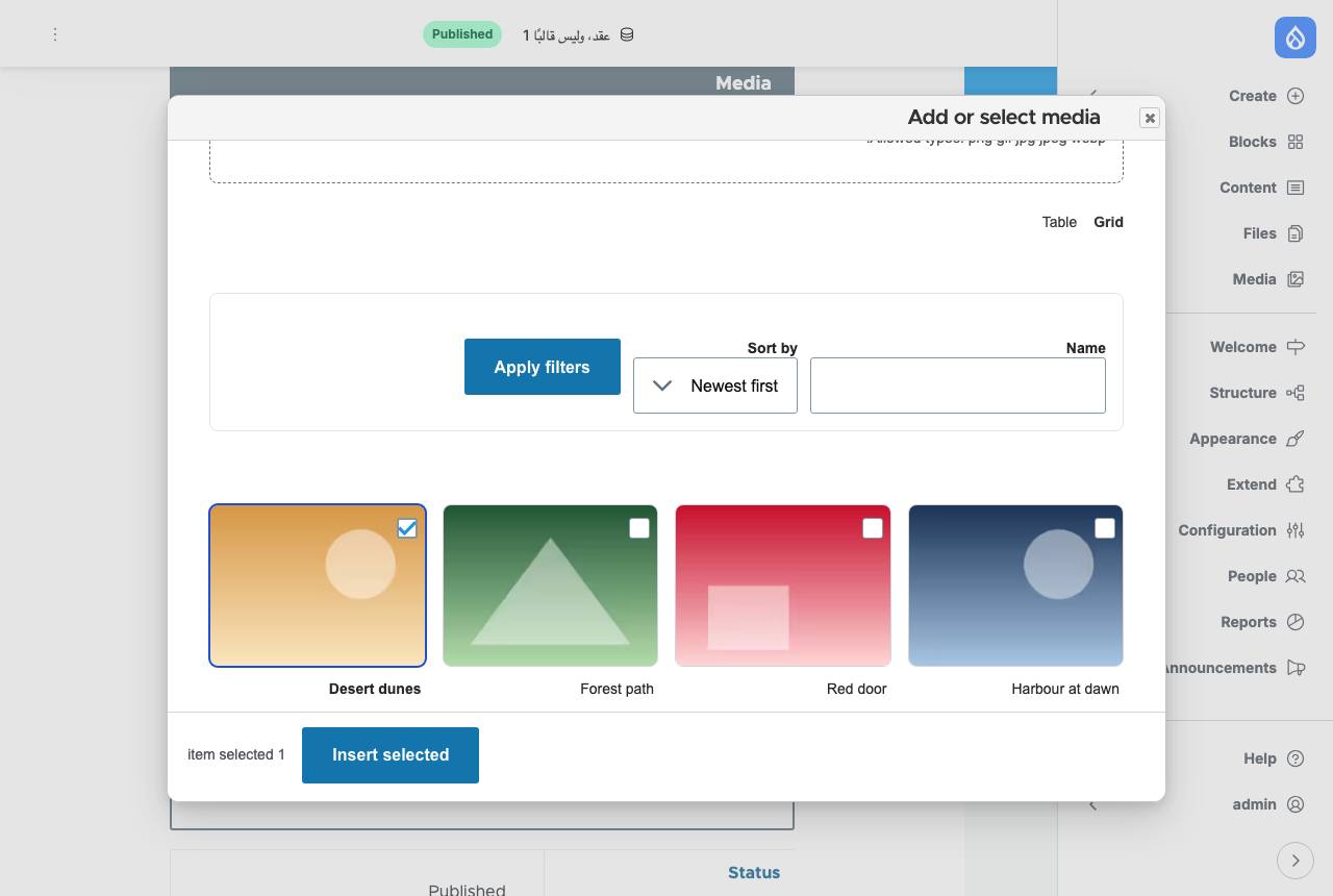
To try it in the demo, use the browser's DevTools rendering emulation
(prefers-contrast, forced-colors) on an article's edit form, and /ar/node/1/edit
for RTL.
Known issues¶
Found in our own check of the code. Items marked Fixed name the commit that fixed them. We track the open ones ourselves; if one matters for your review, say so in this brief's issue.
- Fixed (
bb2a125): more contrast inside a dark region. A combined contextmode=dark contrast=more, in a last sub-layer (base, contrast, mode, mode-contrast), covers both on one element and nested either way; explicitdata-ds-mode="dark"and"light"now setcolor-scheme. - Partly fixed (
bb2a125,e37d733,77237c5,8d66732): more contrast in dark or under adapters. OS dark with OS more contrast gets the combined values, the admin role has all six contrast values, adata-ds-mode="light"region on an OS-dark, OS more-contrast page keeps the contrast values, and Default Admin's high-contrast setting meanscontrast=more. A person can also choose more contrast with the module's display preferences switch. Still open: adapter themes (Claro, Default Admin) keep their own values for the tokens they map, in every context. - Fixed (
bb2a125): default pair failing AA. Darkfg.on-actionis now#18181bon#7aa2ff(7.12:1, was white at 2.49:1), and a test checks every default pair. - Fixed (
b8ffdc0): focus ring hidden on selected grid cards. Selected styles are wrapped in:where(), so the focus ring wins, also in forced colors. - Fixed (
b8ffdc0): reduced motion. New must rulea11y/reduced-motion; the pilot's transitions only run underprefers-reduced-motion: no-preference. - Partly fixed (
bb2a125): no contrast check on author values. The default values are now checked in every context; author values still aren't, and the rules don't name the WCAG success criteria they support. - Partly fixed (
b8ffdc0,bb2a125, demo166e106): the gallery doesn't gate anything. Browser tests cover keyboard focus on a selected card and nested contexts. The gallery now fails the run on an axe violation (WCAG 2.0–2.2 A and AA) wherever the contract is in force, and has chrome cells for keyboard focus, more contrast chosen with the switch, and forced colors with a light and a dark palette. Still open: axe's best-practice rules, and a cell for more contrast nested inside a dark region.
Read only these sections¶
- §8 Rules as data
- Q6, Q10, Q12, Q13
What we heard¶
Nothing yet.
Edit note (2026-10-03): Corrected the cell and context counts (51 cells, 6 contexts), how many color tokens have a contrast value (6 of 24), where more contrast applies, the scope of "zero violations", the claim that each rule has an enforcing check (axe doesn't test focus), and Q1/Q3 to match concept Q6 and §5; added Known issues. All found in a pre-review check of the code.
Edit note (2026-10-03, later): Updated the questions, "What we built" and Known issues for the fixes in b8ffdc0 (focus ring on selected cards, reduced-motion rule and guard, focus test), bb2a125 (combined dark plus more-contrast values, the dark fg.on-action fix, default contrast test) and e37d733 (Default Admin dark setting). Open known issues are now tracked by the maintainers instead of as separate issues.
Edit note (2026-10-18): Updated Known issues for the fixes in 77237c5 (a light region keeps more contrast), 8d66732 (display preferences switch; Default Admin's high-contrast setting) and demo 166e106 (the gallery fails on axe violations); the demo site now runs Drupal 11.5.0-beta1 (the module supports ^11.5 || ^12).