At a glance¶
The whole project on one page, for readers who have five minutes. Every claim links to the part of the docs that backs it.
The problem¶
Drupal 12 ships one admin theme (Default Admin) and no dedicated frontend theme. Contrib UI still has no stable way to match whichever theme is active:
- Default Admin's
--admin-*variables belong to that theme. They don't exist under Claro, Gin or any frontend theme. - Contrib UI doesn't stay on admin routes. The Media Library widget in a frontend node form, the Navigation bar, login forms and Webform all render inside whatever frontend theme the site uses.
- Every frontend theme invents its own token names, so nothing built for one fits another.
So modules either couple themselves to one theme's internals, or ship their own CSS and look slightly off everywhere. Concept §3
The idea¶
One set of design token names that modules code against, and whose values change with where the UI renders: which theme, light or dark, more contrast, forced colors.
- Declare. A module says what it has: "my card has a border; by default use the theme's primary border color." It ships no theme-specific CSS and no hard-coded values.
- Fill. Themes provide the values through small adapters, and site authors can override any of them per context.
- Render. Drupal resolves the values and gives the page plain CSS custom properties.
Follow one card border through all three steps, interactively.
It builds on core's Design Tokens API (W3C DTCG format) and Single Directory Components. It doesn't invent its own token format.
What exists today¶
A working v0 on Drupal 12.0.0-beta1, not a slide deck:
- The module (drupal.org): a vocabulary of about 45 semantic tokens with admin and frontend defaults, including dark and more-contrast values; a resolver that shows where each value came from; per-theme CSS; Drush commands; and an editor at Appearance » Design system.
- Adapters for Default Admin and Claro, so both themes fill the same names.
- A pilot on a real core module. Media Library styled only through the contract, on admin routes and on a frontend page.
- A stylelint rule that reports hard-coded values against a named rule.
- A demo site (GitHub) you can run with DDEV in three commands.
The same Media Library, with the pilot off and on:
| Pilot off | Pilot on | |
|---|---|---|
| Olivero (frontend) | 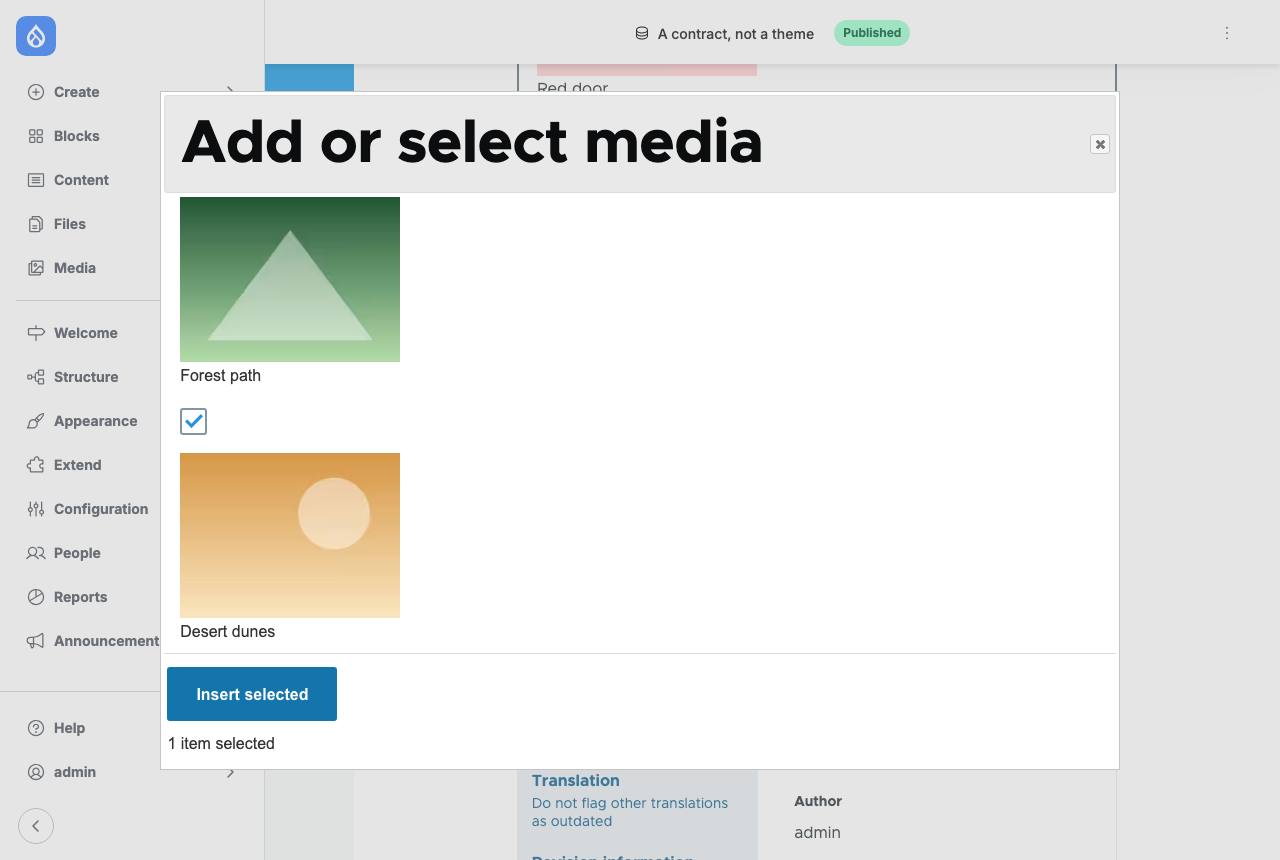 |
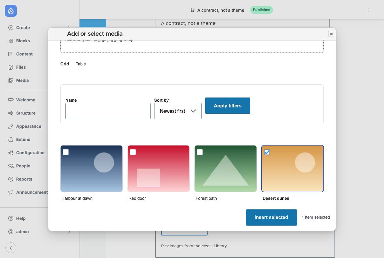 |
| Default Admin | 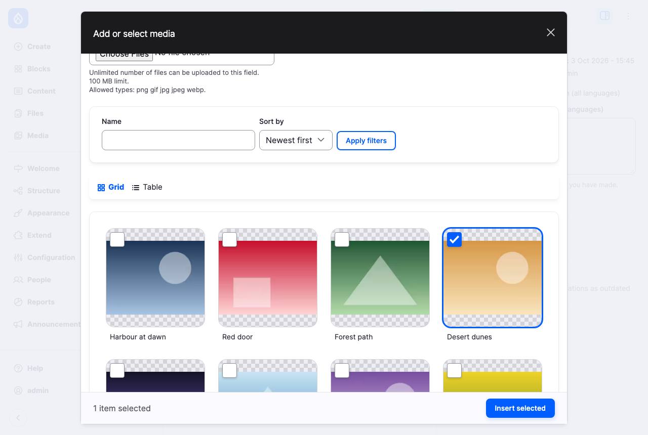 |
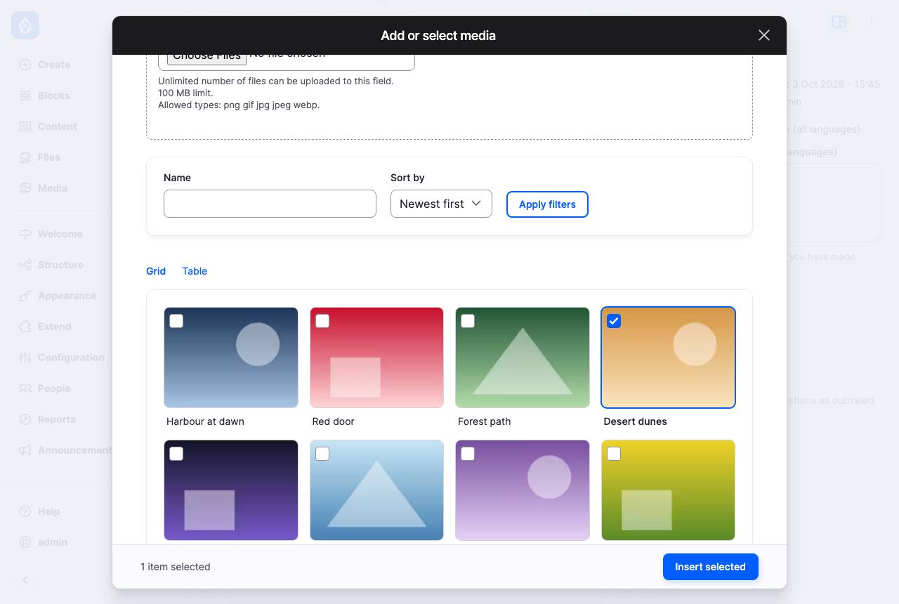 |
A Playwright gallery in the demo captures four themes (Default Admin, Claro, Olivero, Stark) in six contexts: light, dark, RTL, more contrast, dark with more contrast, and forced colors. axe reports no violations in any of them.
Where it stands¶
- Experimental, pre-alpha. The vocabulary will change while it's developed with theme maintainers.
- Reviews are under way. Seven short briefs ask maintainers of the areas it touches (Design Tokens API, components, admin theme, UX, CSS, Media Library, accessibility) for the decisions we can't make alone. Reviews
- Upstream first. We're working on the remaining DTCG value types in core (#3622909), so the module can drop its interim plugins.
What needs direction beyond one module¶
- Who owns the vocabulary? The contract only helps if themes agree on names. Our leaning: seed it from Default Admin, then a small core set plus namespaced extensions. Q4
- Where does it live? Our leaning: contrib first, core later, with the data kept in a framework-neutral format. Q5
- How far does it go? The concept goes past tokens to patterns (Dialog next), frontend and admin UI on one page (Navigation, Canvas) and rules that AI-generated UI can be checked against. The bigger picture puts the end goal in plain words; Concept §6 and §11 has the detail.
Read next¶
- The bigger picture: the end goal this module is the first piece of.
- Concept: the full reasoning, with the open questions and current leanings.
- Builds on: the core issues, contrib projects and standards it continues.
- Prior art: what already exists, in Drupal and beyond.