
Documentation
Regions and blocks
| Region | Machine name | Notes |
|---|---|---|
| Header | header |
Site branding. |
| Primary menu | primary_menu |
Main navigation. |
| Header utilities | header_utilities |
Search and language switcher. On phones these move into the menu panel. |
| Highlighted | highlighted |
Status messages. |
| Breadcrumb | breadcrumb |
|
| Home spotlight | home_spotlight |
Front page only. See Home page. |
| Home sections | home_sections |
Front page only. Each block is a band. |
| Above content | above_content |
Page title, tabs, local actions. |
| Help | help |
|
| Content | content |
|
| Sidebar | sidebar |
When used, content narrows to 8 of 12 columns. |
| Below content | below_content |
Full width. |
| Footer first | footer_first |
Below the footer logo. Menus here render as social icons. |
| Footer | footer |
Each block is a column with a heading. |
| Footer bottom | footer_bottom |
Account menu, Powered by Drupal. |
Main menu
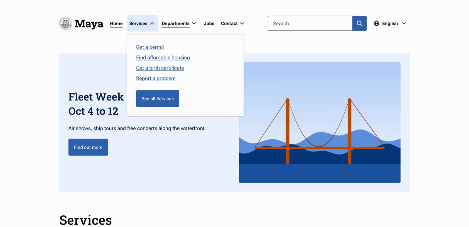
Top-level items with children render as <details> disclosures: dropdown panels from 1024px up and an accordion on smaller screens. If the parent item has a link, the panel ends with a "See all" button. Use route:<nolink> for parents that should not link anywhere. Only two levels are shown.
Social links
Add a menu with links to your social accounts and place it in Footer first. Core menu blocks and Menu Block blocks both work, so a branch of a larger footer menu can supply the links. Links to Facebook, Instagram, Threads, X, Bluesky, LinkedIn, YouTube, TikTok and Mastodon show that network's icon; other links show their title.
Footer columns
Place menu blocks in Footer with Display title checked. SF.gov uses three: Our City, Policy and Get help. Columns share the row equally and wrap onto a second row when there are more than fit.
Region-specific templates
Maya adds a block__region__REGION template suggestion to every block, so block--region--footer.html.twig in a sub-theme restyles every block in the footer.
Teasers
Node teasers render as tiles: the title links to the node, followed by the teaser's fields. View modes named like teasers (teaser_*, or containing card, tile or list) use the same template, unless the sub-theme has a template for that view mode. When a tile's fields include an image, the image shows above the title, and beside it in single-column Views lists.