Theming
The priority order
- Bootstrap's own Sass variables, compiled directly into the component. A component built in a theme (see Building a new component) imports the theme's Bootstrap scaffold and reads
$primary,$border-radius,map.get($spacers, 5)and the rest straight from Sass — the same values Bootstrap itself compiles from, kept in step automatically by every customization the theme already makes in its own_variables.scss. This is priority #1 for anything a theme authors: no separate declaration to keep in sync, and no guessing whether Bootstrap happens to also expose that value as a runtime CSS custom property. - The
--theme-*token contract, as the escape hatch. Reach for a--theme-*value only when Bootstrap has no Sass variable for it at all — motion duration and easing, the reading measure, an eyebrow's letter-spacing and case — or when the component has to render correctly on any theme without a Sass build of its own, which is every IXM Blocks SDC. See Token reference for the full contract and which of it falls into each case. - A literal, only as the last link in a fallback chain, and only when it matches Bootstrap's own compiled default — never as a component's primary source of truth.
Which of the first two applies depends on where the component's CSS is compiled.
A component built in a theme
testimonial.scss (the full file is in step 3 below) imports the scaffold and reads Sass variables directly, at compile time:
@import "@theme/global/src/scss/abstracts/scaffold";

.testimonial {
  --testimonial-mark-size: #{$spacer * 5};
  border-radius: $border-radius-lg;
}
Available after that one import — the theme's own _variables.scss overrides plus every Bootstrap default it doesn't touch:
| Category | Reach for | Notes |
|---|---|---|
| Colour | $primary, $secondary, $success, $danger, $warning, $info, $light, $dark, $body-color, $body-bg, $border-color |
Whatever $theme-colors and the theme's overrides compile to |
| Space | $spacer, map.get($spacers, 0) … map.get($spacers, 8) |
This theme's map runs 0–8, not Bootstrap's stock 0–5 — see Two things Canvas requires |
| Shape | $border-radius, $border-radius-sm, $border-radius-lg, $border-radius-pill, $enable-rounded |
|
| Type | $font-family-sans-serif, $font-family-monospace, $font-size-base/-sm/-lg, $line-height-base, $headings-font-family, $headings-font-weight |
|
| Breakpoints | $grid-breakpoints, the media-breakpoint-up() / -down() / -between() mixins |
map.get() needs its own @use
Every Sass variable above ($primary, $spacer, …) is available the instant a component imports the scaffold — no extra step. Reading a map by key is a function call, not a variable, and Dart Sass moved map functions into the sass:map built-in module: add @use "sass:map"; at the top of the file before calling map.get(). The bare global map-get() still compiles today, but only with a deprecation warning — it's already scheduled for removal in Dart Sass 3.0, so write map.get() from the start. d11/components/global/src/scss/abstracts/_tokens.scss is the reference: @use 'sass:map'; up top, map.get($spacers, 3) everywhere below it.
| Functions | tint-color(), shade-color(), shift-color(), color-contrast(), escape-svg() | From bootstrap/scss/functions, part of the scaffold |
A component that ships pre-compiled
Every IXM Blocks SDC (and bootstrap_components) has no Sass build of its own and no idea which theme, or which framework, will render it. Its plain CSS reads Bootstrap only at runtime, through the --bs-* custom properties Bootstrap's compiled :root emits, one step further down the same priority order:
var(--component-token, var(--theme-token, var(--bs-token, <bootstrap-default literal>)))
Three consequences follow, and they are the whole design of that chain:
- A theme that sets nothing still works. The literal at the end matches Bootstrap's own compiled default, so an unthemed install is not broken, it is just plain.
- Setting one
--theme-*moves everything that reads it.--theme-color-primaryreaches the statistic icon, the tab indicator, the table header accent and the CTA hover rule in one declaration. - Divergence is local. When one component must break from the shared decision, its own token overrides without touching anything else.
Where to put values
| You want to… | Set it on | Example |
|---|---|---|
| Change the whole set, for a theme-built component | The theme's _variables.scss, before the scaffold compiles |
$primary: #10564f; |
| Change the whole set, for every portable IXM Blocks component | :root in the theme (the --theme-* escape hatch) |
--theme-color-primary: #10564f |
| Change one theme-built component everywhere | That component's SCSS | .testimonial { border-radius: $border-radius-lg; } |
| Change one portable component everywhere | That component's class | .statistic-item { --statistic-item-divider-width: 0 } |
| Change one instance | Canvas's Style tab, or a section class | a utility class on the wrapper |
Custom properties resolve where they are declared
A var() inside a custom property's value is substituted at the element that declares it, not where it is used. So this does not work at :root, because --bs-alert-color only exists on the alert:
/* :root, this breaks: --bs-alert-color is undefined here */
:root { --theme-alert-bg: color-mix(in srgb, var(--bs-alert-color) 12%, transparent); }

/* .alert, this works */
.alert { --theme-alert-bg: color-mix(in srgb, var(--bs-alert-color) 12%, transparent); }
This bites most often with per-variant tints and anything derived from a Bootstrap component variable.
Building a custom theme
A custom theme is a Bootstrap subtheme built on your organization's own shared base theme or starter kit, not a bespoke build from scratch. It declares its own --theme-* values and inherits everything structural (the Bootstrap bridge, Canvas wrapper compensations, every touch target) by importing them rather than copying them:
// global.scss
@import "abstracts/tokens";       // your values
@import "base/bootstrap-bridge";  // shared structure, from your base theme
@import "base/your-theme";        // your skin
That import is what keeps a custom theme small. The structural layer lives in the base theme; a custom theme is a palette, a type pairing and a skin file. See your organization's own theming documentation for what that base theme actually provides.
The minimum a custom theme declares
Declare the whole --theme-* contract, not a subset. A theme that sets only its accent inherits Bootstrap's type ramp, spacing rhythm and radius, and the result reads as Bootstrap with a tint rather than as a design.
:root {
  --theme-color-primary: #10564f;
  --theme-color-ink: #212529;
  --theme-color-surface: #ffffff;
  --theme-color-border: #dee2e6;
  --theme-font-heading: "Inter Tight", sans-serif;
  --theme-radius: 0;
  --theme-eyebrow-case: uppercase;
  --theme-tracking-eyebrow: 0.14em;
  /* …and the rest: see the Token reference */
}
Two things Canvas requires
Two Sass settings — $spacers running to key 8, and $grid-breakpoints matching the theme's theme.canvas.yml viewports — only matter on a site using Drupal Canvas, and are silent when wrong. That's Canvas Builder territory, not IXM Blocks; see the Canvas Builder project's own theming docs for the details.
Fonts
Attach webfonts as a theme library, not through a contrib font module:
# your_theme.libraries.yml
google-fonts:
  css:
    theme:
      "https://fonts.googleapis.com/css2?family=Inter:wght@400;500;600;700&display=swap": { type: external, minified: true }
Keep the $font-family-* Sass variables and the webfont request in step; changing one without the other silently falls back to the system stack.
Privacy
A Google Fonts link sends visitor IPs to Google on every page load. On EU-facing builds, self-host the woff2 files or put the library behind the site's consent layer.
Using another CSS framework
See Frameworks: overriding the SDC template per component, keeping the BEM classes, and where Tailwind support is headed.
Building a new component
The baseline for a new theme component, whichever theme it lives in. Worked example: testimonial, originally built in themes/custom/d11/components/testimonial/.
This example has since graduated
testimonial proved useful enough to move into IXM Blocks — see Where it lives below. It's kept here as the walkthrough for building a theme-only component the same way: the steps and reasoning still apply to the next one.
1. Check whether it already exists
Look at Components first: bootstrap_components' primitives and IXM Blocks' own compositions. A testimonial looks like bootstrap_components:blockquote at a glance, but that component has no image, no layout choice and no colour prop — reach for a plain blockquote where that's genuinely all you need, and only build fresh when an existing component's props don't cover it, rather than stretching its markup with slot content it wasn't designed to hold.
2. Structure: Bootstrap utility classes in Twig
Spacing, type size, layout and colour are utility classes written directly in the template, the same as hand-coding a Bootstrap page. Nothing here is a component token:
<div{{ attributes.addClass('testimonial', 'testimonial--' ~ layout, 'text-bg-' ~ color, 'p-4', horizontal ? 'p-md-5' : '') }}>
  <div class="row g-4 align-items-center">
    <div class="{{ horizontal ? 'col-md-4' : 'col-12' }}">
      {% include 'canvas:image' with image|merge({ class: 'testimonial__image img-fluid w-100 rounded-3' }) only %}
    </div>
    <figure class="testimonial__body mb-0 {{ horizontal ? 'col-md-8' : 'col-12' }}">
      <blockquote class="mb-4 {{ horizontal ? 'fs-3 fw-semibold' : 'fs-5 fw-bold' }}">
        <p class="mb-0">“{{ quote }}”</p>
      </blockquote>
      <figcaption>{{ name }}<span class="d-block small">{{ role }}</span></figcaption>
    </figure>
  </div>
</div>
A design variation (a different layout, a different colour) is an enum prop that Twig maps to a different set of utility classes — layout: horizontal | stacked, color: navy | ocean | teal — not a CSS variable. Canvas shows an enum prop as a dropdown in the Style panel; a one-off per-instance tweak still goes through a utility class there, or through Canvas Builder's Style tab, never through a bespoke component token.
A colour prop like color needs its values compiled into the theme: add them to $theme-colors in the theme's _maps.scss so Bootstrap generates the text-bg-* utility the template applies —
// editorial/components/global/src/scss/abstracts/_maps.scss
$theme-colors: map-merge($theme-colors, (
  "navy": #002856,
  "ocean": #005487,
  "teal": #007c99,
));
— then run ddev frontend-build (or have frontend-watch pick it up) so the utility actually exists before the prop's enum values are wired.
3. Component SCSS: Bootstrap Sass variables first, --theme-* as the escape hatch
Everything a utility class already does — padding, gap, font size, background — stays out of the component's own stylesheet; that's step 2. What's left is genuinely custom: decorative quote marks and a capped portrait width, neither of which Bootstrap ships a utility for. Follow the priority order here too — a Bootstrap Sass variable first, since the scaffold import makes them free:
// themes/custom/d11/components/testimonial/src/scss/testimonial.scss
@import "@theme/global/src/scss/abstracts/scaffold";

.testimonial {
  // No Bootstrap variable covers either of these: how big the quote-mark
  // glyph renders, and how wide the portrait is allowed to grow. That's
  // exactly what a component token is for — arithmetic on $spacer, not a
  // literal, so it still scales if the theme's spacer changes.
  --testimonial-mark-size: #{$spacer * 5};
  --testimonial-image-max: 13.5rem;

  position: relative;
  overflow: hidden;
  // Straight from Sass — no component token needed for a value Bootstrap
  // already defines.
  border-radius: $border-radius-lg;

  &--stacked {
    --testimonial-mark-size: #{$spacer * 2};
  }
}
Reach for a --theme-* value only when neither a Bootstrap Sass variable nor a plain Sass value on the component itself covers it — motion timing, the reading measure, an eyebrow's tracking are the usual cases; see Token reference. It's still optional there too: a theme that never declares it gets Bootstrap's own default through the fallback chain.
4. File layout and the SWAT/Vite build
A theme component compiles through the same SWAT pipeline as everything else in components/global — nothing project-specific to configure, just the same three files d11/components/tooltip/ already uses as the reference:
themes/custom/d11/components/testimonial/
├── testimonial.component.yml   # props, plus libraryOverrides pointing at the compiled CSS
├── testimonial.twig
├── package.json                # { "name": "@theme/testimonial", "scripts": { "build": "swat build" } }
└── src/
    └── scss/
        └── testimonial.scss    # compiles to public/css/testimonial.css
# testimonial.component.yml
libraryOverrides:
  css:
    component:
      public/css/testimonial.css: { minified: true }
ddev frontend-build / ddev frontend-watch compile it exactly like any other SWAT package — nothing to adjust there. Never write plain CSS by hand next to an SDC in a theme that uses this build; commit the SCSS source, not public/.
5. Where it lives
Build it in the project theme first. IXM Blocks only takes ownership of a component once it's proven useful across more than one project — see the ownership split in Components — and bootstrap_components owns the Bootstrap primitives outright; this module doesn't fork or wrap them.
One component, three sets of token values
Every component page shows the same SDC three ways: the base theme, which emits the --theme-* contract at Bootstrap's own values, then a light and a dark custom theme that redeclare those values. All three are shot on one page, so the content, the markup, the props and the component CSS are identical; the only variable is the token set, which each page tabulates side by side.

Base: Bootstrap type ramp and colour, CTA squared to the display scale.
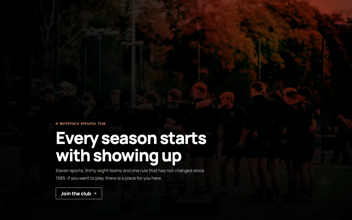
Dark example: the same component, different token values.
Nothing in the component changed between those two images. What changed is a handful of --theme-* declarations.
These screenshots are real renders
Every image is a crop of the same published Canvas page at 1440px, captured as an anonymous visitor with only the active theme changing between passes. They are not mockups, and no content differs between the three; a component that looks different is different only because its tokens are.