Components
Every component here comes from one of two modules. IXM Blocks is this project's own set, built to be swapped freely from theme to theme. Bootstrap ships by default, but nothing stops a theme swapping it for anything else — see Frameworks.
IXM Blocks Components
IXM Blocks' own component library — built to be swapped freely from theme to theme.
-

A full-bleed banner: image or video, one or many slides, content anchored top, centre or bottom.
-

Eyebrow, heading, subtitle and rich body, the catalog's generic text leaf, also used to fill slot-shell components like a card.
-
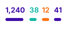
A single animated count-up numeral, icon and label. Drop several into a row to build a band.
-

An icon, a heading, a line of copy and a link, placed in a row to build a set of entry points.
-

An image or video with an optional caption, a ratio lock, and a click-to-play facade for YouTube/Vimeo.
-

Image on one side, text on the other, alternating down the page and stacking on mobile.
-

A tabbed panel where each Tab Item is a real Bootstrap
.tab-panein its final place. -

A responsive data table that stacks into labelled rows on narrow viewports.
-

New
A quote with a portrait and attribution, side by side or stacked as a card.
Views
Style plugins for displaying a live query of site content — news, events, staff — rather than hand-placed items. Picked as a Format when building a View, not placed directly in Canvas.


Bootstrap Components
The default primitive set every build starts with — plain Bootstrap 5, nothing custom.
-

Collapsible content panels
-
Dismissible status/message banner
-

Cited quotation
-

Page-hierarchy trail
-

The base button element every CTA in this catalog builds on
-

Boxed content unit; grouped for equal-height rows
-

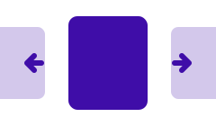
Bootstrap's own slide rotator (distinct from Hero Banner's carousel)
-

The
×dismiss control alerts/modals/offcanvas share -

Toggleable menu
-

Dialog overlay
-

Site navigation primitives
-

Slide-in panel
-
Page-number/prev-next control