Component form
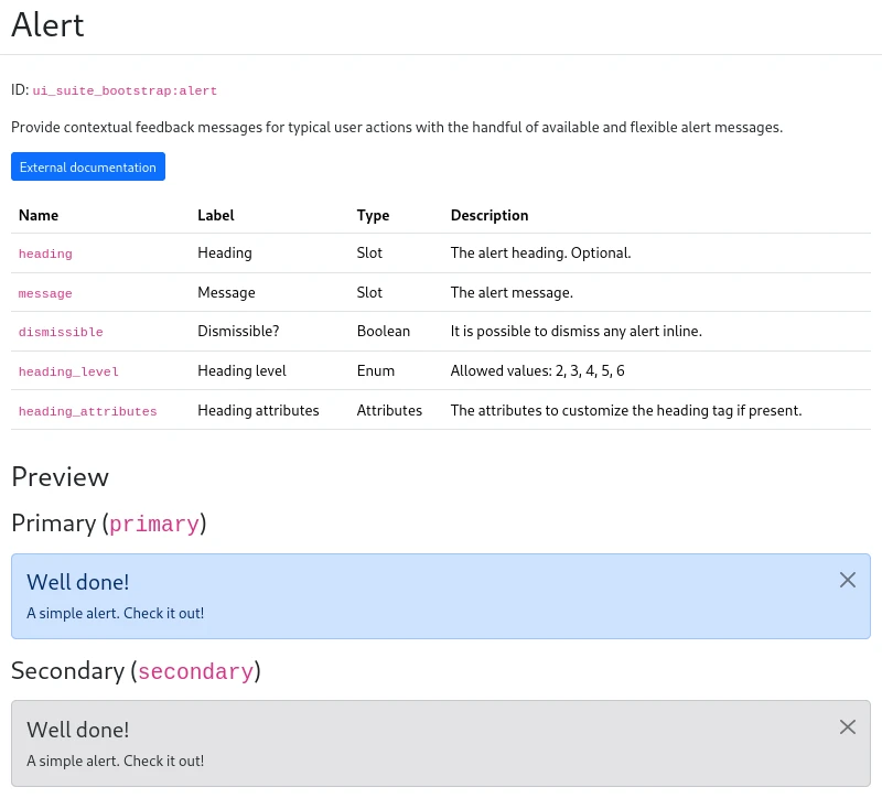
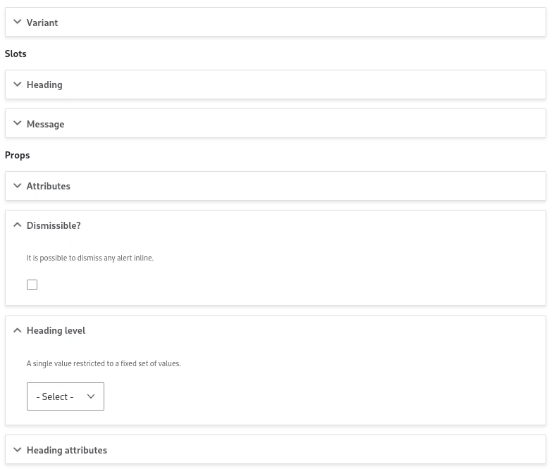
The biggest feature of UI Patterns is the generation of forms from the component definition:
| From component definition.... | ... to component form |
|---|---|
 |
 |
Those forms will be shown everywhere a component is used:
Data sources
Values are taken from sources:
- "Widgets": simple form elements storing directly the data filled by the user. For example, a
textfieldfor a string or acheckboxfor a boolean. - Sources retrieving data from Drupal API: they can be context agnostic (ex: a menu for links) or context specific (ex: the title field for a string)
- Context switchers: They don't retrieve data, but they give access to other data sources. For example, the author fields from an article content.
If there is only a single source available, the source form is directly displayed:

If there are at least 2, a source selector is shown:
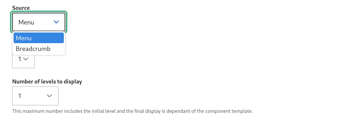
Some sources don't have a form, selecting the source is enough:

Data sources from other prop types
Sources are available according to the prop type:
- the breadcrumb for
linksprops - an entity link for
urlprops - a WYSIWYG for slots
However, sources from other prop types are also available when the data can be converted from the more specific to the less specific:
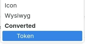
For example:
- A URL data source can be used in a string prop because every URL is also a string. However, a string data source can't be used in a URL prop because not every string is a URL
- A string data source can be used in a slot because every string is also a renderable. However, a free renderable source (like ViewField) can't be used in a string prop because not every renderable is a string.
Context
Sometimes sources require another object to retrieve the data. This is known as context.
Some sources don't need a context and are site wide, for example:
- All “widgets” which are source plugins with only direct input: Textfield, Select, Checkbox…
- List of all menus
- The breadcrumb
- …
Some sources need a context. Examples:
| Context | Source | Prop type |
|---|---|---|
| Content entity | [Entity] link | URL |
| Field | [Field] Formatter | Slot |
| Field | [Field] label | String |
| Field item | [Field item] | (many) |
| View | View title | String |
| View | View rows | Slot |
| View | View field | Slot |
Some sources need a context and are switching the context instead of providing data. Examples:
| Initial context | Source | New context |
|---|---|---|
| Content entity | [Entity] ➜ [Field] | Field |
| Content entity | [Entity] ➜ Referenced [Entity] | Content entity |
| Reference field item | [Field item] ➜ Referenced [Entity] | Content entity |
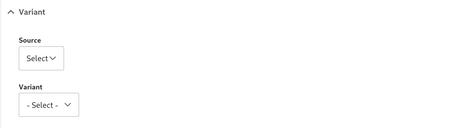
Variant selector
Some components have variants, a list of different "looks" of the component. Variants don't change the model or the meaning of the component, only the look.
Slots
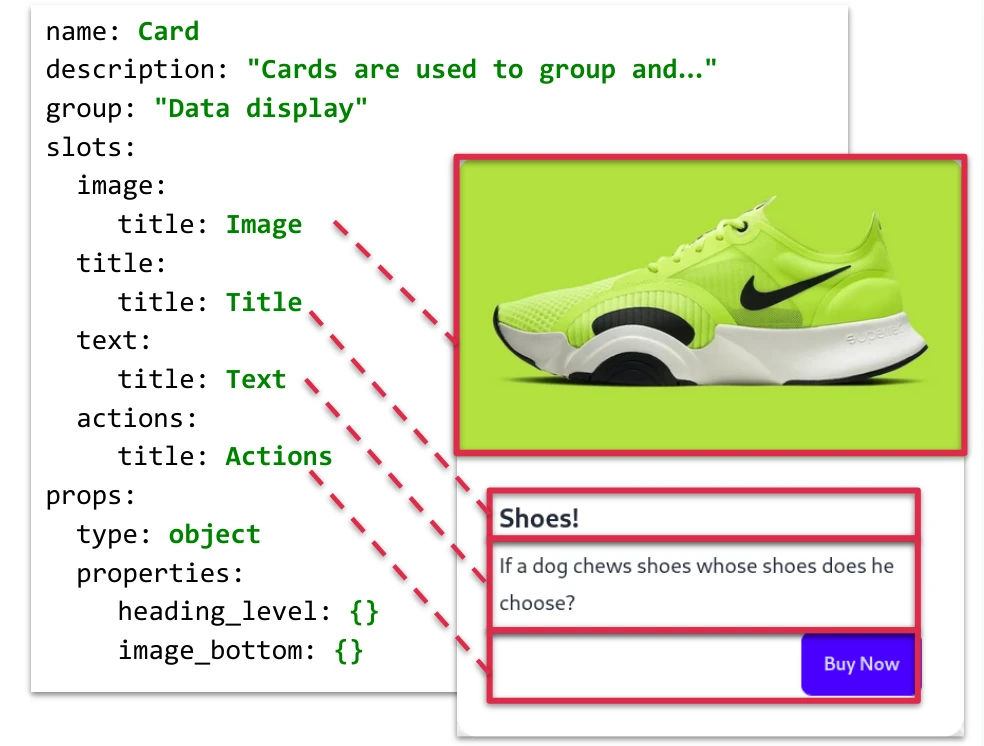
SDC components are made of slots & props:
- Slots: “areas” for free renderables only, like Drupal blocks or other SDC components for example.
- Props: strictly typed data only, for some UI logic in the template.
You can draw the slot areas in a component screenshot:
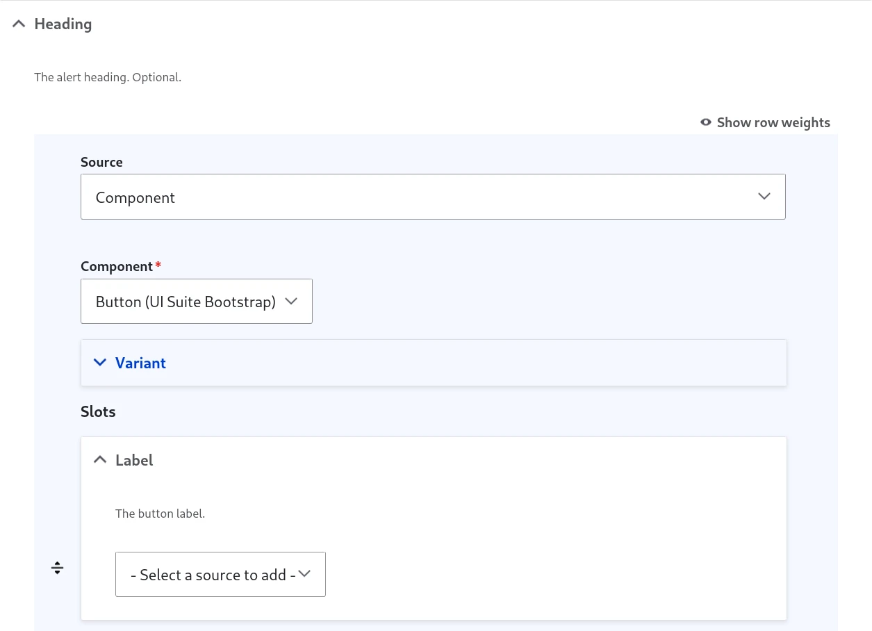
For each slot, it is possible to add one or many sources:
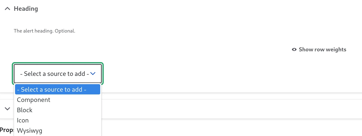
For example:
- "Component": nest another SDC component in the slot.
- "Block": add a Drupal block plugin
- "Wysiwyg": a simple text editor, using the text formats defined in your site.
Other modules can add other sources. For example, "Icon" in this screenshot is brought by https://www.drupal.org/project/ui_icons
Once a source is added, it can be configured and we can add more because the selector is still present:
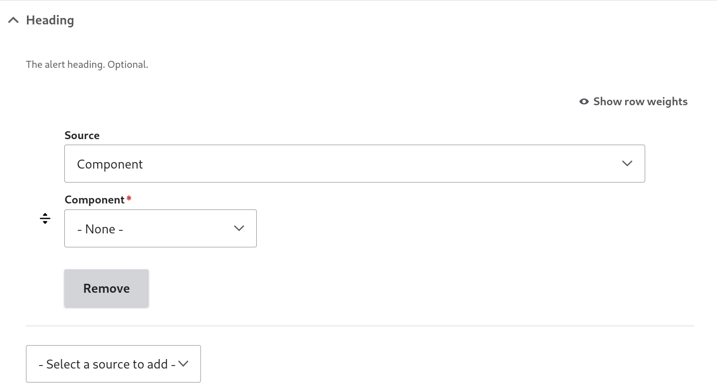
Sources can be reordered inside a slot.
A component can restrict a slot: once the slot holds its maximum number of sources, the selector is disabled, and the "Component" source only offers the components the slot expects.
Using the "Component" source, we have access to the embedded component slots and we can nest data:
Props
A bit like the form for slots with 2 main differences:
- We don’t allow multiple items, so we can replace the source but not add some (and of course no reordering)
- The default source form is already loaded.
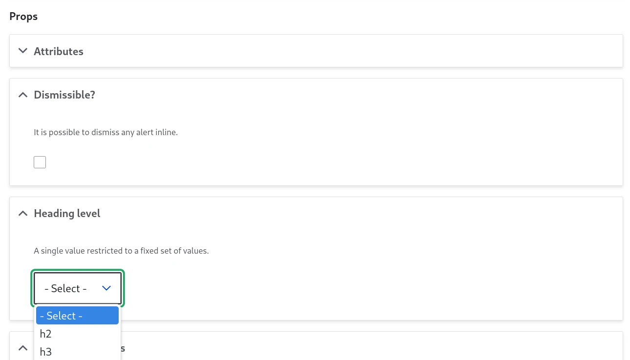
The available sources are varying according to both:
- the prop type. Each prop as a type, which is related to its JSON schema typing, but not exactly the same. You can check what type has a prop in the component library. A prop without a type is not displayed in the form.
- the context, as explained before.