Code components - Slots
Slots allow you to place other code components, or any other Experience Builder provided component, inside your component.
const Jumbotron = ({ header, buttonFooter }) => {  return (    <section>      <div>{header}</div>      <div>        <button>          <a href="#">CTA Button</a>        </button>        {buttonFooter}      </div>    </section>  );};
export default Jumbotron;
Like props, the slot names are camelCased when passed as a parameter to the component code.
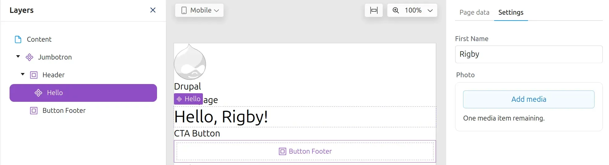
Once a slot has been added to a component, saved, and then added to a page; a slot will become visible in which other components can now be added.
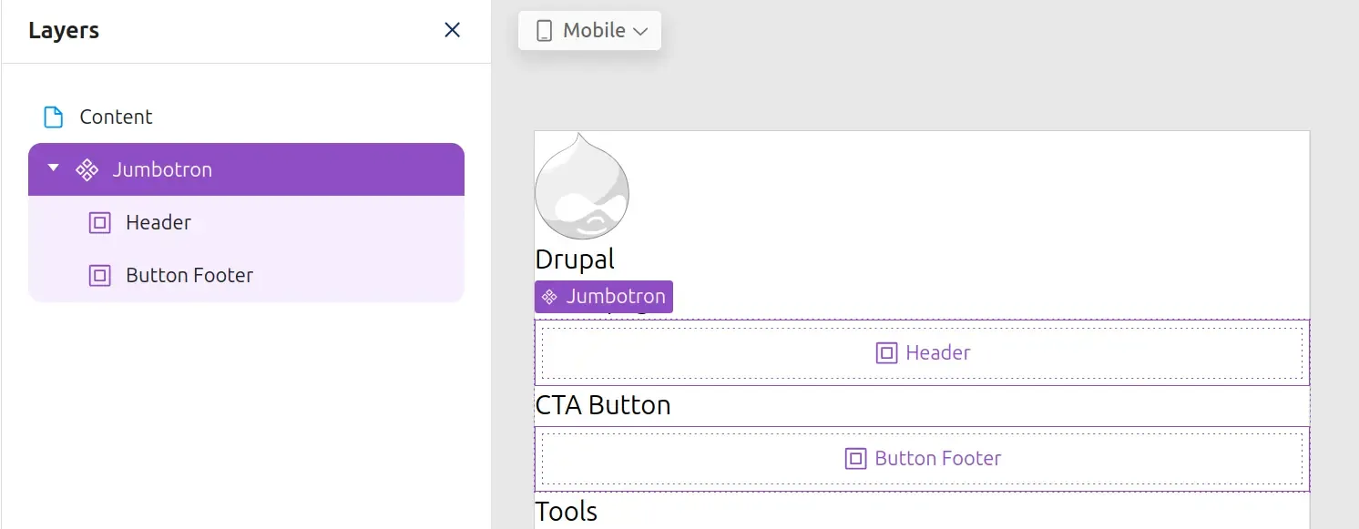
Components can now be added to the slot by dragging them in from the Library. When a component is added to the slot, you will be able to configure its props in the Settings panel which will appear on the right hand side.