Field widgets#
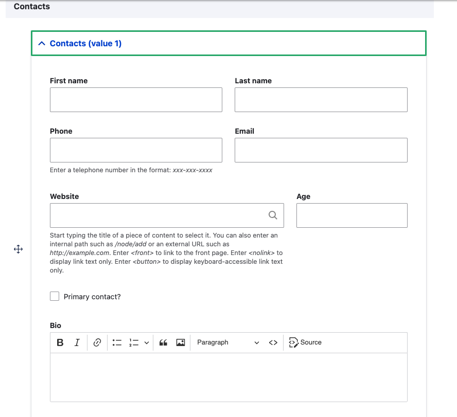
The Custom Field module provides two primary widget types for editing
structured data: Stacked (the default) and Flexbox. Both share a common
set of global settings that control the outer wrapper behavior (details,
fieldset, or div), summary labels, default open/collapsed states and
individual subfield widget settings.
Configuration#
- Navigation to the Manage form display page for the entity type
containing your custom field. (e.g.
/admin/structure/types/manage/page/form-display). - Select a Widget for your field from the dropdown. Stacked is the default, but Flexbox is often a better choice for complete layout control.
- Click the gear icon to access the widget configuration.
- Customize the widget settings as needed.
- Save the changes.
Grouping & Layout
One of the most powerful features of the Custom Field module is the ability to group related fields and control their layout directly.
Fields that belong together should stay together — our widgets make it simple and intuitive to create logical groups with clean layouts, eliminating the need for additional modules like Field Group or custom form alterations.